Preview image. Unlock full-res
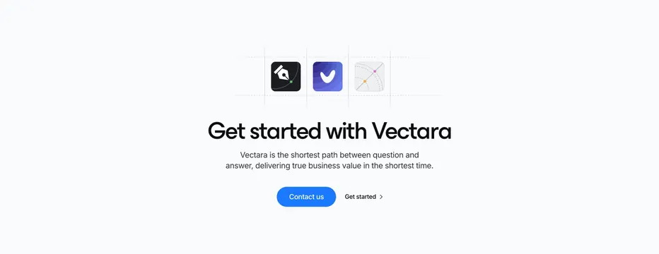
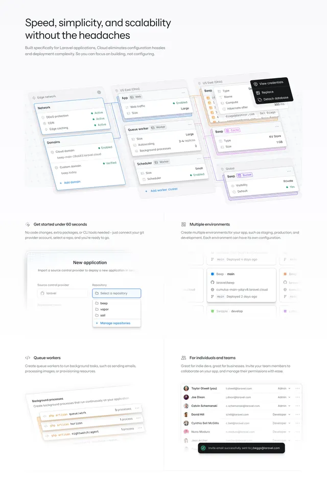
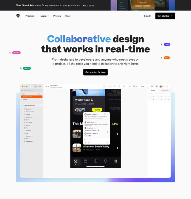
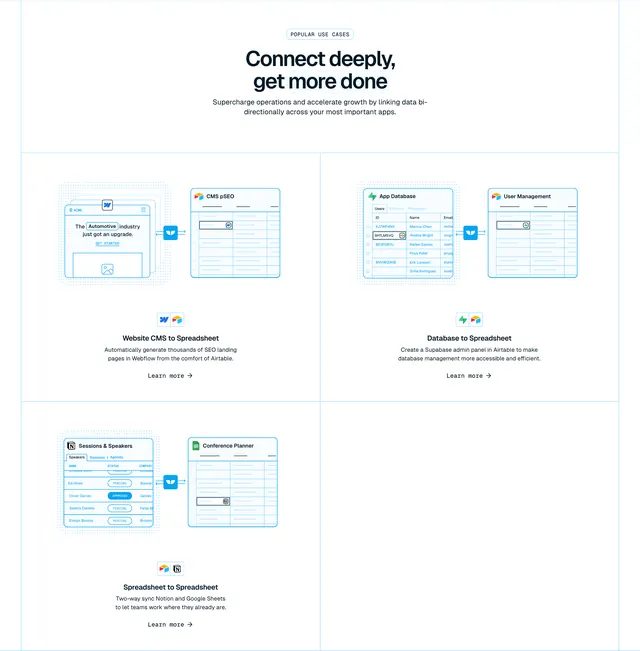
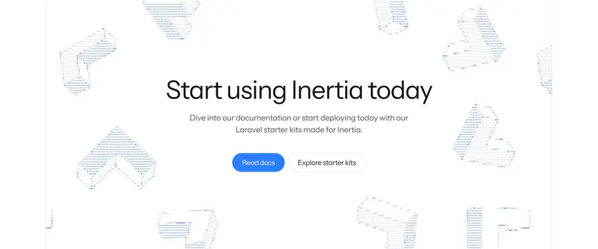
Light centered CTA with a large thin headline and two buttons, framed by faint blue dotted-particle illustrations of hands and shapes.
Summary
A quiet, centered call-to-action whose only decoration is a scatter of faint blue dotted-particle illustrations in the margins, keeping focus on the headline and two buttons.
Visual description
On a white background, an oversized thin-weight headline "Start using Inertia today" is centered, with a two-line muted gray subhead beneath. Below sit two pill buttons side by side: a filled blue primary ("Read docs") and a white outlined secondary ("Explore starter kits"). Surrounding the central column, several light blue dotted-particle illustrations of hands and abstract shapes sit in the left, right, top, and bottom margins, rendered as sparse dot grids so they read as texture rather than imagery. Everything is airy with generous whitespace.
Key takeaway
Dotted-particle (ASCII-style) illustrations placed only in the outer margins so they frame the content without competing with the CTA. Pairing a very thin oversized headline with a small bright primary button for a calm, developer-friendly tone.
Reuse notes
A good closing CTA for a developer tool or documentation-led product where a loud section would feel off-brand. The particle art needs enough whitespace to breathe; on a narrow viewport the margin illustrations may crop awkwardly. Pairs well with otherwise minimal light pages.