Preview image. Unlock full-res
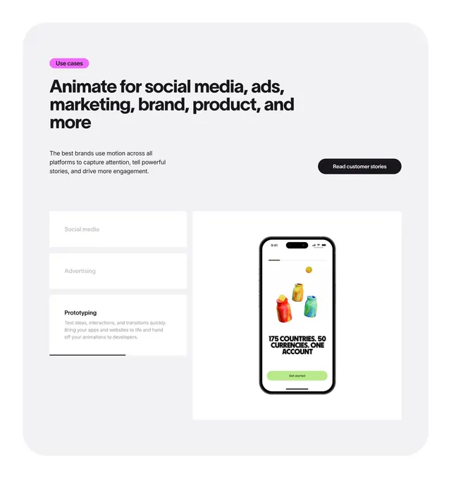
A light boxed features section with a stacked tab accordion on the left and a phone mockup preview on the right.
Summary
A use-cases features block inside a large rounded light-grey container, with a vertical tab list on the left that expands the active item into copy, and a phone mockup on the right. The defining move is the accordion-style tab where the selected row reveals its description in place.
Visual description
A big rounded off-white panel holds everything. Top left, a pink "Use cases" pill sits above a three-line bold black headline, "Animate for social media, ads, marketing, brand, product, and more", with a short grey paragraph and a black "Read customer stories" pill at right. Below left, three stacked white tab rows: "Social media" and "Advertising" are collapsed and greyed, while the active "Prototyping" row is expanded with body copy and an underline progress bar. On the right, a white card frames a realistic iPhone mockup showing a colorful product screen ("175 COUNTRIES. 50 CURRENCIES. ONE ACCOUNT") with a green "Get started" button.
Key takeaway
The vertical accordion-tab pattern, where only the active row opens to reveal text, keeps a multi-use-case story compact and scannable. The underline progress bar under the active tab hints at auto-advancing through cases. Framing the phone mockup in its own white card lifts it off the grey panel.
Reuse notes
Best when one product needs to show several distinct use cases without a wall of text, swapping the right-side preview per tab. The boxed rounded container suits a soft, modern brand. The progress bar implies motion, so only carry that detail if the tabs actually auto-cycle.