Preview image. Unlock full-res
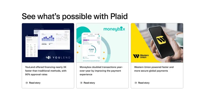
Light three-column resources row of case-study cards, each topped by a colorful product image and a "Read story" link.
Summary
A light resources section presenting three customer case studies as equal cards, each led by a vivid product visual and a short outcome statement.
Visual description
A large left-aligned black headline ("See what's possible with Plaid") sits above a three-column grid of outlined white cards. Each card opens with a full-width rounded image: a navy YouLend dashboard, a teal Moneybox mobile ISA mock, and a yellow Western Union phone-in-hand photo. Below each image is a two-to-three-line bold outcome line ("YouLend offered financing nearly 3X faster...") and, after a gap, a circular arrow icon with a "Read story" link. Cards share consistent padding, thin gray borders, and generous whitespace between them on a white background.
Key takeaway
Leading each case-study card with a brand-colored hero image makes a uniform grid feel varied and lets partner brands carry the color. The circular-arrow "Read story" affordance is a tidy, repeatable card footer. Letting the outcome stat (3X, doubled) be the bold line turns each card into a proof point.
Reuse notes
Reach for this when you have logo-recognizable customers and quantified results to show. Works best with three to give a balanced row; the images must be distinct in color or the grid flattens. Pairs naturally with a hero that already established the brand, since this section assumes trust is being built.
More resources sections
See all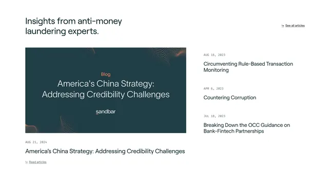
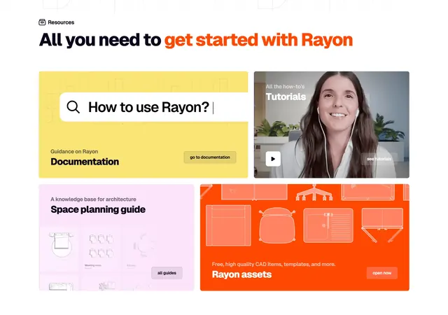
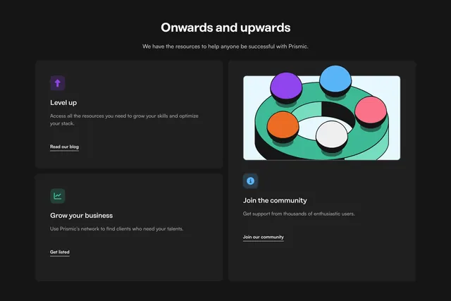

More like this


Keep what you find
A free account saves references to boards and can send you a weekly email of picks based on what you save.
To see every result, go Pro.