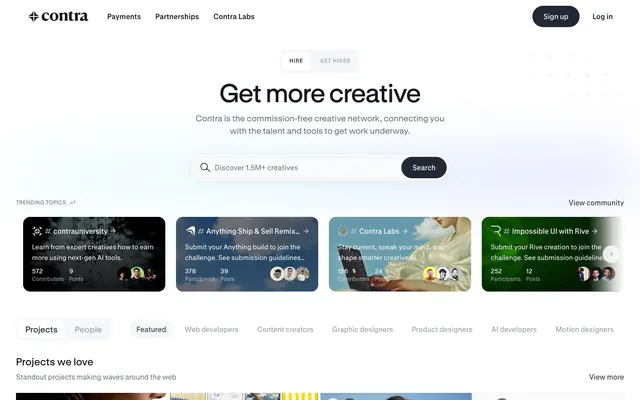
Preview image. Unlock full-res
Frosted glass on dark slate; a refined digital workspace.
Color palette
Decorative card backgrounds, accent elements in content modules — a vivid, deep purple
Decorative card backgrounds in certain content modules
Decorative card backgrounds, vivid content accent
Decorative card backgrounds, vibrant accent
Softer decorative card backgrounds
Vivid green decorative card backgrounds, content accent
Hero background gradient providing atmospheric visual depth
Page backgrounds, card surfaces, primary text on dark backgrounds
Primary action button backgrounds, dark text on light backgrounds, prominent headings
Primary text, prominent UI elements, strong borders
Muted text, helper text, subtle borders, inactive elements
Secondary text, disabled states, subtle borders
Dividers, hairline borders, input outlines
Secondary surface backgrounds, subtle hover states
Input borders, strong accents against light backgrounds
Icon fills, secondary button borders
Typography
- Weights
- 400, 500, 600
- Sizes
- 12px, 14px, 15px, 16px, 24px
- Line height
- 1.15, 1.2, 1.33, 1.4, 1.43, 1.5, 1.6
- Letter spacing
- -0.12, -0.14, -0.15, -0.16, -0.24
- Fallback
- Inter
Primary font for all body text, navigation items, buttons, and most headings below the main hero. Its presence suggests a modern, functional aesthetic.
- Weights
- 400, 500, 600
- Sizes
- 8px, 12px, 19px, 23px, 58px
- Line height
- 0.88, 1.05, 1.33, 1.39, 1.47
- Letter spacing
- -0.08, 0.1, 0.04, 0.04, -0.58
- Fallback
- Inter
Used sparingly for larger display text and specialized content, defining the headline visual presence with its distinct tracking. The very tight tracking at 58px gives headlines a condensed, impactful feel.
Spacing & shape
Elevation
Components
Background: Midnight Slate (#222834), Text: Canvas White (#ffffff), Border: none, Radius: 24px, Padding: 0px 24px (vertical padding derived from line-height).
Background: transparent, Text: Ash Gray (#14171f), Border: none, Radius: 0px. Used for subtle interactions like filter tags.
Background: transparent, Text: Charcoal Black (#000000), Border: 1px solid Charcoal Black (#000000), Radius: 0px, Padding: variable. Placeholder text is Charcoal Black.
Background: transparent or Ghost White (#f5f6f9), Text: Ash Gray (#14171f), Border: 1px solid Porcelain (#e5e7eb) or Charcoal Black (#000000), Radius: 50% (circular), Padding: 7px vertical.
Background: Canvas White (#ffffff), Border: none, Radius: 16px, Padding: 12px or 16px. Features a subtle bottom shadow: rgba(0,0,0,0.05) 0px 10px 20px 0px (nav card).
Background: Contra Violet (#6a57e3), Blush Pink (#45192f), Electric Pink (#cd74dd), Coral Red (#ff5a5e), Lavender Mist (#ddd8ff), or Lime Zest (#f0fb96). Text: Canvas White (#ffffff). Radius: 16px. These cards use vivid background colors from the accent palette, serving as eye-catching content blocks.
Text: Ash Gray (#14171f) or Phantom Gray (#677084). Default state is usually text-only, with no distinct background/border. Hover states are implied to change text color or apply subtle underline (visual evidence not clear, but standard interaction).
Guidelines
- Use Midnight Slate (#222834) exclusively for filled primary buttons and the most prominent text on light backgrounds.
- Apply Canvas White (#ffffff) for all main page backgrounds and component surfaces to maintain a pristine aesthetic.
- Employ GT Standard L 58px with letter-spacing -0.58px for all main section headlines, giving them a distinct condensed aggression.
- Prioritize 24px border-radius for all interactive buttons and 16px for content cards to unify the component curvature.
- Maintain a clear visual hierarchy by limiting saturated colors to decorative content cards and subtle functional accents, keeping core UI achromatic.
- Utilize Phantom Gray (#677084) for secondary text, labels, and hair-thin dividers to preserve visual lightness.
- Ensure input fields have sharp, 0px radius borders in Charcoal Black (#000000) for a precise, functional appearance.
- Do not use highly saturated colors for button backgrounds or primary text unless it’s a specific branded content block.
- Avoid heavy shadows or gradients on core UI elements; elevation should be minimal and primarily achieved with the provided soft shadows.
- Do not use default system fonts; always specify GT Standard M or L, or their designated substitutes.
- Refrain from using more than two distinct text sizes within a single component to prevent visual clutter.
- Do not introduce new border radii beyond the defined 24px, 16px, 10px, 4px, 32px, 40px, and 50% for consistency.
- Never use less than 4px element spacing; maintain a minimum of 4px between adjacent elements.
- Do not apply excessive padding; adhere to the 12px card padding and ensure button padding is symmetrical from the center.
About this system
ShowHide
Contra embraces a sleek, desaturated design language with crisp typography and subtle interactions. The interface prioritizes clear content hierarchy on a largely achromatic canvas, punctuated by a deep slate gray for primary actions and occasional, carefully placed pops of vivid color within content modules. Component surfaces typically feature soft, rounded edges and minimal elevation, fostering a sense of approachability and digital craftsmanship.
The page maintains a centered max-width layout for most content, with a full-bleed hero section at the top featuring a subtle gradient background and centered headline. Content sections follow a consistent vertical rhythm, often alternating between a single-column block and a multi-column (e.g., 4-column) grid of content cards. Navigation is handled by a sticky top bar. Content arrangement often features text-dominant sections followed by image-rich grids. The overall density is balanced, allowing breathing room between sections while presenting information in a structured, digestible manner.
The site uses a mixture of diverse imagery: product screenshots, abstract graphics, and some lifestyle/candid photography within content modules. Product screenshots are typically contained and framed, often with contextual UI elements. Abstract graphics are used decoratively, integrating with the card backgrounds. Photography, when present, is diverse in style but generally contained within card components rather than full-bleed heroes. Icons are minimalist, primarily outlined or filled in achromatic tones. Imagery is utilized both for decorative atmosphere and to showcase creative work, but doesn't dominate page density; text remains a strong focus.
Reminiscent of Bēhance, Dribbble, Webflow, Linear, Framer.
# Contra — Style Reference
> Frosted glass on dark slate; a refined digital workspace.

**Theme:** light

**Site:** https://contra.com

Contra embraces a sleek, desaturated design language with crisp typography and subtle interactions. The interface prioritizes clear content hierarchy on a largely achromatic canvas, punctuated by a deep slate gray for primary actions and occasional, carefully placed pops of vivid color within content modules. Component surfaces typically feature soft, rounded edges and minimal elevation, fostering a sense of approachability and digital craftsmanship.

## Tokens — Colors

| Name | Value | Token | Role |
|------|------|------|------|
| Contra Violet | `#6a57e3` | `--color-contra-violet` | Decorative card backgrounds, accent elements in content modules — a vivid, deep purple |
| Blush Pink | `#45192f` | `--color-blush-pink` | Decorative card backgrounds in certain content modules |
| Electric Pink | `#cd74dd` | `--color-electric-pink` | Decorative card backgrounds, vivid content accent |
| Coral Red | `#ff5a5e` | `--color-coral-red` | Decorative card backgrounds, vibrant accent |
| Lavender Mist | `#ddd8ff` | `--color-lavender-mist` | Softer decorative card backgrounds |
| Lime Zest | `#f0fb96` | `--color-lime-zest` | Vivid green decorative card backgrounds, content accent |
| Ocean Spectrum | `#cdefd0` | `--color-ocean-spectrum` | Hero background gradient providing atmospheric visual depth |
| Canvas White | `#ffffff` | `--color-canvas-white` | Page backgrounds, card surfaces, primary text on dark backgrounds |
| Midnight Slate | `#222834` | `--color-midnight-slate` | Primary action button backgrounds, dark text on light backgrounds, prominent headings |
| Ash Gray | `#14171f` | `--color-ash-gray` | Primary text, prominent UI elements, strong borders |
| Phantom Gray | `#677084` | `--color-phantom-gray` | Muted text, helper text, subtle borders, inactive elements |
| Silver Pine | `#9ba2b0` | `--color-silver-pine` | Secondary text, disabled states, subtle borders |
| Porcelain | `#e5e7eb` | `--color-porcelain` | Dividers, hairline borders, input outlines |
| Ghost White | `#f5f6f9` | `--color-ghost-white` | Secondary surface backgrounds, subtle hover states |
| Charcoal Black | `#000000` | `--color-charcoal-black` | Input borders, strong accents against light backgrounds |
| Cloud Gray | `#d0d4dc` | `--color-cloud-gray` | Icon fills, secondary button borders |

## Tokens — Typography

### GT Standard M
- **Substitute:** Inter
- **Weights:** 400, 500, 600
- **Sizes:** 12px, 14px, 15px, 16px, 24px
- **Line height:** 1.15, 1.2, 1.33, 1.4, 1.43, 1.5, 1.6
- **Letter spacing:** -0.12, -0.14, -0.15, -0.16, -0.24
- **Role:** Primary font for all body text, navigation items, buttons, and most headings below the main hero. Its presence suggests a modern, functional aesthetic.

### GT Standard L
- **Substitute:** Inter
- **Weights:** 400, 500, 600
- **Sizes:** 8px, 12px, 19px, 23px, 58px
- **Line height:** 0.88, 1.05, 1.33, 1.39, 1.47
- **Letter spacing:** -0.08, 0.1, 0.04, 0.04, -0.58
- **Role:** Used sparingly for larger display text and specialized content, defining the headline visual presence with its distinct tracking. The very tight tracking at 58px gives headlines a condensed, impactful feel.

## Tokens — Type Scale

Augmented Fourth (1.414) from 14px base.

| Role | Size | Line height | Letter spacing |
|------|------|------|------|
| body | 14px | 1.4 | -0.14px |
| body-lg | 16px | 1.6 | -0.16px |
| subheading | 19px | 1.39 | 0.04em |
| heading-lg | 24px | 1.2 | -0.24px |
| display | 58px | 0.88 | -0.58px |

## Tokens — Spacing

- **Section gap:** 65px
- **Card padding:** 12px
- **Element gap:** 4px

## Tokens — Radius

- **Buttons:** 24px
- **Inputs:** 0px
- **Cards:** 16px
- **avatars:** 50%
- **modules:** 10px
- **tags:** 32px

## Tokens — Elevation

- **Card (Navigation):** `rgba(0, 0, 0, 0.05) 0px 10px 20px 0px`
- **Button:** `rgba(34, 40, 52, 0.05) 0px 4px 10px 0px, rgba(34, 40, 52, 0.04) -2px 18px 18px 0px`

## Layout

The page maintains a centered max-width layout for most content, with a full-bleed hero section at the top featuring a subtle gradient background and centered headline. Content sections follow a consistent vertical rhythm, often alternating between a single-column block and a multi-column (e.g., 4-column) grid of content cards. Navigation is handled by a sticky top bar. Content arrangement often features text-dominant sections followed by image-rich grids. The overall density is balanced, allowing breathing room between sections while presenting information in a structured, digestible manner.

## Imagery

The site uses a mixture of diverse imagery: product screenshots, abstract graphics, and some lifestyle/candid photography within content modules. Product screenshots are typically contained and framed, often with contextual UI elements. Abstract graphics are used decoratively, integrating with the card backgrounds. Photography, when present, is diverse in style but generally contained within card components rather than full-bleed heroes. Icons are minimalist, primarily outlined or filled in achromatic tones. Imagery is utilized both for decorative atmosphere and to showcase creative work, but doesn't dominate page density; text remains a strong focus.

## Components

### Filled Primary Button
*Calls to action, form submissions.*

Background: Midnight Slate (#222834), Text: Canvas White (#ffffff), Border: none, Radius: 24px, Padding: 0px 24px (vertical padding derived from line-height).

### Ghost Button
*Secondary actions, filtering, navigation.*

Background: transparent, Text: Ash Gray (#14171f), Border: none, Radius: 0px. Used for subtle interactions like filter tags.

### Outlined Input Field
*User input for forms, search bars.*

Background: transparent, Text: Charcoal Black (#000000), Border: 1px solid Charcoal Black (#000000), Radius: 0px, Padding: variable. Placeholder text is Charcoal Black.

### Compact Filter Button
*Filtering and categorization within content sections.*

Background: transparent or Ghost White (#f5f6f9), Text: Ash Gray (#14171f), Border: 1px solid Porcelain (#e5e7eb) or Charcoal Black (#000000), Radius: 50% (circular), Padding: 7px vertical.

### Content Card (Featured)
*Displaying articles, projects, or featured content.*

Background: Canvas White (#ffffff), Border: none, Radius: 16px, Padding: 12px or 16px. Features a subtle bottom shadow: rgba(0,0,0,0.05) 0px 10px 20px 0px (nav card).

### Branded Content Card
*Showcasing specific branded content with unique backgrounds.*

Background: Contra Violet (#6a57e3), Blush Pink (#45192f), Electric Pink (#cd74dd), Coral Red (#ff5a5e), Lavender Mist (#ddd8ff), or Lime Zest (#f0fb96). Text: Canvas White (#ffffff). Radius: 16px. These cards use vivid background colors from the accent palette, serving as eye-catching content blocks.

### Navigation Link
*Primary site navigation in the header and footer.*

Text: Ash Gray (#14171f) or Phantom Gray (#677084). Default state is usually text-only, with no distinct background/border. Hover states are implied to change text color or apply subtle underline (visual evidence not clear, but standard interaction).

## Guidelines

### Do

- Use Midnight Slate (#222834) exclusively for filled primary buttons and the most prominent text on light backgrounds.
- Apply Canvas White (#ffffff) for all main page backgrounds and component surfaces to maintain a pristine aesthetic.
- Employ GT Standard L 58px with letter-spacing -0.58px for all main section headlines, giving them a distinct condensed aggression.
- Prioritize 24px border-radius for all interactive buttons and 16px for content cards to unify the component curvature.
- Maintain a clear visual hierarchy by limiting saturated colors to decorative content cards and subtle functional accents, keeping core UI achromatic.
- Utilize Phantom Gray (#677084) for secondary text, labels, and hair-thin dividers to preserve visual lightness.
- Ensure input fields have sharp, 0px radius borders in Charcoal Black (#000000) for a precise, functional appearance.

### Don't

- Do not use highly saturated colors for button backgrounds or primary text unless it’s a specific branded content block.
- Avoid heavy shadows or gradients on core UI elements; elevation should be minimal and primarily achieved with the provided soft shadows.
- Do not use default system fonts; always specify GT Standard M or L, or their designated substitutes.
- Refrain from using more than two distinct text sizes within a single component to prevent visual clutter.
- Do not introduce new border radii beyond the defined 24px, 16px, 10px, 4px, 32px, 40px, and 50% for consistency.
- Never use less than 4px element spacing; maintain a minimum of 4px between adjacent elements.
- Do not apply excessive padding; adhere to the 12px card padding and ensure button padding is symmetrical from the center.

## Agent Prompt Guide

Quick Color Reference:
text: #14171f
background: #ffffff
border: #e5e7eb
accent: #6a57e3
primary action: #222834 (filled action)

Example Component Prompts:
1. Create a Hero Section: Background is 'Ocean Spectrum' gradient. Headline 'Get more creative' in GT Standard L 58px, weight 400, #14171f, letter-spacing -0.58px. Subtext 'Contra is the commission-free creative network...' in GT Standard M 16px, weight 400, #677084.
2. Create a Primary Action Button: #222834 background, #ffffff text, 9999px radius, compact pill padding. Use this filled treatment for the main CTA.
3. Create a Branded Content Card: Background 'Contra Violet' (#6a57e3), text 'Latest Insights' in Canvas White (#ffffff), GT Standard M 14px weight 500. Radius 16px, padding 12px. Include a small icon inside using Canvas White fill.
More like this









Keep what you find
A free account saves references to boards and can send you a weekly email of picks based on what you save.
To see every result, go Pro.