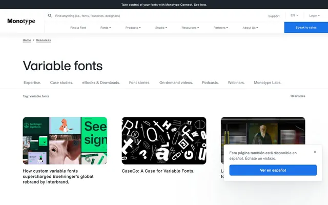
Preview image. Unlock full-res
Type Foundry Blueprint: precision on a clean canvas
Color palette
Primary action buttons, active navigation indicators — signifies core interaction and brand presence
Primary text, headers, icon fills, dark button backgrounds, focused interactive borders
Muted text, secondary navigation links, subtle borders
Page backgrounds, card surfaces, text on dark buttons
Subtle borders, dividers, hover states on lighter backgrounds
Delicate borders and subtle shadows for cards
Card borders, slightly more prominent dividers
Typography
- Weights
- 400
- Sizes
- 16px
- Line height
- 1.2
sans-serif — detected in extracted data but not described by AI
- Weights
- 400
- Sizes
- 13px, 14px, 16px
- Line height
- 1.2, 1.23, 1.38, 1.5
- Fallback
- Arial
Body copy, navigation items, descriptive text. Its compact clarity supports dense information display without sacrificing legibility.
- Weights
- 400
- Sizes
- 13px, 16px
- Line height
- 1.23, 1.5
- Letter spacing
- -0.0200em
- Fallback
- Arial Bold
Emphasized text, subheadings, and bold navigation entries. The subtle negative letter-spacing creates a tighter, more deliberate appearance.
- Weights
- 400
- Sizes
- 11px, 14px
- Line height
- 1.45, 2, 2.55
- Fallback
- Arial
Fine print, supporting metadata, and compact menu items. Its smaller scale and higher line height ensures legibility at small sizes.
- Weights
- 400
- Sizes
- 57px
- Line height
- 1.12
- Fallback
- Arial
Prominent page headlines. Despite being medium weight, its large size and tight line height command attention as a display font.
- Weights
- 400
- Sizes
- 26px
- Line height
- 1.2
- Fallback
- Arial
Specialized decorative headings or unique typographic elements, leveraging variable font capabilities. It carries significant visual weight while being restrained in color.
Spacing & shape
Elevation
Components
Filled with Ocean Blue (#1a73e8), Pure White (#ffffff) text, 8px border-radius, and 12px 24px padding.
Filled with Midnight Graphite (#1e242c), Pure White (#ffffff) text, 0px border-radius, and 8px 24px padding.
Transparent background, Pewter Slate (#576579) text and border, 0px border-radius, and no explicit padding, implying inline usage.
Transparent background, Midnight Graphite (#1e242c) text and border, 0px border-radius, with no explicit padding.
Pure White (#ffffff) background, 8px border-radius, subtle shadow at rgba(55, 73, 81, 0.12) with increasing spread, and 24px padding on all sides. Bordered with a 1px solid Ash Grey (#dbdfe5).
Transparent background, Midnight Graphite (#1e242c) text, and 0px border-radius. Intended for inline, understated usage.
White background with a 1px Light Fog (#e7eaee) border, featuring a small icon. Text is Midnight Graphite (#1e242c).
Guidelines
- Use Midnight Graphite (#1e242c) for primary text and headings for maximum contrast on white backgrounds.
- Apply Ocean Blue (#1a73e8) exclusively for primary interactive elements like call-to-action buttons.
- Maintain 8px border-radius for all buttons and cards, and 16px for image containers for visual consistency.
- Utilize HelveticaNowMTTextRegular for body text, ensuring a lineHeight of 1.5, to prioritize readability and a professional appearance.
- Separate content sections with a sectionGap of 104px to provide ample breathing room between major informational blocks.
- Employ the subtle shadow style rgba(55, 73, 81, 0.12) 0px 112px 228px 0px for cards to provide a delicate sense of elevation without being distracting.
- Ensure letterSpacing for emphasized text (HelveticaNowMTTextBold) is -0.0200em to achieve a tighter, more refined typographic appearance.
- Avoid using highly saturated colors for backgrounds or large decorative elements; color is reserved for functional accents.
- Do not deviate from the established 8px and 16px border radii to maintain the subtle soft-edged aesthetic.
- Refrain from using strong, dark shadows for default elements; elevation is minimal and suggests slight lift rather than significant depth.
- Do not use generic system sans-serif fonts where custom ones are specified; the exact typeface contributes significantly to brand identity.
- Avoid excessive element decorations or heavy borders; surfaces should remain clean and uncluttered.
- Do not introduce additional semantic colors (e.g., green for success, red for error) without explicit integration, as the palette is highly controlled.
- Eschew dramatic or flamboyant animations; motion should be subtle, with `ease` timing functions, to maintain an efficient and professional feel.
About this system
ShowHide
Monotype's design language is an exercise in restrained professionalism, echoing the foundational nature of typography itself. It uses a pristine white canvas contrasted with deep, dark grays and a singular vivid blue accent for interactive elements. Typography is precise and utilitarian, with compact line spacing and subtle letter-spacing adjustments, prioritizing clarity and authority. Components are lightweight, featuring soft cards, ghost controls, and minimal elevation, allowing content to take precedence without visual clutter.
The page maintains a max-width contained layout, centering content within a flexible boundary. The hero section features a full-bleed dark banner with a prominent centered headline, followed by white sections. Content flow is primarily vertical, with consistent section gaps of 104px, creating a spacious and breathable rhythm. Interior content often alternates between text and image blocks, sometimes in two-column arrangements. A 3-column grid structure is used for displaying resource cards. Navigation consists of a sticky top bar with a primary 'Speak to sales' button, alongside a secondary header with more detailed navigation items and a search input.
The site predominantly uses diverse product and brand-specific imagery, ranging from illustrative graphics with geometric forms to high-quality photography. Imagery generally features contained, sometimes rounded (16px radius) elements, rather than full-bleed compositions. There is a mix of abstract concepts, typography in use, and occasionally product-focused shots. Icons are simple, outlined, and monochromatic, typically in Midnight Graphite, serving an explanatory or decorative role rather than being heavily visual. Overall, imagery supports content and brand identity without overwhelming the clean UI, maintaining a text-dominant density.
Reminiscent of Webflow, Figma, Stripe, Google Material Design (web).
# Monotype. — Style Reference
> Type Foundry Blueprint: precision on a clean canvas

**Theme:** light

**Site:** https://variable-fonts.com

Monotype's design language is an exercise in restrained professionalism, echoing the foundational nature of typography itself. It uses a pristine white canvas contrasted with deep, dark grays and a singular vivid blue accent for interactive elements. Typography is precise and utilitarian, with compact line spacing and subtle letter-spacing adjustments, prioritizing clarity and authority. Components are lightweight, featuring soft cards, ghost controls, and minimal elevation, allowing content to take precedence without visual clutter.

## Tokens — Colors

| Name | Value | Token | Role |
|------|------|------|------|
| Ocean Blue | `#1a73e8` | `--color-ocean-blue` | Primary action buttons, active navigation indicators — signifies core interaction and brand presence |
| Midnight Graphite | `#1e242c` | `--color-midnight-graphite` | Primary text, headers, icon fills, dark button backgrounds, focused interactive borders |
| Pewter Slate | `#576579` | `--color-pewter-slate` | Muted text, secondary navigation links, subtle borders |
| Pure White | `#ffffff` | `--color-pure-white` | Page backgrounds, card surfaces, text on dark buttons |
| Light Fog | `#e7eaee` | `--color-light-fog` | Subtle borders, dividers, hover states on lighter backgrounds |
| Silver Dust | `#cfd5dd` | `--color-silver-dust` | Delicate borders and subtle shadows for cards |
| Ash Grey | `#dbdfe5` | `--color-ash-grey` | Card borders, slightly more prominent dividers |

## Tokens — Typography

### sans-serif
- **Weights:** 400
- **Sizes:** 16px
- **Line height:** 1.2
- **Role:** sans-serif — detected in extracted data but not described by AI

### HelveticaNowMTTextRegular
- **Substitute:** Arial
- **Weights:** 400
- **Sizes:** 13px, 14px, 16px
- **Line height:** 1.2, 1.23, 1.38, 1.5
- **Role:** Body copy, navigation items, descriptive text. Its compact clarity supports dense information display without sacrificing legibility.

### HelveticaNowMTTextBold
- **Substitute:** Arial Bold
- **Weights:** 400
- **Sizes:** 13px, 16px
- **Line height:** 1.23, 1.5
- **Letter spacing:** -0.0200em
- **Role:** Emphasized text, subheadings, and bold navigation entries. The subtle negative letter-spacing creates a tighter, more deliberate appearance.

### HelveticaNowMTMicroRegular
- **Substitute:** Arial
- **Weights:** 400
- **Sizes:** 11px, 14px
- **Line height:** 1.45, 2, 2.55
- **Role:** Fine print, supporting metadata, and compact menu items. Its smaller scale and higher line height ensures legibility at small sizes.

### HelveticaNowMTDisplayMedium
- **Substitute:** Arial
- **Weights:** 400
- **Sizes:** 57px
- **Line height:** 1.12
- **Role:** Prominent page headlines. Despite being medium weight, its large size and tight line height command attention as a display font.

### TypecaseVar
- **Substitute:** Arial
- **Weights:** 400
- **Sizes:** 26px
- **Line height:** 1.2
- **Role:** Specialized decorative headings or unique typographic elements, leveraging variable font capabilities. It carries significant visual weight while being restrained in color.

## Tokens — Type Scale

| Role | Size | Line height | Letter spacing |
|------|------|------|------|
| body-lg | 16px | 1.5 | — |
| heading | 26px | 1.2 | — |
| display | 57px | 1.12 | — |

## Tokens — Spacing

- **Section gap:** 104px
- **Card padding:** 24px
- **Element gap:** 16px

## Tokens — Radius

- **Buttons:** 8px
- **Cards:** 8px
- **Images:** 16px

## Tokens — Elevation

- **Resource Card:** `rgba(55, 73, 81, 0.12) 0px 112px 228px 0px, rgba(55, 73, 81, 0.07) 0px 25.017px 50.927px 0px, rgba(55, 73, 81, 0.05) 0px 7.448px 15.162px 0px`

## Layout

The page maintains a max-width contained layout, centering content within a flexible boundary. The hero section features a full-bleed dark banner with a prominent centered headline, followed by white sections. Content flow is primarily vertical, with consistent section gaps of 104px, creating a spacious and breathable rhythm. Interior content often alternates between text and image blocks, sometimes in two-column arrangements. A 3-column grid structure is used for displaying resource cards. Navigation consists of a sticky top bar with a primary 'Speak to sales' button, alongside a secondary header with more detailed navigation items and a search input.

## Imagery

The site predominantly uses diverse product and brand-specific imagery, ranging from illustrative graphics with geometric forms to high-quality photography. Imagery generally features contained, sometimes rounded (16px radius) elements, rather than full-bleed compositions. There is a mix of abstract concepts, typography in use, and occasionally product-focused shots. Icons are simple, outlined, and monochromatic, typically in Midnight Graphite, serving an explanatory or decorative role rather than being heavily visual. Overall, imagery supports content and brand identity without overwhelming the clean UI, maintaining a text-dominant density.

## Components

### Primary Action Button
*Main call to action.*

Filled with Ocean Blue (#1a73e8), Pure White (#ffffff) text, 8px border-radius, and 12px 24px padding.

### Navigation Button (Dark)
*Primary navigation item, especially in header.*

Filled with Midnight Graphite (#1e242c), Pure White (#ffffff) text, 0px border-radius, and 8px 24px padding.

### Ghost Button (Muted)
*Secondary or auxiliary actions, often text-only.*

Transparent background, Pewter Slate (#576579) text and border, 0px border-radius, and no explicit padding, implying inline usage.

### Ghost Button (Dark)
*Text-based navigation or subtle interactive elements.*

Transparent background, Midnight Graphite (#1e242c) text and border, 0px border-radius, with no explicit padding.

### Resource Card
*Content presentation for articles and resources.*

Pure White (#ffffff) background, 8px border-radius, subtle shadow at rgba(55, 73, 81, 0.12) with increasing spread, and 24px padding on all sides. Bordered with a 1px solid Ash Grey (#dbdfe5).

### Tag Badge
*Categorization labels.*

Transparent background, Midnight Graphite (#1e242c) text, and 0px border-radius. Intended for inline, understated usage.

### Search Input
*Global search functionality.*

White background with a 1px Light Fog (#e7eaee) border, featuring a small icon. Text is Midnight Graphite (#1e242c).

## Guidelines

### Do

- Use Midnight Graphite (#1e242c) for primary text and headings for maximum contrast on white backgrounds.
- Apply Ocean Blue (#1a73e8) exclusively for primary interactive elements like call-to-action buttons.
- Maintain 8px border-radius for all buttons and cards, and 16px for image containers for visual consistency.
- Utilize HelveticaNowMTTextRegular for body text, ensuring a lineHeight of 1.5, to prioritize readability and a professional appearance.
- Separate content sections with a sectionGap of 104px to provide ample breathing room between major informational blocks.
- Employ the subtle shadow style rgba(55, 73, 81, 0.12) 0px 112px 228px 0px for cards to provide a delicate sense of elevation without being distracting.
- Ensure letterSpacing for emphasized text (HelveticaNowMTTextBold) is -0.0200em to achieve a tighter, more refined typographic appearance.

### Don't

- Avoid using highly saturated colors for backgrounds or large decorative elements; color is reserved for functional accents.
- Do not deviate from the established 8px and 16px border radii to maintain the subtle soft-edged aesthetic.
- Refrain from using strong, dark shadows for default elements; elevation is minimal and suggests slight lift rather than significant depth.
- Do not use generic system sans-serif fonts where custom ones are specified; the exact typeface contributes significantly to brand identity.
- Avoid excessive element decorations or heavy borders; surfaces should remain clean and uncluttered.
- Do not introduce additional semantic colors (e.g., green for success, red for error) without explicit integration, as the palette is highly controlled.
- Eschew dramatic or flamboyant animations; motion should be subtle, with `ease` timing functions, to maintain an efficient and professional feel.

## Agent Prompt Guide

Quick Color Reference:
text: #1e242c
background: #ffffff
border: #e7eaee
accent: #1a73e8
primary action: #1a73e8 (filled action)

Example Component Prompts:
1. Create a primary call-to-action button: text 'Learn More' in Pure White (#ffffff), filled with Ocean Blue (#1a73e8), 8px border-radius, and 12px 24px padding. Use HelveticaNowMTTextRegular at 16px.
2. Design a Resource Card: Pure White (#ffffff) background, 8px border-radius, 1px solid Ash Grey (#dbdfe5) border, and the specified card shadow. Inside, include a heading in Midnight Graphite (#1e242c) at 26px TypecaseVar and body text in Pewter Slate (#576579) at 14px HelveticaNowMTTextRegular with 24px of internal padding.
3. Implement a Tag Badge: text 'Variable fonts' in Midnight Graphite (#1e242c), transparent background, no border, 0px border-radius. Use HelveticaNowMTMicroRegular at 11px.
More like this
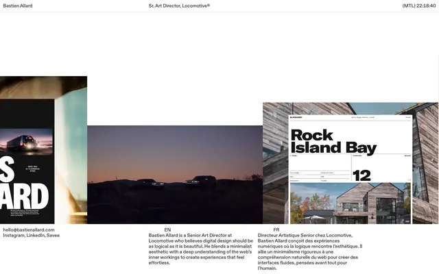









Keep what you find
A free account saves references to boards and can send you a weekly email of picks based on what you save.
To see every result, go Pro.