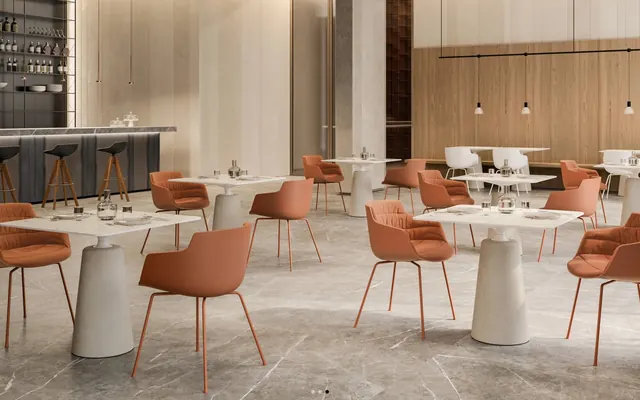
Preview image. Unlock full-res
Architectural Blueprint on Marble: Precise lines and forms over a neutral, expansive canvas.
Color palette
Violet text accent for links, tags, and emphasized short phrases. Use as a supporting accent, not as a status color
Page backgrounds, elevated card surfaces, clean backdrop for product visuals
Primary text, headings, strong outlines, section backgrounds for contrast. Creates a bold, definitive visual anchor
Soft icon strokes, subtle dividers, and low-emphasis decorative details. Do not promote it to the primary CTA color
Muted secondary text, placeholder text in input fields, less prominent UI elements
Tertiary text, subtle descriptions, copyright information. Used for low-priority textual content
Very subtle descriptive text, fine print, or as a background accent to text for very low hierarchy
Typography
- Weights
- 300, 400, 500, 600
- Sizes
- 16px, 18px, 24px, 30px, 50px, 100px
- Line height
- 1, 1.07, 1.08, 1.13, 1.25, 1.5, 1.56, 1.63, 1.75
- Letter spacing
- -0.0500em, -0.0400em, -0.0250em, -0.0020em
- Fallback
- Inter, Arial, sans-serif
Primary brand typeface for all text content. The use of a custom font named 'Plain' suggests a focus on understated elegance, with a wide range of weights providing granular control over hierarchy. The specific letter-spacing values ensure precise optical alignment across different sizes, maintaining a consistent, refined feel.
Spacing & shape
Components
Background: transparent (rgba(0,0,0,0)), Text: Ink Black (#000000), Border: 1px solid Ash Gray (#e5e7eb) on top, Padding: 18px top/bottom, 48px left/right. Radius: 0px.
Background: transparent (rgba(0,0,0,0)), Text: Ink Black (#000000), No explicit border. Padding: 0px.
Background: transparent (rgba(0,0,0,0)), Text: Ink Black (#000000), Border: 1px solid Slate Text (#6b7280). Padding: 8px top/bottom, 12px left/right. Radius: 0px. Placeholder text is Slate Text (#6b7280).
Background for product card: Canvas White (#ffffff). No visible border radius, hard edges. Features strong black text for titles, with smaller slate or gray text for descriptions. Visual elements are contained within the card's bounds without overlap.
Comprises a white circular outline over a Canvas White (#ffffff) background. Text is Ink Black (#000000), typically centered in the circle. The graphic is a white circle, the structure is created by the black text and the negative space. The radius of the circle is undefined in the tokens but visually large and soft-edged.
Text: Ink Black (#000000), typically accompanied by an icon or visual cue. No explicit background or padding, presented as a standard link. Underlined on hover.
Guidelines
- Prioritize Ink Black (#000000) for all primary text and headings.
- Use Canvas White (#ffffff) for all main section backgrounds and card surfaces.
- Apply Plain typeface with specific letter-spacing values as defined in Typography for all text elements to maintain precise optical rhythm.
- Utilize Ash Gray (#e5e7eb) for subtle borders and dividers between content blocks and interactive elements.
- Maintain a compact density with an 8px element gap and 12px internal padding for cards.
- Form inputs should feature a 1px solid Slate Text (#6b7280) border with a 0px radius, aligning with the clean, unornamented aesthetic.
- Only use Azure Accent (#2563eb) for specific interactive feedback such as focus states or informational messages, never as a primary brand color.
- Avoid using saturated background colors; all primary backgrounds should adhere to Canvas White (#ffffff) or Ink Black (#000000).
- Do not introduce decorative shadows or heavy gradients; the system relies on flat surfaces and high contrast.
- Refrain from using varied border radii across components; stick to 0px for most elements and 2px only for inputs.
- Do not deviate from the specified letter-spacing for 'Plain' font; optical precision is critical for this brand’s typographic identity.
- Do not use color to create hierarchy in text; rely on font weight and size variations within the `Plain` typeface.
- Avoid large, impactful graphics unless they are product photography; maintain a text-dominant, information-focused layout.
- Do not add unnecessary padding or margin; adhere to the defined spacing tokens for a consistently compact arrangement.
About this system
ShowHide
The Contract design system by MDF Italia embodies a refined, architectural blueprint aesthetic: a stark monochromatic palette emphasizes structure and form. Typography is the primary visual communicator, utilizing a wide range of weights to establish hierarchy rather than color. Surfaces are clean and unadorned, promoting a focus on product photography and minimal, precise UI elements. The overall impression is one of understated luxury and functional clarity, where space and proportion play a crucial role.
The page primarily uses a full-bleed layout for sections, with strong visual separation often created by alternating Ink Black (#000000) and Canvas White (#ffffff) backgrounds. Content within these sections is typically contained within a maximum width (not explicitly defined, but visually present). The hero section features a large, striking image or video. Content is often arranged in simple two-column text-left/image-right patterns or centered stacking for emphasis. Card grids are used for feature presentation or product categories. Navigation is a minimalist top bar, with elements appearing lightweight and subservient to the main content.
Imagery primarily consists of high-quality product photography and architectural renders. These visuals are typically contained within their sections, often shown as part of a larger composition or in a grid, with clean edges. Product shots are often full-frame or tightly cropped, emphasizing the material and form of the furniture. There are minimal decorative illustrations or abstract graphics. Icons are monochrome, typically filled where present, and serve a functional purpose.
Reminiscent of B&B Italia, Flos, Artemide, Vitra.
# Contract — Style Reference
> Architectural Blueprint on Marble: Precise lines and forms over a neutral, expansive canvas.

**Theme:** light

**Site:** https://contract.mdfitalia.com/en

The Contract design system by MDF Italia embodies a refined, architectural blueprint aesthetic: a stark monochromatic palette emphasizes structure and form. Typography is the primary visual communicator, utilizing a wide range of weights to establish hierarchy rather than color. Surfaces are clean and unadorned, promoting a focus on product photography and minimal, precise UI elements. The overall impression is one of understated luxury and functional clarity, where space and proportion play a crucial role.

## Tokens — Colors

| Name | Value | Token | Role |
|------|------|------|------|
| Azure Accent | `#2563eb` | `--color-azure-accent` | Violet text accent for links, tags, and emphasized short phrases. Use as a supporting accent, not as a status color |
| Canvas White | `#ffffff` | `--color-canvas-white` | Page backgrounds, elevated card surfaces, clean backdrop for product visuals |
| Ink Black | `#000000` | `--color-ink-black` | Primary text, headings, strong outlines, section backgrounds for contrast. Creates a bold, definitive visual anchor |
| Ash Gray | `#e5e7eb` | `--color-ash-gray` | Soft icon strokes, subtle dividers, and low-emphasis decorative details. Do not promote it to the primary CTA color |
| Slate Text | `#6b7280` | `--color-slate-text` | Muted secondary text, placeholder text in input fields, less prominent UI elements |
| Medium Gray | `#b3b3b3` | `--color-medium-gray` | Tertiary text, subtle descriptions, copyright information. Used for low-priority textual content |
| Light Gray | `#bbbbbb` | `--color-light-gray` | Very subtle descriptive text, fine print, or as a background accent to text for very low hierarchy |

## Tokens — Typography

### Plain
- **Substitute:** Inter, Arial, sans-serif
- **Weights:** 300, 400, 500, 600
- **Sizes:** 16px, 18px, 24px, 30px, 50px, 100px
- **Line height:** 1, 1.07, 1.08, 1.13, 1.25, 1.5, 1.56, 1.63, 1.75
- **Letter spacing:** -0.0500em, -0.0400em, -0.0250em, -0.0020em
- **Role:** Primary brand typeface for all text content. The use of a custom font named 'Plain' suggests a focus on understated elegance, with a wide range of weights providing granular control over hierarchy. The specific letter-spacing values ensure precise optical alignment across different sizes, maintaining a consistent, refined feel.

## Tokens — Type Scale

Augmented Fourth (1.414) from 16px base.

| Role | Size | Line height | Letter spacing |
|------|------|------|------|
| body | 16px | 1.5 | -0.002em |
| subheading | 18px | 1.56 | -0.002em |
| heading-sm | 24px | 1.63 | -0.025em |
| heading | 30px | 1.13 | -0.04em |
| heading-lg | 50px | 1.08 | -0.04em |
| display | 100px | 1 | -0.05em |

## Tokens — Spacing

- **Section gap:** 69px
- **Card padding:** 12px
- **Element gap:** 8px

## Tokens — Radius

- **Default:** 0px
- **Inputs:** 2px

## Layout

The page primarily uses a full-bleed layout for sections, with strong visual separation often created by alternating Ink Black (#000000) and Canvas White (#ffffff) backgrounds. Content within these sections is typically contained within a maximum width (not explicitly defined, but visually present). The hero section features a large, striking image or video. Content is often arranged in simple two-column text-left/image-right patterns or centered stacking for emphasis. Card grids are used for feature presentation or product categories. Navigation is a minimalist top bar, with elements appearing lightweight and subservient to the main content.

## Imagery

Imagery primarily consists of high-quality product photography and architectural renders. These visuals are typically contained within their sections, often shown as part of a larger composition or in a grid, with clean edges. Product shots are often full-frame or tightly cropped, emphasizing the material and form of the furniture. There are minimal decorative illustrations or abstract graphics. Icons are monochrome, typically filled where present, and serve a functional purpose.

## Components

### Primary Ghost Button
*Interactive control for primary actions, presenting as an outlined element to maintain a light visual footprint.*

Background: transparent (rgba(0,0,0,0)), Text: Ink Black (#000000), Border: 1px solid Ash Gray (#e5e7eb) on top, Padding: 18px top/bottom, 48px left/right. Radius: 0px.

### Text Link Button
*Minimal interactive control for navigation or secondary actions, appearing as plain text.*

Background: transparent (rgba(0,0,0,0)), Text: Ink Black (#000000), No explicit border. Padding: 0px.

### Text Input Field
*User input area for forms.*

Background: transparent (rgba(0,0,0,0)), Text: Ink Black (#000000), Border: 1px solid Slate Text (#6b7280). Padding: 8px top/bottom, 12px left/right. Radius: 0px. Placeholder text is Slate Text (#6b7280).

### Office Product Card
*Display individual product categories or offerings.*

Background for product card: Canvas White (#ffffff). No visible border radius, hard edges. Features strong black text for titles, with smaller slate or gray text for descriptions. Visual elements are contained within the card's bounds without overlap.

### Key Value Circle
*Highlights key features or services within a section.*

Comprises a white circular outline over a Canvas White (#ffffff) background. Text is Ink Black (#000000), typically centered in the circle. The graphic is a white circle, the structure is created by the black text and the negative space. The radius of the circle is undefined in the tokens but visually large and soft-edged.

### Download Catalog Link
*Direct call to action for downloading detailed information.*

Text: Ink Black (#000000), typically accompanied by an icon or visual cue. No explicit background or padding, presented as a standard link. Underlined on hover.

## Guidelines

### Do

- Prioritize Ink Black (#000000) for all primary text and headings.
- Use Canvas White (#ffffff) for all main section backgrounds and card surfaces.
- Apply Plain typeface with specific letter-spacing values as defined in Typography for all text elements to maintain precise optical rhythm.
- Utilize Ash Gray (#e5e7eb) for subtle borders and dividers between content blocks and interactive elements.
- Maintain a compact density with an 8px element gap and 12px internal padding for cards.
- Form inputs should feature a 1px solid Slate Text (#6b7280) border with a 0px radius, aligning with the clean, unornamented aesthetic.
- Only use Azure Accent (#2563eb) for specific interactive feedback such as focus states or informational messages, never as a primary brand color.

### Don't

- Avoid using saturated background colors; all primary backgrounds should adhere to Canvas White (#ffffff) or Ink Black (#000000).
- Do not introduce decorative shadows or heavy gradients; the system relies on flat surfaces and high contrast.
- Refrain from using varied border radii across components; stick to 0px for most elements and 2px only for inputs.
- Do not deviate from the specified letter-spacing for 'Plain' font; optical precision is critical for this brand’s typographic identity.
- Do not use color to create hierarchy in text; rely on font weight and size variations within the `Plain` typeface.
- Avoid large, impactful graphics unless they are product photography; maintain a text-dominant, information-focused layout.
- Do not add unnecessary padding or margin; adhere to the defined spacing tokens for a consistently compact arrangement.

## Agent Prompt Guide

Quick Color Reference:
text: #000000
background: #ffffff
border: #e5e7eb
accent: #2563eb
primary action: no distinct CTA color

Example Component Prompts:
No distinct primary action color was observed; use the extracted neutral button treatments instead of inventing a filled CTA color.
2. Create a heading section: background Canvas White (#ffffff). Headline 'Contract, according to mdf italia' at 100px Plain weight 300, Ink Black (#000000), letter-spacing -0.0500em. Subtext 'Pioneers in a new way of conceiving space...' at 18px Plain weight 400, Ink Black (#000000), letter-spacing -0.0020em.
3. Create an Input Field: background rgba(0,0,0,0), text Ink Black (#000000), 1px solid Slate Text (#6b7280) border, 8px vertical padding, 12px horizontal padding, 2px radius. Placeholder text Slate Text (#6b7280).
4. Create a 'Key values' section: background Canvas White (#ffffff). Heading 'Key values' at 50px Plain weight 600, Ink Black (#000000). Below the heading, create a three-column grid of 'Key Value Circle' components each with Ink Black (#000000) text (e.g., 'Bespoke products').
More like this









Keep what you find
A free account saves references to boards and can send you a weekly email of picks based on what you save.
To see every result, go Pro.