Preview image. Unlock full-res
organized content on frosted glass
Color palette
Supporting palette color for small decorative accents when the core palette needs contrast. Do not promote it to the primary CTA color
Blue accent for outlined action borders, linked labels, and lightweight interactive emphasis. Do not promote it to the primary CTA color
Outline for active/focused elements, interactive links, and highlights — signals engagement dynamically
Red wash for highlight backgrounds, decorative bands, and soft emphasis behind content. Use as a supporting accent, not as a status color
Red supporting accent for decorative details and low-frequency emphasis. Use as a supporting accent, not as a status color
Page backgrounds, card base layer, foundational surface
Default card backgrounds, subtle surface distinction from the main canvas
Subtle background for UI elements, light active states
Light background for specific interactive cards or linked elements, a slight cool tint
Background for information cards, providing a soft, accessible contrast to the standard frost
Primary text, headings, and crucial interface elements for high readability
Secondary text, muted headlines, subtle labels
Tertiary text, helper text, and subtle interface labels, receding slightly from text secondary
Muted UI surface for disabled controls, low-emphasis panels, and placeholder blocks. Do not promote it to the primary CTA color
Typography
- Weights
- 400, 600
- Sizes
- 12px, 14px, 40px
- Line height
- 1, 1.43, 1.67
- Letter spacing
- 0.0070em
- Fallback
- Inter
Body text, card labels, and some section information. Its precise tracking supports dense information display without sacrificing clarity.
- Weights
- 400, 500, 600
- Sizes
- 14px, 16px, 20px, 31px
- Line height
- 1, 1.25, 1.38, 1.43, 1.5
- Letter spacing
- -0.0130em, 0.0050em, 0.0070em, 0.0140em
- Fallback
- Figtree
Headings and prominent links, its varied weights and tight letter spacing create a modern, impactful presence for key statements.
- Weights
- 400, 500
- Sizes
- 8px, 10px, 12px, 14px, 16px, 18px, 20px, 22px, 24px, 26px
- Line height
- 1, 1.11, 1.13, 1.2, 1.25, 1.45, 1.67
- Letter spacing
- 0.0090em, 0.0130em, 0.0200em, 0.0220em, 0.0250em, 0.0440em, 0.0500em, 0.0750em, 0.1000em, 0.2000em
- Fallback
- Montserrat
Detailed labels, metadata, and small print, its generous letter-spacing at smaller sizes ensures legibility of ancillary information.
- Weights
- 400, 700
- Sizes
- 16px, 17px, 24px
- Line height
- 1.2, 1.35, 1.4
- Letter spacing
- normal
- Fallback
- Roboto
Used for specific social media embeds and some stylized links, maintaining its distinct character.
- Weights
- 400, 600
- Sizes
- 8px, 11px, 16px
- Line height
- 0.75, 1.4, 1.63, 1.82
- Letter spacing
- -0.004, 0.013, 0.018
SF Pro Display — detected in extracted data but not described by AI
- Weights
- 700
- Sizes
- 15px, 16px, 38px
- Line height
- 1, 1.33
Bluu suuperstar — detected in extracted data but not described by AI
Spacing & shape
Elevation
Components
Ghost button with `Card Frost` background, `Text Primary` color, `230px` radius for a pill shape, and `12px` vertical, `24px` horizontal padding. No border unless active.
Ghost button with `Outline Blue` border, `Text Primary` color, `56px` radius, and `10px` vertical, `16px` horizontal padding.
Background `Card Frost`, `32px` border-radius, no box shadow, `32px` padding on all sides. Houses main text content and sub-components.
Background can be `Cloud Tint` or `Warm Paper`. `8px` border-radius, subtle shadow `rgba(0, 0, 0, 0.06) 0px 1px 2px 0px, rgba(0, 0, 0, 0.1) 0px 1px 3px 0px`, and `8px` vertical padding with no horizontal padding.
Transparent background, no border-radius, no shadow, no padding. Used for simple content wrapping.
Background `Gradient Sunset`, `32px` border-radius, `32px` padding. Contains inverted text for contrast.
White background, `Divider Gray` 1px border. Focus state border turns into `Interactive Violet`.
Background `Cloud Tint`, border `Interactive Violet`, `100px` radius for a pill shape, `6px` vertical, `10px` horizontal padding.
Guidelines
- Use `Text Primary` (#333333) for all main content and headings.
- Apply `Card Frost` (#f7f7f9) as the default background for content cards, reserving `Canvas White` (#ffffff) for the page background.
- Utilize `32px` border-radius for main content cards and larger organizational blocks.
- Employ `Outline Blue` (#1685c7) for borders of interactive elements when a filled background is not desired.
- Ensure generous `32px` padding within all `Default Content Card` elements.
- Differentiate interactive elements using `Interactive Violet` (#6366f1) for borders on focus or active states.
- Maintain a clear visual hierarchy by limiting prominent box shadows to `Layered Detail Card` elements, and keep them subtle.
- Do not use highly saturated colors for large background areas; maintain the overall achromatic canvas.
- Avoid using multiple distinct colors for primary call-to-action buttons; the system emphasizes outlined chromatic actions.
- Do not use generic border-radii; adhere to the specified `32px` for cards, `230px` for pill buttons, and `8px` for inputs.
- Avoid deep, dark shadows; elevation is achieved through subtle, light box-shadows or subtle colored tints.
- Do not use large, decorative imagery; product screenshots and UI examples should be contained within cards.
- Refrain from drastically altering default typography letter-spacing for body text; rely on the defined values for each font family.
- Do not introduce new border styles; primarily use 1-4px solid borders with neutral or accent colors.
About this system
ShowHide
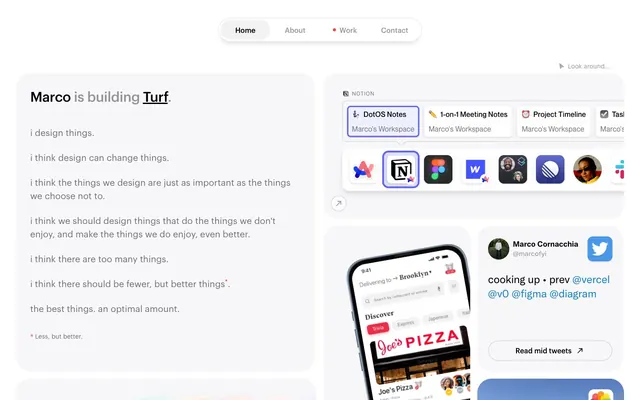
Macro.fyi presents a functional white-canvas aesthetic, emphasizing content organization within distinct, softly shadowed containers. The system balances readability with a dense information display, utilizing a largely achromatic palette punctuated by a sole vivid violet for actionable elements and subtle gradient accents for dynamic cards.
The page uses a maximum width of 1400px but primarily feels constrained and organized, reminiscent of a desktop application. The hero section often features a centered headline over a subtle background. Content is arranged within distinct rectangular cards, leading to a grid-like or stacked flow with consistent vertical `24px` section gaps. Many sections feature side-by-side card arrangements, creating visual pairs. The overall density is compact but not crowded, with content clearly delineated by card boundaries and subtle shadows. Navigation is a simple top bar with pill-shaped ghost buttons.
This site predominantly uses clean, contained product screenshots and carefully cropped UI examples, often within cards with rounded corners. Photography is minimal, focusing on atmospheric shots when present. Icons are primarily outlined or filled charcoal gray, with a consistent stroke weight, serving functional rather than decorative roles. The visual focus is on clarity and the presentation of work and tools, making the imagery explanatory and showcasing rather than atmospheric.
Reminiscent of Notion, Linear, Superhuman, Read.cv.
# Marco — Style Reference
> organized content on frosted glass

**Theme:** light

**Site:** https://www.marco.fyi

Macro.fyi presents a functional white-canvas aesthetic, emphasizing content organization within distinct, softly shadowed containers. The system balances readability with a dense information display, utilizing a largely achromatic palette punctuated by a sole vivid violet for actionable elements and subtle gradient accents for dynamic cards.

## Tokens — Colors

| Name | Value | Token | Role |
|------|------|------|------|
| Gradient Sunset | `#ff4d79` | `--color-gradient-sunset` | Supporting palette color for small decorative accents when the core palette needs contrast. Do not promote it to the primary CTA color |
| Outline Blue | `#1685c7` | `--color-outline-blue` | Blue accent for outlined action borders, linked labels, and lightweight interactive emphasis. Do not promote it to the primary CTA color |
| Interactive Violet | `#6366f1` | `--color-interactive-violet` | Outline for active/focused elements, interactive links, and highlights — signals engagement dynamically |
| Alarm Red | `#e92f48` | `--color-alarm-red` | Red wash for highlight backgrounds, decorative bands, and soft emphasis behind content. Use as a supporting accent, not as a status color |
| Blush Shadow | `#f8c1c8` | `--color-blush-shadow` | Red supporting accent for decorative details and low-frequency emphasis. Use as a supporting accent, not as a status color |
| Canvas White | `#ffffff` | `--color-canvas-white` | Page backgrounds, card base layer, foundational surface |
| Card Frost | `#f7f7f9` | `--color-card-frost` | Default card backgrounds, subtle surface distinction from the main canvas |
| Whisper Gray | `#f2f2f2` | `--color-whisper-gray` | Subtle background for UI elements, light active states |
| Cloud Tint | `#eff0ff` | `--color-cloud-tint` | Light background for specific interactive cards or linked elements, a slight cool tint |
| Warm Paper | `#fff9ed` | `--color-warm-paper` | Background for information cards, providing a soft, accessible contrast to the standard frost |
| Text Primary | `#333333` | `--color-text-primary` | Primary text, headings, and crucial interface elements for high readability |
| Text Secondary | `#707070` | `--color-text-secondary` | Secondary text, muted headlines, subtle labels |
| Text Dim | `#949494` | `--color-text-dim` | Tertiary text, helper text, and subtle interface labels, receding slightly from text secondary |
| Divider Gray | `#cccccf` | `--color-divider-gray` | Muted UI surface for disabled controls, low-emphasis panels, and placeholder blocks. Do not promote it to the primary CTA color |

## Tokens — Typography

### Maison Neue
- **Substitute:** Inter
- **Weights:** 400, 600
- **Sizes:** 12px, 14px, 40px
- **Line height:** 1, 1.43, 1.67
- **Letter spacing:** 0.0070em
- **Role:** Body text, card labels, and some section information. Its precise tracking supports dense information display without sacrificing clarity.

### Graphik
- **Substitute:** Figtree
- **Weights:** 400, 500, 600
- **Sizes:** 14px, 16px, 20px, 31px
- **Line height:** 1, 1.25, 1.38, 1.43, 1.5
- **Letter spacing:** -0.0130em, 0.0050em, 0.0070em, 0.0140em
- **Role:** Headings and prominent links, its varied weights and tight letter spacing create a modern, impactful presence for key statements.

### Neue Montreal
- **Substitute:** Montserrat
- **Weights:** 400, 500
- **Sizes:** 8px, 10px, 12px, 14px, 16px, 18px, 20px, 22px, 24px, 26px
- **Line height:** 1, 1.11, 1.13, 1.2, 1.25, 1.45, 1.67
- **Letter spacing:** 0.0090em, 0.0130em, 0.0200em, 0.0220em, 0.0250em, 0.0440em, 0.0500em, 0.0750em, 0.1000em, 0.2000em
- **Role:** Detailed labels, metadata, and small print, its generous letter-spacing at smaller sizes ensures legibility of ancillary information.

### Chirp
- **Substitute:** Roboto
- **Weights:** 400, 700
- **Sizes:** 16px, 17px, 24px
- **Line height:** 1.2, 1.35, 1.4
- **Letter spacing:** normal
- **Role:** Used for specific social media embeds and some stylized links, maintaining its distinct character.

### SF Pro Display
- **Weights:** 400, 600
- **Sizes:** 8px, 11px, 16px
- **Line height:** 0.75, 1.4, 1.63, 1.82
- **Letter spacing:** -0.004, 0.013, 0.018
- **Role:** SF Pro Display — detected in extracted data but not described by AI

### Bluu suuperstar
- **Weights:** 700
- **Sizes:** 15px, 16px, 38px
- **Line height:** 1, 1.33
- **Role:** Bluu suuperstar — detected in extracted data but not described by AI

## Tokens — Type Scale

Perfect Fourth (1.333) from 14px base.

| Role | Size | Line height | Letter spacing |
|------|------|------|------|
| body | 14px | 1.43 | — |
| body-lg | 16px | 1.25 | — |
| subheading | 20px | 1.2 | 0.009em |
| heading | 31px | 1.25 | -0.403px |
| display | 40px | 1.67 | — |

## Tokens — Spacing

- **Max width:** 1400px
- **Section gap:** 24px
- **Card padding:** 32px
- **Element gap:** 8px

## Tokens — Radius

- **Default:** 12px
- **Buttons:** 230px
- **Inputs:** 8px
- **Cards:** 32px
- **badges:** 100px
- **thumbnails:** 18px

## Tokens — Elevation

- **Layered Detail Card:** `rgba(0, 0, 0, 0.06) 0px 1px 2px 0px, rgba(0, 0, 0, 0.1) 0px 1px 3px 0px`
- **Thumbnail Image:** `rgba(0, 0, 0, 0.25) 0px 1px 2px 0px`
- **Interactive Link with Shadow:** `rgba(0, 0, 0, 0.25) 0px 1px 3px 0px`

## Layout

The page uses a maximum width of 1400px but primarily feels constrained and organized, reminiscent of a desktop application. The hero section often features a centered headline over a subtle background. Content is arranged within distinct rectangular cards, leading to a grid-like or stacked flow with consistent vertical `24px` section gaps. Many sections feature side-by-side card arrangements, creating visual pairs. The overall density is compact but not crowded, with content clearly delineated by card boundaries and subtle shadows. Navigation is a simple top bar with pill-shaped ghost buttons.

## Imagery

This site predominantly uses clean, contained product screenshots and carefully cropped UI examples, often within cards with rounded corners. Photography is minimal, focusing on atmospheric shots when present. Icons are primarily outlined or filled charcoal gray, with a consistent stroke weight, serving functional rather than decorative roles. The visual focus is on clarity and the presentation of work and tools, making the imagery explanatory and showcasing rather than atmospheric.

## Components

### Pill Navigation Button
*Top-level navigation and filter controls.*

Ghost button with `Card Frost` background, `Text Primary` color, `230px` radius for a pill shape, and `12px` vertical, `24px` horizontal padding. No border unless active.

### Outline Action Button
*Secondary calls-to-action or subtle interactive elements.*

Ghost button with `Outline Blue` border, `Text Primary` color, `56px` radius, and `10px` vertical, `16px` horizontal padding.

### Default Content Card
*Container for primary content blocks.*

Background `Card Frost`, `32px` border-radius, no box shadow, `32px` padding on all sides. Houses main text content and sub-components.

### Layered Detail Card
*Elevated information or interactive listings within larger content areas.*

Background can be `Cloud Tint` or `Warm Paper`. `8px` border-radius, subtle shadow `rgba(0, 0, 0, 0.06) 0px 1px 2px 0px, rgba(0, 0, 0, 0.1) 0px 1px 3px 0px`, and `8px` vertical padding with no horizontal padding.

### Ghost Card
*Purely structural grouping without visual adornment.*

Transparent background, no border-radius, no shadow, no padding. Used for simple content wrapping.

### Gradient Action Card
*Prominent interactive elements or special offers.*

Background `Gradient Sunset`, `32px` border-radius, `32px` padding. Contains inverted text for contrast.

### Input Field
*User input for forms.*

White background, `Divider Gray` 1px border. Focus state border turns into `Interactive Violet`.

### Selected Link Badge
*Indicates active or selected items in a list.*

Background `Cloud Tint`, border `Interactive Violet`, `100px` radius for a pill shape, `6px` vertical, `10px` horizontal padding.

## Guidelines

### Do

- Use `Text Primary` (#333333) for all main content and headings.
- Apply `Card Frost` (#f7f7f9) as the default background for content cards, reserving `Canvas White` (#ffffff) for the page background.
- Utilize `32px` border-radius for main content cards and larger organizational blocks.
- Employ `Outline Blue` (#1685c7) for borders of interactive elements when a filled background is not desired.
- Ensure generous `32px` padding within all `Default Content Card` elements.
- Differentiate interactive elements using `Interactive Violet` (#6366f1) for borders on focus or active states.
- Maintain a clear visual hierarchy by limiting prominent box shadows to `Layered Detail Card` elements, and keep them subtle.

### Don't

- Do not use highly saturated colors for large background areas; maintain the overall achromatic canvas.
- Avoid using multiple distinct colors for primary call-to-action buttons; the system emphasizes outlined chromatic actions.
- Do not use generic border-radii; adhere to the specified `32px` for cards, `230px` for pill buttons, and `8px` for inputs.
- Avoid deep, dark shadows; elevation is achieved through subtle, light box-shadows or subtle colored tints.
- Do not use large, decorative imagery; product screenshots and UI examples should be contained within cards.
- Refrain from drastically altering default typography letter-spacing for body text; rely on the defined values for each font family.
- Do not introduce new border styles; primarily use 1-4px solid borders with neutral or accent colors.

## Agent Prompt Guide

### Quick Color Reference
- text: #333333
- background: #ffffff
- border: #cccccf
- accent: #6366f1
- primary action: #1685c7 (outlined action border)

### 3-5 Example Component Prompts
- Create a section divider: `1px solid #cccccf` border, `8px` vertical margin.
- Create an Outlined Primary Action: Transparent background, #1685c7 border and text, 9999px radius, compact pill padding. Use it for the main CTA instead of a filled button.
- Design a gradient action button: `Gradient Sunset` background `linear-gradient(16deg, rgb(255, 77, 121), rgb(255, 128, 64) 85%)`, `32px` border-radius, `Canvas White` (#ffffff) text color (Graphik weight 500, 16px), with `16px` vertical and `32px` horizontal padding.
More like this









Keep what you find
A free account saves references to boards and can send you a weekly email of picks based on what you save.
To see every result, go Pro.