Preview image. Unlock full-res
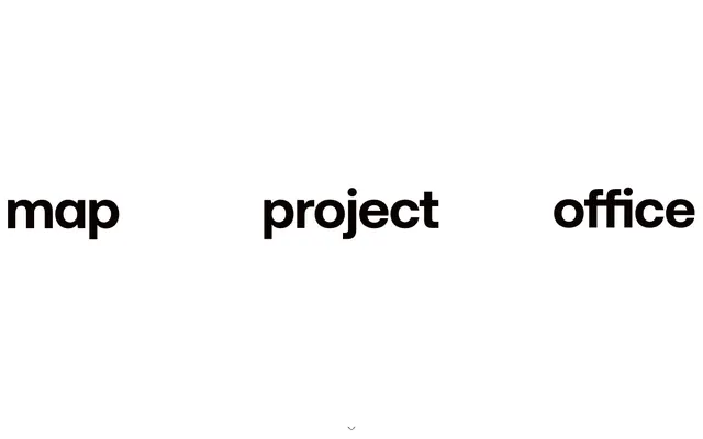
Type-driven monochrome canvas. A high-contrast display of minimal elements on a vast, unadorned surface, where typography commands attention.
Color palette
Page backgrounds, primary surface, and negative space – the dominant visual field that allows typography to stand out
Primary text, element borders, outlines for interactive elements, and areas that provide strong contrast for inverse typography
Secondary text for headings, providing a slightly softer contrast than Ink Black while maintaining strong legibility
Medium-contrast borders, control outlines, and structural separators. Do not promote it to the primary CTA color
Typography
- Weights
- 400
- Sizes
- 16px, 20px
- Line height
- 1, 1.2, 1.5, 1.63
- Letter spacing
- normal
- Fallback
- Montserrat Bold, Lato Bold
Primary headings and interactive link text, conveying authority and directness through its bold, expansive form. The `ss01` feature suggests a custom, brand-specific character set.
- Weights
- 400
- Sizes
- 14px
- Line height
- 1.43
- Letter spacing
- normal
- Fallback
- Space Mono Regular, IBM Plex Mono Regular
Used for specific secondary textual elements and body copy, offering a more nuanced textual voice. The `ss01` feature indicates a customized font for brand-specific glyphs.
Spacing & shape
Components
Text link using MapSans-Bold, Ink Black, 16px size. Hover state is implied by underline or background color change, but not explicitly defined as a separate color.
Text in Ink Black (MapSans-Bold or MapFono-Regular depending on context) with an Ink Black border on one side, such as a bottom border for active states or a subtle right border for menu items. No distinct background fill.
Large text using MapSans-Bold, Ink Black, with generous vertical spacing and centered alignment, often appearing alone on a Canvas White background.
Text using Subtle Gray (MapSans-Bold or MapFono-Regular) with no background or border, changing to Ink Black on hover/active.
Guidelines
- Prioritize typography as the primary visual element, using MapSans-Bold for impact and MapFono-Regular for clarity.
- Maintain a stark, high-contrast aesthetic with Canvas White for backgrounds and Ink Black for primary text and outlines.
- Use Muted Ash (#393939) exclusively for secondary heading text to provide a subtle reduction in visual weight.
- Apply Subtle Gray (#767676) sparingly for tertiary UI elements and low-priority text, ensuring it is always legible against Canvas White backgrounds.
- Employ a generous section gap of 160px to create ample visual breathing room between major content blocks.
- Utilize Ink Black as the border for active or interactive ghost elements to subtly define their interactive nature.
- Keep all corners sharp with a 0px radius, reinforcing a precise and unadorned aesthetic.
- Avoid introducing any saturated colors for branding or interface elements; color is reserved for content, not UI.
- Do not use box shadows or other elevation cues; the design relies on flat planes and stark contrast for visual hierarchy.
- Refrain from using gradients anywhere in the interface; the system is built on solid, uniform color fields.
- Do not use generic system fonts; always implement MapSans-Bold and MapFono-Regular for consistent brand identity.
- Avoid dense information layouts; prioritize white space and minimalist compositions.
- Do not use rounded corners on any UI elements; maintain sharp, defined edges.
- Do not use filled buttons; interactive elements should be text-only or ghosted with subtle borders.
About this system
ShowHide
Map Project Office conveys a minimalist, stark presence through its high-contrast monochrome design. The visual system emphasizes large, bold typography as the dominant design element, often serving as primary navigation or key content. Surfaces are uniformly white or near-black, with subtle gray cues indicating interactive elements or secondary information. The overall aesthetic is one of restrained impact, prioritizing legibility and functional clarity within a sculptural, type-focused environment.
The page primarily uses a full-bleed layout, where content stretches the full width of the viewport, particularly for large textual elements. There is no explicit max-width containment at a page level. The hero pattern features large, centered headlines, often a single word or short phrase, dominating the initial view. Section rhythm is driven by generous vertical spacing (160px section gap) and the alternating starkness of large text blocks and embedded content like video. Content arrangement tends to be centered stacks for headings and navigation, with visual elements like videos centrally placed. There is no apparent grid usage for multi-column layouts given the current data, emphasizing a linear, single-column content flow. Navigation consists of a minimal top-right text menu, with primary navigation often integrated into the main page content as large, interactive text links.
The visual language focuses on product screenshots and occasional abstract graphics, treated with a minimalist, often isolated approach. Photography appears to be tight crops of products on solid backgrounds, devoid of lifestyle context. Illustrations are simple and functional, serving explanatory rather than decorative roles. Icons are minimalist and outlined. Imagery primarily serves to showcase products directly or to support technical explanations, rather than creating an atmosphere. The overall density of imagery is low, with text and typography dominating the visual space.
Reminiscent of A/B Testing agency, Art gallery website, High-end fashion brand, Independent film studio.
# map project office — Style Reference
> Type-driven monochrome canvas. A high-contrast display of minimal elements on a vast, unadorned surface, where typography commands attention.

**Theme:** light

**Site:** https://mapprojectoffice.com

Map Project Office conveys a minimalist, stark presence through its high-contrast monochrome design. The visual system emphasizes large, bold typography as the dominant design element, often serving as primary navigation or key content. Surfaces are uniformly white or near-black, with subtle gray cues indicating interactive elements or secondary information. The overall aesthetic is one of restrained impact, prioritizing legibility and functional clarity within a sculptural, type-focused environment.

## Tokens — Colors

| Name | Value | Token | Role |
|------|------|------|------|
| Canvas White | `#ffffff` | `--color-canvas-white` | Page backgrounds, primary surface, and negative space – the dominant visual field that allows typography to stand out |
| Ink Black | `#0a0101` | `--color-ink-black` | Primary text, element borders, outlines for interactive elements, and areas that provide strong contrast for inverse typography |
| Muted Ash | `#393939` | `--color-muted-ash` | Secondary text for headings, providing a slightly softer contrast than Ink Black while maintaining strong legibility |
| Subtle Gray | `#767676` | `--color-subtle-gray` | Medium-contrast borders, control outlines, and structural separators. Do not promote it to the primary CTA color |

## Tokens — Typography

### MapSans-Bold
- **Substitute:** Montserrat Bold, Lato Bold
- **Weights:** 400
- **Sizes:** 16px, 20px
- **Line height:** 1, 1.2, 1.5, 1.63
- **Letter spacing:** normal
- **Role:** Primary headings and interactive link text, conveying authority and directness through its bold, expansive form. The `ss01` feature suggests a custom, brand-specific character set.

### MapFono-Regular
- **Substitute:** Space Mono Regular, IBM Plex Mono Regular
- **Weights:** 400
- **Sizes:** 14px
- **Line height:** 1.43
- **Letter spacing:** normal
- **Role:** Used for specific secondary textual elements and body copy, offering a more nuanced textual voice. The `ss01` feature indicates a customized font for brand-specific glyphs.

## Tokens — Spacing

- **Section gap:** 160px
- **Card padding:** 16px
- **Element gap:** 16px

## Tokens — Radius

- **Default:** 0px

## Layout

The page primarily uses a full-bleed layout, where content stretches the full width of the viewport, particularly for large textual elements. There is no explicit max-width containment at a page level. The hero pattern features large, centered headlines, often a single word or short phrase, dominating the initial view. Section rhythm is driven by generous vertical spacing (160px section gap) and the alternating starkness of large text blocks and embedded content like video. Content arrangement tends to be centered stacks for headings and navigation, with visual elements like videos centrally placed. There is no apparent grid usage for multi-column layouts given the current data, emphasizing a linear, single-column content flow. Navigation consists of a minimal top-right text menu, with primary navigation often integrated into the main page content as large, interactive text links.

## Imagery

The visual language focuses on product screenshots and occasional abstract graphics, treated with a minimalist, often isolated approach. Photography appears to be tight crops of products on solid backgrounds, devoid of lifestyle context. Illustrations are simple and functional, serving explanatory rather than decorative roles. Icons are minimalist and outlined. Imagery primarily serves to showcase products directly or to support technical explanations, rather than creating an atmosphere. The overall density of imagery is low, with text and typography dominating the visual space.

## Components

### Primary Navigation Link
*Top-level navigation items*

Text link using MapSans-Bold, Ink Black, 16px size. Hover state is implied by underline or background color change, but not explicitly defined as a separate color.

### Ghost Bordered Link
*Secondary interactive elements, often found in footers or supplemental navigation.*

Text in Ink Black (MapSans-Bold or MapFono-Regular depending on context) with an Ink Black border on one side, such as a bottom border for active states or a subtle right border for menu items. No distinct background fill.

### Hero Headline
*Dominant textual element on the home page or major sections.*

Large text using MapSans-Bold, Ink Black, with generous vertical spacing and centered alignment, often appearing alone on a Canvas White background.

### Muted Text Button
*Interactive controls with lower prominence, like 'pause'/'unmute'.*

Text using Subtle Gray (MapSans-Bold or MapFono-Regular) with no background or border, changing to Ink Black on hover/active.

## Guidelines

### Do

- Prioritize typography as the primary visual element, using MapSans-Bold for impact and MapFono-Regular for clarity.
- Maintain a stark, high-contrast aesthetic with Canvas White for backgrounds and Ink Black for primary text and outlines.
- Use Muted Ash (#393939) exclusively for secondary heading text to provide a subtle reduction in visual weight.
- Apply Subtle Gray (#767676) sparingly for tertiary UI elements and low-priority text, ensuring it is always legible against Canvas White backgrounds.
- Employ a generous section gap of 160px to create ample visual breathing room between major content blocks.
- Utilize Ink Black as the border for active or interactive ghost elements to subtly define their interactive nature.
- Keep all corners sharp with a 0px radius, reinforcing a precise and unadorned aesthetic.

### Don't

- Avoid introducing any saturated colors for branding or interface elements; color is reserved for content, not UI.
- Do not use box shadows or other elevation cues; the design relies on flat planes and stark contrast for visual hierarchy.
- Refrain from using gradients anywhere in the interface; the system is built on solid, uniform color fields.
- Do not use generic system fonts; always implement MapSans-Bold and MapFono-Regular for consistent brand identity.
- Avoid dense information layouts; prioritize white space and minimalist compositions.
- Do not use rounded corners on any UI elements; maintain sharp, defined edges.
- Do not use filled buttons; interactive elements should be text-only or ghosted with subtle borders.

## Agent Prompt Guide

Quick Color Reference:
text: #0a0101
background: #ffffff
border: #0a0101
accent: no distinct accent color
primary action: no distinct CTA color

Example Component Prompts:
1. Create a top-level navigation bar: background Canvas White. On the right, display three text links: 'Index', 'Studio', 'Contact'. Each link uses MapSans-Bold, 16px, Ink Black text, with 16px of padding around it. Space links with 16px elementGap.
2. Design a hero section for the homepage: background Canvas White. Center a headline 'map project office' in MapSans-Bold, 64px (estimated, size >20px), Ink Black. Below it, center smaller text 'london-based industrial design studio' in MapFono-Regular, 14px, Muted Ash.
3. Build a ghost interactive control: on a Canvas White background, display the text 'unmute' using MapFono-Regular, 14px, Subtle Gray. No background or border. On hover, the text color changes to Ink Black (#0a0101).
More like this









Keep what you find
A free account saves references to boards and can send you a weekly email of picks based on what you save.
To see every result, go Pro.