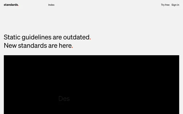
Preview image. Unlock full-res
High-contrast precision blueprint.
Color palette
Primary call-to-action buttons and subtle accent details. Its vividness is designed to draw immediate attention against the neutral palette
Page background; light surface for contained sections
Primary text, core UI elements, button backgrounds for secondary actions, and dominant strokes for dividers and borders. Establishes strong contrast
Muted text, subtle borders, and placeholder content. Provides secondary visual information without competing with primary content
Hairline borders for cards and subtle dividers, creating a soft separation on lighter backgrounds
Typography
- Weights
- 400, 600
- Sizes
- 10px, 14px, 20px, 31px, 52px
- Line height
- 1, 1.15, 1.27, 1.45, 1.55
- Letter spacing
- -0.0100em
- Fallback
- system-ui, sans-serif
The sole typeface for the entire system, its slight negative letter-spacing for all sizes creates a refined, compact feel. Weight 400 is for body text and descriptive elements, while 600 is reserved for impactful headings and navigational elements, maintaining a consistent, precise tone throughout the interface.
Spacing & shape
Components
Filled with Action Orange (#ff2e00), white text, and a 4px border radius. Padding: 13.3px vertical, 13.3px horizontal. Uses Soehne font, weight 400, -0.0100em letter spacing.
Filled with Midnight Ink (#000000), white text, and a 4px border radius. Padding: 13.3px vertical, 13.3px horizontal. Uses Soehne font, weight 400, -0.0100em letter spacing.
Transparent background, no box shadow, 0px border radius. Border top and left are Whisper Gray (#d7d7d7). No explicit padding, content within defines its own spacing. Used for content grouping like company logos.
Text color is Midnight Ink (#000000) or Steel Gray (#a1a1a1). Uses Soehne font, weight 400, small sizes like 14px, with -0.0100em letter spacing. No underlines, relying on color for distinction.
Guidelines
- Prioritize Midnight Ink (#000000) for all primary text and critical UI elements to ensure high contrast.
- Use Element Gap (10px) consistently for horizontal and vertical spacing between small interactive elements.
- Apply Action Orange (#ff2e00) exclusively for primary calls-to-action and minimal, impactful accents.
- Ensure all buttons have a 4px border radius for a subtle, consistent corner treatment.
- Maintain the -0.0100em letter-spacing for all text elements to preserve the distinct typographical feel.
- Utilize Canvas Ice (#eaeaea) as the dominant background color for most page sections.
- Structure all headings with Soehne font, weight 600, paired with section gaps of 46px to define clear content blocks.
- Avoid using multiple chromatic colors; limit accents strictly to Action Orange (#ff2e00).
- Do not introduce additional font families or weights beyond Soehne 400 and 600.
- Refrain from applying shadows to elements; maintain a flat design aesthetic.
- Do not vary letter-spacing from -0.0100em across any text element.
- Avoid decorative gradients or complex backgrounds; stick to solid colors.
- Do not use border radii different from 4px on interactive elements or 0px on cards.
- Do not deviate from the established spacing tokens; maintain the spacious rhythm.
About this system
ShowHide
Standards adopts a stark, high-contrast visual language; an almost monochrome canvas of near-white and black is punctuated sparingly by a vivid, energetic orange. Typography is central, using a bespoke sans-serif with subtle letter-spacing for a precise, authoritative voice. Components are minimal and sharp, focusing on functionality over adornment, with clean borders and tight spacing that reinforce a sense of clarity and efficiency. The overall effect is direct and impactful, designed to convey competence and modern exactitude.
The page maintains a full-bleed visual model, without a fixed max-width container. The hero section establishes a stark contrast with a large, centered, high-impact headline directly on the Canvas Ice background, immediately followed by a full-width black block potentially for video or product showcase. Sections alternate between light Canvas Ice backgrounds and full-width content blocks. Content is arranged in flexible, often multi-column grids or centered stacks. Vertical rhythm is defined by consistent section gaps (around 46px), and card grids often feature six-column layouts where elements have 0px radius and no box shadows, appearing as pure contained blocks hinting at content. The navigation is minimal, featuring a sticky top bar with logo, index, and simple text links.
This system features a highly minimal approach to imagery. Product screenshots show cropped application windows on pure white backgrounds, emphasizing software UI without lifestyle context. Illustrations are entirely absent. Icons, when present, are simple, monochromatic, and outlined, reinforcing the clean, functional aesthetic with a subtle stroke weight. The overall density is text-dominant, with imagery serving as direct functional examples or placeholder content in ghost card backgrounds, never vying for attention with complex visual narratives.
Reminiscent of Figma, Linear, Stripe, Supabase.
# Standards — Style Reference
> High-contrast precision blueprint.

**Theme:** light

**Site:** https://standards.site

Standards adopts a stark, high-contrast visual language; an almost monochrome canvas of near-white and black is punctuated sparingly by a vivid, energetic orange. Typography is central, using a bespoke sans-serif with subtle letter-spacing for a precise, authoritative voice. Components are minimal and sharp, focusing on functionality over adornment, with clean borders and tight spacing that reinforce a sense of clarity and efficiency. The overall effect is direct and impactful, designed to convey competence and modern exactitude.

## Tokens — Colors

| Name | Value | Token | Role |
|------|------|------|------|
| Action Orange | `#ff2e00` | `--color-action-orange` | Primary call-to-action buttons and subtle accent details. Its vividness is designed to draw immediate attention against the neutral palette |
| Canvas Ice | `#eaeaea` | `--color-canvas-ice` | Page background; light surface for contained sections |
| Midnight Ink | `#000000` | `--color-midnight-ink` | Primary text, core UI elements, button backgrounds for secondary actions, and dominant strokes for dividers and borders. Establishes strong contrast |
| Steel Gray | `#a1a1a1` | `--color-steel-gray` | Muted text, subtle borders, and placeholder content. Provides secondary visual information without competing with primary content |
| Whisper Gray | `#d7d7d7` | `--color-whisper-gray` | Hairline borders for cards and subtle dividers, creating a soft separation on lighter backgrounds |

## Tokens — Typography

### Soehne
- **Substitute:** system-ui, sans-serif
- **Weights:** 400, 600
- **Sizes:** 10px, 14px, 20px, 31px, 52px
- **Line height:** 1, 1.15, 1.27, 1.45, 1.55
- **Letter spacing:** -0.0100em
- **Role:** The sole typeface for the entire system, its slight negative letter-spacing for all sizes creates a refined, compact feel. Weight 400 is for body text and descriptive elements, while 600 is reserved for impactful headings and navigational elements, maintaining a consistent, precise tone throughout the interface.

## Tokens — Type Scale

Perfect Fifth (1.5) from 20px base.

| Role | Size | Line height | Letter spacing |
|------|------|------|------|
| caption | 10px | 1.55 | -0.1px |
| body-sm | 14px | 1.45 | -0.14px |
| body | 20px | 1.27 | -0.2px |
| heading-sm | 31px | 1.15 | -0.31px |
| display | 52px | 1 | -0.52px |

## Tokens — Spacing

- **Section gap:** 46px
- **Card padding:** 13px
- **Element gap:** 10px

## Tokens — Radius

- **Buttons:** 4px

## Layout

The page maintains a full-bleed visual model, without a fixed max-width container. The hero section establishes a stark contrast with a large, centered, high-impact headline directly on the Canvas Ice background, immediately followed by a full-width black block potentially for video or product showcase. Sections alternate between light Canvas Ice backgrounds and full-width content blocks. Content is arranged in flexible, often multi-column grids or centered stacks. Vertical rhythm is defined by consistent section gaps (around 46px), and card grids often feature six-column layouts where elements have 0px radius and no box shadows, appearing as pure contained blocks hinting at content. The navigation is minimal, featuring a sticky top bar with logo, index, and simple text links.

## Imagery

This system features a highly minimal approach to imagery. Product screenshots show cropped application windows on pure white backgrounds, emphasizing software UI without lifestyle context. Illustrations are entirely absent. Icons, when present, are simple, monochromatic, and outlined, reinforcing the clean, functional aesthetic with a subtle stroke weight. The overall density is text-dominant, with imagery serving as direct functional examples or placeholder content in ghost card backgrounds, never vying for attention with complex visual narratives.

## Components

### Primary Action Button
*Key interactive element.*

Filled with Action Orange (#ff2e00), white text, and a 4px border radius. Padding: 13.3px vertical, 13.3px horizontal. Uses Soehne font, weight 400, -0.0100em letter spacing.

### Secondary Action Button
*Alternative interactive element, less emphasis.*

Filled with Midnight Ink (#000000), white text, and a 4px border radius. Padding: 13.3px vertical, 13.3px horizontal. Uses Soehne font, weight 400, -0.0100em letter spacing.

### Ghost Card
*Container for content, appearing as an empty visual block.*

Transparent background, no box shadow, 0px border radius. Border top and left are Whisper Gray (#d7d7d7). No explicit padding, content within defines its own spacing. Used for content grouping like company logos.

### Navigation Link
*Primary navigation item in headers and footers.*

Text color is Midnight Ink (#000000) or Steel Gray (#a1a1a1). Uses Soehne font, weight 400, small sizes like 14px, with -0.0100em letter spacing. No underlines, relying on color for distinction.

## Guidelines

### Do

- Prioritize Midnight Ink (#000000) for all primary text and critical UI elements to ensure high contrast.
- Use Element Gap (10px) consistently for horizontal and vertical spacing between small interactive elements.
- Apply Action Orange (#ff2e00) exclusively for primary calls-to-action and minimal, impactful accents.
- Ensure all buttons have a 4px border radius for a subtle, consistent corner treatment.
- Maintain the -0.0100em letter-spacing for all text elements to preserve the distinct typographical feel.
- Utilize Canvas Ice (#eaeaea) as the dominant background color for most page sections.
- Structure all headings with Soehne font, weight 600, paired with section gaps of 46px to define clear content blocks.

### Don't

- Avoid using multiple chromatic colors; limit accents strictly to Action Orange (#ff2e00).
- Do not introduce additional font families or weights beyond Soehne 400 and 600.
- Refrain from applying shadows to elements; maintain a flat design aesthetic.
- Do not vary letter-spacing from -0.0100em across any text element.
- Avoid decorative gradients or complex backgrounds; stick to solid colors.
- Do not use border radii different from 4px on interactive elements or 0px on cards.
- Do not deviate from the established spacing tokens; maintain the spacious rhythm.

## Agent Prompt Guide

Quick Color Reference:
text: #000000
background: #eaeaea
border: #d7d7d7
accent: #ff2e00
primary action: #ff2e00 (filled action)

Example Component Prompts:
Create a hero section: Canvas Ice (#eaeaea) background. Headline at 52px Soehne weight 600, Midnight Ink (#000000), letter-spacing -0.52px. Subtext at 20px Soehne weight 400, Midnight Ink (#000000), letter-spacing -0.2px.
Create a Primary Action Button: #ff2e00 background, #a1a1a1 text, 9999px radius, compact pill padding. Use this filled treatment for the main CTA.
Create a ghost card with content: Transparent background, 0px border radius, top/left border Whisper Gray (#d7d7d7) 0.5px solid. Content inside includes a 14px Soehne weight 400, Steel Gray (#a1a1a1) text caption, letter-spacing -0.14px, with 10px element gap from other elements.
More like this









Keep what you find
A free account saves references to boards and can send you a weekly email of picks based on what you save.
To see every result, go Pro.