Preview image. Unlock full-res
Architectural blueprint on white marble
Color palette
Decorative highlights, background for distinct informational blocks or showcase elements
Page backgrounds, card surfaces, and primary text for dark backgrounds
Primary body text, headings, borders, and UI accents on a light background. Defines content and structure
Secondary text, subtle dividers, or background elements where a softer contrast than black is desired
Typography
- Weights
- 400
- Sizes
- 12px
- Line height
- 1.63
- Fallback
- Helvetica Neue, sans-serif
Primary font for all text elements. Its system-default nature reinforces a focus on clarity and content over stylistic typography. Used for headings, body text, and links.
Spacing & shape
Components
Text rendered in Midnight Ink (#000000) on Canvas White (#ffffff) background, 12px Arial, weight 400. No borders or padding, relying on generous letter-spacing and surrounding whitespace for distinction.
A hairline border of Midnight Ink (#000000) used to segment content horizontally, breaking the layout into distinct functional areas. Height of 1px.
A rectangular block with a solid Amber Red (#ff4600) background, containing a centered headline in Canvas White (#ffffff). Occupies significant horizontal space to draw attention. No border radius.
Text uses Muted Ash (#4d4d4d) for a softer presence than primary text, typically at 12px Arial. Used for descriptions or contextual details, providing readability without competing with main content.
Small 12px Arial text in Midnight Ink (#000000) for copyright notices, positioned at the bottom of the page, acting as a subtle anchor for the page content.
Guidelines
- Use Canvas White (#ffffff) as the default background for all page sections and content blocks.
- Apply Midnight Ink (#000000) for all primary text, headings, and outlines of interactive elements.
- Maintain a consistent type style of Arial, weight 400 for all text, varying only in size (e.g., 12px) and line-height (1.63).
- Utilize 287px for vertical section spacing to create significant visual breathing room between major content blocks.
- Employ a 1px border of Midnight Ink (#000000) as the primary visual divider to establish clear content segmentation.
- Use Amber Red (#ff4600) strictly for accent backgrounds or highlight blocks, never for text or borders.
- Ensure generous padding around text and elements, using 16px as a base for internal component spacing.
- Avoid using any border-radius; all corners should be sharp and angular, maintaining a strict, architectural aesthetic.
- Do not introduce additional font families or weights beyond Arial 400; maintain typographic minimalism.
- Refrain from using shadows or any form of elevation; surfaces should remain flat against the canvas.
- Do not deviate from the monochrome palette of black and white, except for the explicit use of Amber Red (#ff4600) as an accent.
- Avoid decorative imagery; the design should prioritize UI elements and content over illustrative graphics.
- Do not use gradients; all color applications should be solid and flat.
- Avoid overlapping elements; maintain clear separation and distinct boundaries between all components.
About this system
ShowHide
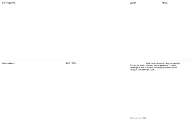
Gio Pandone's visual system evokes the precision of an architectural blueprint: a monochrome canvas defined by stark black and white contrasts. Typography is restrained and functional, serving to organize content with clear hierarchy rather than decorative flourishes. The design relies on generous white space and a strict grid to convey order and professionalism, with color introduced sparingly for active states or specific brand elements rather than broad application. Components are minimal, focusing on content delivery without heavy ornamentation.
The page maintains a full-bleed layout horizontally, but content is subtly contained within an implied maximum width. The hero section is sparse and text-dominant. The overall section rhythm is defined by a central horizontal dividend line and very large vertical section gaps (287px) between content blocks. Content is primarily arranged in large, isolated logical blocks, often with a clear left-aligned or centered stack, and occasionally a two-column structure (e.g., text beside a solid color block). There are no grid systems for features or cards, prioritizing individual content blocks. Navigation is a minimal, top-right header with text links. The dominant layout pattern is extreme white space and stark divisions.
The site's visual language is characterized by an absence of photography or complex illustrations. Instead, it relies on minimalist, geometric blocks of solid color (Amber Red) to highlight project examples. Iconography uses simple, single-stroke outlines if present. The focus is entirely on typography and structured layout, treating content presentation as a purely functional UI exercise rather than relying on rich visuals for atmosphere or explanation. Density is image-scant, heavily skewed towards text and negative space.
Reminiscent of Contra, Read.cv, Basic Sans, Manual of Style.
# Gio Pandone — Style Reference
> Architectural blueprint on white marble

**Theme:** light

**Site:** https://www.giopandone.com

Gio Pandone's visual system evokes the precision of an architectural blueprint: a monochrome canvas defined by stark black and white contrasts. Typography is restrained and functional, serving to organize content with clear hierarchy rather than decorative flourishes. The design relies on generous white space and a strict grid to convey order and professionalism, with color introduced sparingly for active states or specific brand elements rather than broad application. Components are minimal, focusing on content delivery without heavy ornamentation.

## Tokens — Colors

| Name | Value | Token | Role |
|------|------|------|------|
| Amber Red | `#ff4600` | `--color-amber-red` | Decorative highlights, background for distinct informational blocks or showcase elements |
| Canvas White | `#ffffff` | `--color-canvas-white` | Page backgrounds, card surfaces, and primary text for dark backgrounds |
| Midnight Ink | `#000000` | `--color-midnight-ink` | Primary body text, headings, borders, and UI accents on a light background. Defines content and structure |
| Muted Ash | `#4d4d4d` | `--color-muted-ash` | Secondary text, subtle dividers, or background elements where a softer contrast than black is desired |

## Tokens — Typography

### Arial
- **Substitute:** Helvetica Neue, sans-serif
- **Weights:** 400
- **Sizes:** 12px
- **Line height:** 1.63
- **Role:** Primary font for all text elements. Its system-default nature reinforces a focus on clarity and content over stylistic typography. Used for headings, body text, and links.

## Tokens — Spacing

- **Card padding:** 16px
- **Element gap:** 16px

## Tokens — Radius

- **none:** 0px

## Layout

The page maintains a full-bleed layout horizontally, but content is subtly contained within an implied maximum width. The hero section is sparse and text-dominant. The overall section rhythm is defined by a central horizontal dividend line and very large vertical section gaps (287px) between content blocks. Content is primarily arranged in large, isolated logical blocks, often with a clear left-aligned or centered stack, and occasionally a two-column structure (e.g., text beside a solid color block). There are no grid systems for features or cards, prioritizing individual content blocks. Navigation is a minimal, top-right header with text links. The dominant layout pattern is extreme white space and stark divisions.

## Imagery

The site's visual language is characterized by an absence of photography or complex illustrations. Instead, it relies on minimalist, geometric blocks of solid color (Amber Red) to highlight project examples. Iconography uses simple, single-stroke outlines if present. The focus is entirely on typography and structured layout, treating content presentation as a purely functional UI exercise rather than relying on rich visuals for atmosphere or explanation. Density is image-scant, heavily skewed towards text and negative space.

## Components

### Ghost Header Link
*Navigation links*

Text rendered in Midnight Ink (#000000) on Canvas White (#ffffff) background, 12px Arial, weight 400. No borders or padding, relying on generous letter-spacing and surrounding whitespace for distinction.

### Horizontal Divider
*Visual separation*

A hairline border of Midnight Ink (#000000) used to segment content horizontally, breaking the layout into distinct functional areas. Height of 1px.

### Work Showcase Block
*Highlighting portfolio items*

A rectangular block with a solid Amber Red (#ff4600) background, containing a centered headline in Canvas White (#ffffff). Occupies significant horizontal space to draw attention. No border radius.

### Info / Meta Text
*Descriptive and secondary information*

Text uses Muted Ash (#4d4d4d) for a softer presence than primary text, typically at 12px Arial. Used for descriptions or contextual details, providing readability without competing with main content.

### Copyright Footer Text
*Legal and copyright information*

Small 12px Arial text in Midnight Ink (#000000) for copyright notices, positioned at the bottom of the page, acting as a subtle anchor for the page content.

## Guidelines

### Do

- Use Canvas White (#ffffff) as the default background for all page sections and content blocks.
- Apply Midnight Ink (#000000) for all primary text, headings, and outlines of interactive elements.
- Maintain a consistent type style of Arial, weight 400 for all text, varying only in size (e.g., 12px) and line-height (1.63).
- Utilize 287px for vertical section spacing to create significant visual breathing room between major content blocks.
- Employ a 1px border of Midnight Ink (#000000) as the primary visual divider to establish clear content segmentation.
- Use Amber Red (#ff4600) strictly for accent backgrounds or highlight blocks, never for text or borders.
- Ensure generous padding around text and elements, using 16px as a base for internal component spacing.

### Don't

- Avoid using any border-radius; all corners should be sharp and angular, maintaining a strict, architectural aesthetic.
- Do not introduce additional font families or weights beyond Arial 400; maintain typographic minimalism.
- Refrain from using shadows or any form of elevation; surfaces should remain flat against the canvas.
- Do not deviate from the monochrome palette of black and white, except for the explicit use of Amber Red (#ff4600) as an accent.
- Avoid decorative imagery; the design should prioritize UI elements and content over illustrative graphics.
- Do not use gradients; all color applications should be solid and flat.
- Avoid overlapping elements; maintain clear separation and distinct boundaries between all components.

## Agent Prompt Guide

Quick Color Reference: text: #000000, background: #ffffff, border: #000000, accent: #ff4600, primary action: no distinct CTA color

Example Component Prompts:
1. Create a primary headline: Arial, 400 weight, 12px, #000000, line-height 1.63.
2. Create a content block background: #ff4600 background, with centered text in #ffffff, Arial, 400 weight, 12px, line-height 1.63.
3. Create a subtle descriptive text: Arial, 400 weight, 12px, #4d4d4d, line-height 1.63.
4. Create a top navigation link: Arial, 400 weight, 12px, #000000, line-height 1.63, no background, no border, no padding.
5. Create a horizontal divider: 1px height, #000000 background, full page width.
More like this









Keep what you find
A free account saves references to boards and can send you a weekly email of picks based on what you save.
To see every result, go Pro.