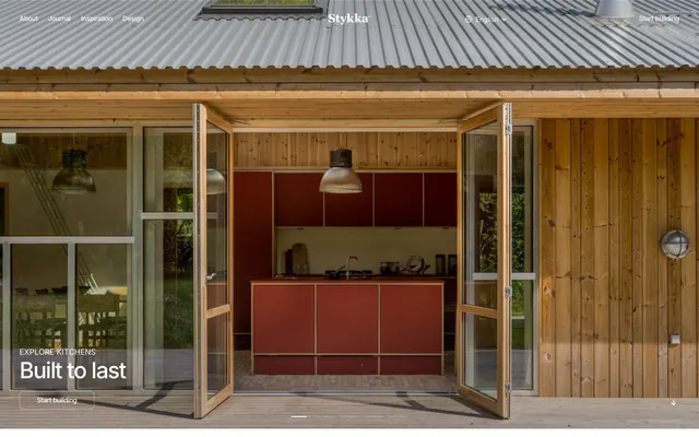
Preview image. Unlock full-res
Architectural blueprint on white marble
Color palette
Primary text, main headings, critical UI strokes, page background overlay in hero sections. Its deep, pure black anchors the otherwise light design
Page backgrounds, card surfaces, secondary text in dark contexts. Provides a clean, expansive base
Subtle background tones, dividers, and ghost buttons for elements that need to recede slightly from Canvas White
Secondary text, muted icons, and subtle borders where Absolute Zero would be too dominant
Hairline borders, subtle separators, and inactive states for minimal visual interruption
Typography
- Weights
- 400, 500
- Sizes
- 11px, 14px, 16px, 22px, 24px, 30px, 46px
- Line height
- 1, 1.05, 1.1, 1.2, 1.25, 1.5
- Letter spacing
- -0.042em at 46px, -0.040em at 30px, -0.037em at 24px, -0.036em at 22px, -0.023em at 16px, 0.021em at 11-14px
- Fallback
- system-ui, sans-serif
Versatile workhorse sans-serif for body text, subheadings, and navigation. Its slightly condensed forms maintain compactness while remaining legible.
- Weights
- 400
- Sizes
- 18px
- Line height
- 1
- Letter spacing
- -0.010em
- Fallback
- monospace
Distinctive monospaced font used for key declarations and hero typography, adding a technical, crafted aesthetic through its wide letter-spacing and uniform width.
- Weights
- 400
- Sizes
- 12px
- Line height
- 1.2
- Letter spacing
- normal
- Fallback
- system-ui, sans-serif
Small functional text for captions, metadata, and fine print. Default system font ensures wide compatibility for less critical content.
Spacing & shape
Components
Text color Absolute Zero (#000000). Transparent background. Border color Absolute Zero (#000000). Border radius 8px. Padding 10px vertical, 36px horizontal. Uses 'Stykka Blue' for link action per original data, but rendered `transparent`/`#000000` from page. Needs explicit definition for functional link-blue to be present on actual usage.
Background color Ash Gray (#f6f6f6). No box shadow. Border radius 16px. Padding 33px vertical, 24px horizontal. These cards have no explicit border, creating a floating appearance.
Text color Absolute Zero (#000000). Interactive border bottom color Absolute Zero (#000000) for hover/active states at 1px thickness. Default line height 1.20.
Guidelines
- Use Canvas White (#ffffff) as the primary background for all page sections unless an image or specific brand block dictates otherwise.
- Apply Absolute Zero (#000000) for all primary text content and main headings to maintain stark contrast and strong legibility.
- Ensure large headlines, particularly in hero sections, use Azeret Mono 400 with a wide letter spacing of -0.010em and a line height of 1.0.
- Group related UI elements with an element gap of 10px to maintain a slightly compact but clear arrangement.
- Implement a border-radius of 16px for all card-like containers, and 8px for buttons and interactive navigation elements.
- Use Ash Gray (#f6f6f6) sparingly for subtle background distinctions or low-prominence UI elements, such as card backgrounds that are not meant to pop.
- For ghost buttons, define text and border in Absolute Zero (#000000) with a transparent background, ensuring a subtle call to action.
- Avoid using highly saturated colors for backgrounds or large UI areas; maintain a largely monochromatic base palette.
- Do not introduce strong box shadows or heavy elevation effects; the design relies on subtle background shifts and natural light.
- Do not deviate from the specified negative letter spacing for large type; it is a signature element of the typographic style.
- Do not use generic, unstyled links. All links should explicitly reference Absolute Zero for text, with optional border-bottom interaction states.
- Avoid arbitrary custom padding values for cards and buttons; stick to the defined 33px vertical / 24px horizontal for cards and 10px vertical / 36px horizontal for buttons.
- Do not introduce decorative gradients or complex overlays; keep surfaces and backgrounds clean and simple.
- Do not use system sans-serif for headlines or main body text; it is reserved for captions and minor functional text.
About this system
ShowHide
Stykka's visual system evokes a sense of understated craftsmanship and natural permanence. It combines a restrained, almost monochromatic palette with a strong typographic presence and material-focused imagery. The design is airy and structured, using subtle layering and natural light to highlight content rather than bold colors or heavy UI elements. Typography varies between a clean sans-serif for main content and a distinctive monospaced font for key statements, creating an intentional rhythm.
The page uses a maximum content width, centered horizontally, alternating with full-bleed hero sections. The initial hero features a full-width background image with strong visual depth, overlaid with centered, large-scale typography. Subsequent sections follow a consistent vertical rhythm with clear spacing between content blocks. Content is primarily arranged in multi-column grids or alternating text-and-image layouts, often with text on the left and visuals on the right, or a 4-column card grid. The navigation is a sticky top bar with minimal links on the far left and right. Density is balanced, with generous white space around elements and sections.
The visual language is dominated by high-quality photography of wooden architectural spaces and kitchen interiors. Images are typically full-bleed or large blocks, featuring natural light and honest materiality. Product photography uses tight crops focusing on the crafted details of the kitchen elements. There's an absence of abstract graphics or illustrations, emphasizing real-world context and tangible quality. Icons are minimal, subtle, and monochromatic, primarily used for navigation or small functional elements. The density is image-heavy, serving as primary content rather than mere decoration.
Reminiscent of Frama, B&B Italia, Muuto.
# Stykka — Style Reference
> Architectural blueprint on white marble

**Theme:** light

**Site:** https://stykka.com

Stykka's visual system evokes a sense of understated craftsmanship and natural permanence. It combines a restrained, almost monochromatic palette with a strong typographic presence and material-focused imagery. The design is airy and structured, using subtle layering and natural light to highlight content rather than bold colors or heavy UI elements. Typography varies between a clean sans-serif for main content and a distinctive monospaced font for key statements, creating an intentional rhythm.

## Tokens — Colors

| Name | Value | Token | Role |
|------|------|------|------|
| Absolute Zero | `#000000` | `--color-absolute-zero` | Primary text, main headings, critical UI strokes, page background overlay in hero sections. Its deep, pure black anchors the otherwise light design |
| Canvas White | `#ffffff` | `--color-canvas-white` | Page backgrounds, card surfaces, secondary text in dark contexts. Provides a clean, expansive base |
| Ash Gray | `#f6f6f6` | `--color-ash-gray` | Subtle background tones, dividers, and ghost buttons for elements that need to recede slightly from Canvas White |
| Medium Gray | `#2e2e20` | `--color-medium-gray` | Secondary text, muted icons, and subtle borders where Absolute Zero would be too dominant |
| Light Gray | `#c9c9c9` | `--color-light-gray` | Hairline borders, subtle separators, and inactive states for minimal visual interruption |

## Tokens — Typography

### Inter
- **Substitute:** system-ui, sans-serif
- **Weights:** 400, 500
- **Sizes:** 11px, 14px, 16px, 22px, 24px, 30px, 46px
- **Line height:** 1, 1.05, 1.1, 1.2, 1.25, 1.5
- **Letter spacing:** -0.042em at 46px, -0.040em at 30px, -0.037em at 24px, -0.036em at 22px, -0.023em at 16px, 0.021em at 11-14px
- **Role:** Versatile workhorse sans-serif for body text, subheadings, and navigation. Its slightly condensed forms maintain compactness while remaining legible.

### Azeret Mono
- **Substitute:** monospace
- **Weights:** 400
- **Sizes:** 18px
- **Line height:** 1
- **Letter spacing:** -0.010em
- **Role:** Distinctive monospaced font used for key declarations and hero typography, adding a technical, crafted aesthetic through its wide letter-spacing and uniform width.

### sans-serif
- **Substitute:** system-ui, sans-serif
- **Weights:** 400
- **Sizes:** 12px
- **Line height:** 1.2
- **Letter spacing:** normal
- **Role:** Small functional text for captions, metadata, and fine print. Default system font ensures wide compatibility for less critical content.

## Tokens — Type Scale

Major Third (1.25) from 14px base.

| Role | Size | Line height | Letter spacing |
|------|------|------|------|
| caption | 11px | 1.5 | 0.23px |
| body | 14px | 1.5 | 0.294px |
| heading-sm | 18px | 1 | -0.18px |
| heading | 22px | 1.25 | -0.803px |
| heading-lg | 24px | 1.25 | -0.888px |
| display | 30px | 1.05 | -1.2px |
| display-lg | 46px | 1 | -1.932px |

## Tokens — Spacing

- **Section gap:** 30px
- **Card padding:** 24px
- **Element gap:** 10px

## Tokens — Radius

- **Buttons:** 8px
- **Cards:** 16px
- **navigation:** 8px

## Layout

The page uses a maximum content width, centered horizontally, alternating with full-bleed hero sections. The initial hero features a full-width background image with strong visual depth, overlaid with centered, large-scale typography. Subsequent sections follow a consistent vertical rhythm with clear spacing between content blocks. Content is primarily arranged in multi-column grids or alternating text-and-image layouts, often with text on the left and visuals on the right, or a 4-column card grid. The navigation is a sticky top bar with minimal links on the far left and right. Density is balanced, with generous white space around elements and sections.

## Imagery

The visual language is dominated by high-quality photography of wooden architectural spaces and kitchen interiors. Images are typically full-bleed or large blocks, featuring natural light and honest materiality. Product photography uses tight crops focusing on the crafted details of the kitchen elements. There's an absence of abstract graphics or illustrations, emphasizing real-world context and tangible quality. Icons are minimal, subtle, and monochromatic, primarily used for navigation or small functional elements. The density is image-heavy, serving as primary content rather than mere decoration.

## Components

### Ghost Primary Button
*Call to action button for primary user actions, designed to integrate subtly into the layout.*

Text color Absolute Zero (#000000). Transparent background. Border color Absolute Zero (#000000). Border radius 8px. Padding 10px vertical, 36px horizontal. Uses 'Stykka Blue' for link action per original data, but rendered `transparent`/`#000000` from page. Needs explicit definition for functional link-blue to be present on actual usage.

### Information Card
*Container for showcasing features, testimonials, or short content blocks.*

Background color Ash Gray (#f6f6f6). No box shadow. Border radius 16px. Padding 33px vertical, 24px horizontal. These cards have no explicit border, creating a floating appearance.

### Navigation Link
*Standard navigation item in header and footer.*

Text color Absolute Zero (#000000). Interactive border bottom color Absolute Zero (#000000) for hover/active states at 1px thickness. Default line height 1.20.

## Guidelines

### Do

- Use Canvas White (#ffffff) as the primary background for all page sections unless an image or specific brand block dictates otherwise.
- Apply Absolute Zero (#000000) for all primary text content and main headings to maintain stark contrast and strong legibility.
- Ensure large headlines, particularly in hero sections, use Azeret Mono 400 with a wide letter spacing of -0.010em and a line height of 1.0.
- Group related UI elements with an element gap of 10px to maintain a slightly compact but clear arrangement.
- Implement a border-radius of 16px for all card-like containers, and 8px for buttons and interactive navigation elements.
- Use Ash Gray (#f6f6f6) sparingly for subtle background distinctions or low-prominence UI elements, such as card backgrounds that are not meant to pop.
- For ghost buttons, define text and border in Absolute Zero (#000000) with a transparent background, ensuring a subtle call to action.

### Don't

- Avoid using highly saturated colors for backgrounds or large UI areas; maintain a largely monochromatic base palette.
- Do not introduce strong box shadows or heavy elevation effects; the design relies on subtle background shifts and natural light.
- Do not deviate from the specified negative letter spacing for large type; it is a signature element of the typographic style.
- Do not use generic, unstyled links. All links should explicitly reference Absolute Zero for text, with optional border-bottom interaction states.
- Avoid arbitrary custom padding values for cards and buttons; stick to the defined 33px vertical / 24px horizontal for cards and 10px vertical / 36px horizontal for buttons.
- Do not introduce decorative gradients or complex overlays; keep surfaces and backgrounds clean and simple.
- Do not use system sans-serif for headlines or main body text; it is reserved for captions and minor functional text.

## Agent Prompt Guide

Quick Color Reference:
text: #000000
background: #ffffff
border: #000000 (for ghost buttons/interactive borders), #c9c9c9 (for hairline dividers)
accent: no distinct accent color
primary action: no distinct CTA color

Example Component Prompts:
No distinct primary action color was observed; use the extracted neutral button treatments instead of inventing a filled CTA color.
2. Create an Information Card: Headline 'SUPERIOR BUILD QUALITY' (Inter, 500, 22px, lh 1.25, ls -0.803px). Body text 'Built to last. Real wood...' (Inter, 400, 16px, lh 1.5, ls -0.368px). Background color #f6f6f6, no shadow, 16px border radius, 33px vertical padding, 24px horizontal padding. Include an image above the text.
3. Create a Hero Section Headline: Text 'B u i l t t o l a s t'. Font: Azeret Mono, weight 400, size 46px, line height 1.0, letter spacing -1.932px, color #ffffff. Position this text over a full-bleed dark background image.
More like this









Keep what you find
A free account saves references to boards and can send you a weekly email of picks based on what you save.
To see every result, go Pro.