Preview image. Unlock full-res
etched digital blueprint
Color palette
Primary action button background and border, interactive link hover states — a singular splash of moderate color against the monochrome backdrop, indicating active engagement
Small interactive color swatches, decorative accents. One of several vibrant, utilitarian color choices
Small interactive color swatches, decorative accents
Small interactive color swatches, decorative accents
Small interactive color swatches, decorative accents
Small interactive color swatches, decorative accents
Small interactive color swatches, decorative accents
Small interactive color swatches, decorative accents
Light neutral action fill for buttons on dark surfaces.
Primary text, outlines for UI elements, button backgrounds for filled actions, decorative strokes. This defines the system's dominant line-art style
Subtle text, navigation links, secondary borders, less prominent UI outlines. Provides contrast without fully merging with Programming Black
Typography
- Weights
- 300, 400, 600
- Sizes
- 16px, 18px, 19px, 20px, 32px
- Line height
- 1, 1.08, 1.13, 1.25, 1.36, 1.4, 1.5, 1.6
- Letter spacing
- 0.031em, 0.063em
- Fallback
- Montserrat
The primary typeface for all text. Its slightly extended width and geometric quality reinforce the technical, blueprint-like aesthetic. Weight 300 provides lightness for body text, while 600 delivers impact for headings.
Spacing & shape
Components
Background: transparent (rgba(0,0,0,0)), Text: Programming Black (#000000), Border: 0px. On hover/active, a 4px Programming Black bottom border appears. Padding: 0px top/bottom, 4px right, 0px left.
Background: Programming Black (#000000), Text: Canvas White (#ffffff). Padding: 16px all sides. Radius: 0px.
Background: Canvas White (#ffffff), Text: Design Green (#56b78f), Border: 1px Design Green (#56b78f). Padding: 8.8px top/bottom, 16px left/right. Radius: 0px.
Background: transparent (rgba(0,0,0,0)), Text: Wireframe Gray (#1e1e1e), Border: 1px Wireframe Gray (#1e1e1e). Padding: 8px all sides. Radius: 0px.
Background: varies (e.g., Vivid Yellow #ffe000, Vivid Orange #ee724b, etc.), Text: transparent, Border: 0px. Padding: 0px. Radius: 0px. These are primarily for visual selection or tiny, non-textual interaction areas.
Border: 1px Programming Black (#000000), Background: Canvas White (#ffffff), Text: Programming Black (#000000). Radius: 0px. Padding: Standard, implied by context (e.g., 8px). Focus state will maintain the stark black outline.
Text: Wireframe Gray (#1e1e1e), Font: Lexend, weight 400. Hover state: underline or a subtle change to Programming Black.
Guidelines
- Adhere to a strict 0px border-radius for all elements, maintaining the sharp, angular aesthetic.
- Use Programming Black (#000000) for all primary borders and UI outlines to maintain the 'sketch' aesthetic.
- Introduce color sparingly, using Design Green (#56b78f) for primary actions and other vibrant accents (Vivid Yellow #ffe000, Vivid Orange #ee724b, etc.) as small, functional swatches.
- Utilize Lexend throughout, varying weights (300, 400, 600) to create typographic hierarchy, not different fonts.
- Maintain the wireframe visual language for sections, using a 2px Programming Black (#000000) border on all major content blocks.
- Employ the 8px base unit for all spacing, ensuring consistent rhythm in element gaps and padding.
- Implement motion with `ease` timing functions over short durations (0.15s - 0.3s) for crisp, responsive interactions.
- Avoid decorative shadows or elaborate elevation effects; the design relies on flat, outlined elements.
- Do not introduce rounded corners; all elements must maintain sharp, 0px radii.
- Refrain from using gradients on UI elements; color should be flat and atomic.
- Do not use multiple font families; Lexend is the sole typeface for both headings and body text.
- Avoid large blocks of color; the aesthetic is predominately black and white, with color used as punctuation.
- Do not add any subtle background patterns or textures; surfaces should remain pure white (#ffffff) or solid black (#000000).
- Never embed photography directly; all imagery should be contained within outlined frames, treated as design elements rather than full-bleed content.
About this system
ShowHide
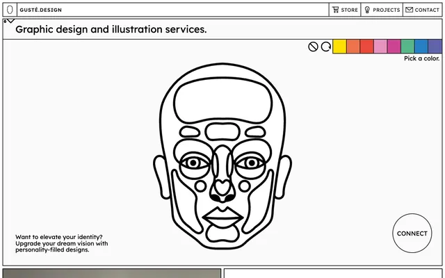
GUSTÉ.DESIGN uses a digital wireframe aesthetic, characterized by stark black and white contrasts, sharp corners, and minimalist typography. The visual language is that of an unfinished program or a blueprint, with every element outlined, creating a sense of precision and intentionality. Color is introduced sparingly, primarily as single-pixel accents or small, vibrant swatches, acting as functional highlights within the otherwise monochrome interface. Components are lightweight and appear as etched lines, reinforcing the technical and structured feel of the design.
The page uses a maximum content width that appears to be centered (implied by the visual framing) but is not strictly fixed (as pageMaxWidth is null) allowing for adaptive boundaries. The hero section often features large, singular graphic elements (like the outlined face) centered or offset, with minimalist text overlays. The section rhythm is primarily defined by distinct, outlined rectangular content blocks that visually separate information, rather than alternating background colors. Content is arranged in alternating image-left, text-right patterns or simple stacked, centered blocks. A simple horizontal navigation bar at the top, bordered by solid lines, reinforces the structured, box-model aesthetic. The density is relatively spacious, with ample white space around content blocks, giving elements room to 'breathe' within their wireframe constraints.
This design system uses a combination of line-art illustrations and contained photography. Line-art, specifically vector-based outlines (like the face graphic), serves as a central atmospheric element, mimicking technical drawings or digital interfaces. Photography is used sparingly and always contained within hard-edged, bordered frames, often cropped to focus on the subject with a clean background. Images are treated as embedded objects within the UI, not full-bleed visuals, maintaining the overall 'blueprint' aesthetic. Iconography is minimalist, outlined, and monochromatic, matching the primary UI styling. Density is low; visuals primarily serve as key focal points or illustrative examples rather than immersive content.
Reminiscent of Figma, Linear, Are.na.
# Home — Style Reference
> etched digital blueprint

**Theme:** light

**Site:** https://guste.design

GUSTÉ.DESIGN uses a digital wireframe aesthetic, characterized by stark black and white contrasts, sharp corners, and minimalist typography. The visual language is that of an unfinished program or a blueprint, with every element outlined, creating a sense of precision and intentionality. Color is introduced sparingly, primarily as single-pixel accents or small, vibrant swatches, acting as functional highlights within the otherwise monochrome interface. Components are lightweight and appear as etched lines, reinforcing the technical and structured feel of the design.

## Tokens — Colors

| Name | Value | Token | Role |
|------|------|------|------|
| Design Green | `#56b78f` | `--color-design-green` | Primary action button background and border, interactive link hover states — a singular splash of moderate color against the monochrome backdrop, indicating active engagement |
| Vivid Yellow | `#ffe000` | `--color-vivid-yellow` | Small interactive color swatches, decorative accents. One of several vibrant, utilitarian color choices |
| Vivid Orange | `#ee724b` | `--color-vivid-orange` | Small interactive color swatches, decorative accents |
| Vivid Red | `#e94a3b` | `--color-vivid-red` | Small interactive color swatches, decorative accents |
| Moderate Pink | `#e694bf` | `--color-moderate-pink` | Small interactive color swatches, decorative accents |
| Vivid Pink | `#cd4592` | `--color-vivid-pink` | Small interactive color swatches, decorative accents |
| Vivid Blue | `#277fc3` | `--color-vivid-blue` | Small interactive color swatches, decorative accents |
| Moderate Violet | `#6164ab` | `--color-moderate-violet` | Small interactive color swatches, decorative accents |
| Canvas White | `#ffffff` | `--color-canvas-white` | Light neutral action fill for buttons on dark surfaces. |
| Programming Black | `#000000` | `--color-programming-black` | Primary text, outlines for UI elements, button backgrounds for filled actions, decorative strokes. This defines the system's dominant line-art style |
| Wireframe Gray | `#1e1e1e` | `--color-wireframe-gray` | Subtle text, navigation links, secondary borders, less prominent UI outlines. Provides contrast without fully merging with Programming Black |

## Tokens — Typography

### Lexend
- **Substitute:** Montserrat
- **Weights:** 300, 400, 600
- **Sizes:** 16px, 18px, 19px, 20px, 32px
- **Line height:** 1, 1.08, 1.13, 1.25, 1.36, 1.4, 1.5, 1.6
- **Letter spacing:** 0.031em, 0.063em
- **Role:** The primary typeface for all text. Its slightly extended width and geometric quality reinforce the technical, blueprint-like aesthetic. Weight 300 provides lightness for body text, while 600 delivers impact for headings.

## Tokens — Type Scale

Augmented Fourth (1.414) from 16px base.

| Role | Size | Line height | Letter spacing |
|------|------|------|------|
| body | 16px | 1.5 | — |
| subheading | 19px | 1.4 | — |
| display | 32px | 1 | — |

## Tokens — Spacing

- **Section gap:** 64px
- **Card padding:** 16px
- **Element gap:** 8px

## Tokens — Radius

- **all:** 0px

## Layout

The page uses a maximum content width that appears to be centered (implied by the visual framing) but is not strictly fixed (as pageMaxWidth is null) allowing for adaptive boundaries. The hero section often features large, singular graphic elements (like the outlined face) centered or offset, with minimalist text overlays. The section rhythm is primarily defined by distinct, outlined rectangular content blocks that visually separate information, rather than alternating background colors. Content is arranged in alternating image-left, text-right patterns or simple stacked, centered blocks. A simple horizontal navigation bar at the top, bordered by solid lines, reinforces the structured, box-model aesthetic. The density is relatively spacious, with ample white space around content blocks, giving elements room to 'breathe' within their wireframe constraints.

## Imagery

This design system uses a combination of line-art illustrations and contained photography. Line-art, specifically vector-based outlines (like the face graphic), serves as a central atmospheric element, mimicking technical drawings or digital interfaces. Photography is used sparingly and always contained within hard-edged, bordered frames, often cropped to focus on the subject with a clean background. Images are treated as embedded objects within the UI, not full-bleed visuals, maintaining the overall 'blueprint' aesthetic. Iconography is minimalist, outlined, and monochromatic, matching the primary UI styling. Density is low; visuals primarily serve as key focal points or illustrative examples rather than immersive content.

## Components

### Ghost Button
*Ghost buttons for navigation, secondary actions, and interactive elements. These are the predominant button style, appearing as simple text with a 4px black bottom border on hover or active states.*

Background: transparent (rgba(0,0,0,0)), Text: Programming Black (#000000), Border: 0px. On hover/active, a 4px Programming Black bottom border appears. Padding: 0px top/bottom, 4px right, 0px left.

### Filled Action Button
*Primary call to action.*

Background: Programming Black (#000000), Text: Canvas White (#ffffff). Padding: 16px all sides. Radius: 0px.

### Outline Action Button (Green)
*Semantic secondary actions, like 'Book a Call'. This is the only instance of a consistently colored, outlined button, making it a clear, yet subtle, call to action.*

Background: Canvas White (#ffffff), Text: Design Green (#56b78f), Border: 1px Design Green (#56b78f). Padding: 8.8px top/bottom, 16px left/right. Radius: 0px.

### Monochrome Outline Button
*Interactive controls with a distinct outline but no background fill.*

Background: transparent (rgba(0,0,0,0)), Text: Wireframe Gray (#1e1e1e), Border: 1px Wireframe Gray (#1e1e1e). Padding: 8px all sides. Radius: 0px.

### Color Swatch Button
*Small, square buttons used to select colors or as decorative interface elements.*

Background: varies (e.g., Vivid Yellow #ffe000, Vivid Orange #ee724b, etc.), Text: transparent, Border: 0px. Padding: 0px. Radius: 0px. These are primarily for visual selection or tiny, non-textual interaction areas.

### Text Input / Form Field
*Standard text entry fields.*

Border: 1px Programming Black (#000000), Background: Canvas White (#ffffff), Text: Programming Black (#000000). Radius: 0px. Padding: Standard, implied by context (e.g., 8px). Focus state will maintain the stark black outline.

### Navigation Link
*Top-level navigation items.*

Text: Wireframe Gray (#1e1e1e), Font: Lexend, weight 400. Hover state: underline or a subtle change to Programming Black.

## Guidelines

### Do

- Adhere to a strict 0px border-radius for all elements, maintaining the sharp, angular aesthetic.
- Use Programming Black (#000000) for all primary borders and UI outlines to maintain the 'sketch' aesthetic.
- Introduce color sparingly, using Design Green (#56b78f) for primary actions and other vibrant accents (Vivid Yellow #ffe000, Vivid Orange #ee724b, etc.) as small, functional swatches.
- Utilize Lexend throughout, varying weights (300, 400, 600) to create typographic hierarchy, not different fonts.
- Maintain the wireframe visual language for sections, using a 2px Programming Black (#000000) border on all major content blocks.
- Employ the 8px base unit for all spacing, ensuring consistent rhythm in element gaps and padding.
- Implement motion with `ease` timing functions over short durations (0.15s - 0.3s) for crisp, responsive interactions.

### Don't

- Avoid decorative shadows or elaborate elevation effects; the design relies on flat, outlined elements.
- Do not introduce rounded corners; all elements must maintain sharp, 0px radii.
- Refrain from using gradients on UI elements; color should be flat and atomic.
- Do not use multiple font families; Lexend is the sole typeface for both headings and body text.
- Avoid large blocks of color; the aesthetic is predominately black and white, with color used as punctuation.
- Do not add any subtle background patterns or textures; surfaces should remain pure white (#ffffff) or solid black (#000000).
- Never embed photography directly; all imagery should be contained within outlined frames, treated as design elements rather than full-bleed content.

## Agent Prompt Guide

Quick Color Reference:
text: #000000
background: #ffffff
border: #000000
accent: #56b78f
primary action: #000000 (filled action)

Example Component Prompts:
1. Create a primary navigation item: Text 'PROJECTS' in Wireframe Gray (#1e1e1e), Lexend weight 400. On hover, apply a 4px bottom border in Programming Black (#000000).
2. Generate a 'Book a Call' button: Outline Action Button (Green), Text 'BOOK A CALL' in Design Green (#56b78f), Lexend weight 600, with a 1px Design Green (#56b78f) border, 0px radius, and 8.8px vertical padding, 16px horizontal padding.
3. Design a hero section headline: 'Graphic design and illustration services.' in Programming Black (#000000), Lexend weight 600, size 32px, line-height 1.0, with a 2px Programming Black (#000000) border around the entire content block.
More like this









Keep what you find
A free account saves references to boards and can send you a weekly email of picks based on what you save.
To see every result, go Pro.