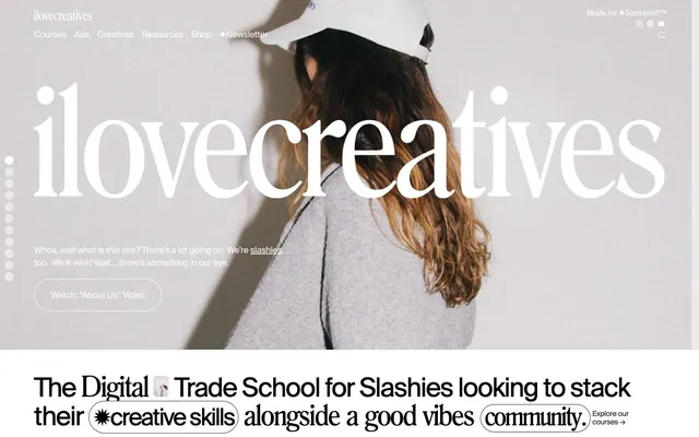
Preview image. Unlock full-res
Black & White Zine
Color palette
Page backgrounds, card surfaces, ghost button backgrounds, default icon color
Dark borders and separators for elevated surfaces and inverted UI. Do not promote it to the primary CTA color
Secondary text, subtle borders, outlines for ghost buttons, decorative elements
Typography
- Weights
- 100, 400, 500
- Sizes
- 13px, 14px, 15px, 16px, 18px, 20px, 22px, 32px, 49px, 54px
- Line height
- 0.83, 1, 1.05, 1.1, 1.17, 1.2, 1.4, 1.43, 1.8
- Letter spacing
- -0.06em at 54px, -0.04em at 49px, -0.028em at 32px, -0.026em at 22px, -0.024em at 20px, -0.022em at 18px, -0.02em at 16px, -0.018em at 15px, -0.017em at 14px, -0.017em at 13px
- Fallback
- Inter
Dominant UI text for body, links, buttons, and most headings. Its wide range of weights and tight letter-spacing create a concise, authoritative yet approachable feel.
- Weights
- 100
- Sizes
- 20px, 35px, 53px, 59px
- Line height
- 0.95, 1, 1.06, 1.27
- Letter spacing
- -0.06em at 59px, -0.04em at 53px and 35px, -0.04em at 20px
- Fallback
- Playfair Display
Display headings and decorative button text. Its delicate, distinctive serifs provide a contrasting artistic touch against the utilitarian SuisseRegular, especially at larger sizes and with negative tracking. Intentionally used at a thin weight.
- Weights
- 100
- Sizes
- 10px, 18px, 32px
- Line height
- 1, 1.1, 1.4, 2.52
- Letter spacing
- -0.02em at 32px, 18px and 10px
Rarely used, potentially system fallback or specific utility text. Its presence suggests a pragmatic approach for very small or highly functional labels.
Spacing & shape
Components
White background, Code Black text, Text Gray 1px border, 450px border-radius, 1.5px vertical padding, 6px horizontal padding. The extreme radius creates a distinct pill shape.
Transparent background, Text Gray text and 1px border. 0px border-radius, 0px padding. This functions as a text link with a subtle outline.
White background, Code Black text, Text Gray 1px border, 1458px (effectively fully rounded) border-radius, 1px vertical padding, 8px horizontal padding. A slightly tighter, fully rounded variant of the Pill Button.
Transparent background, Code Black text and 1px border, 300px border-radius, 5px vertical padding, 20px horizontal padding. Larger and more rounded than the standard Ghost Button.
Canvas White background, 20px border-radius, with interior padding likely around 20px. Often contains imagery and stacked text.
Transparent background, Canvas White text (when against dark primary text), 0px border-radius, 2px padding. Used with custom fonts like 'romana' and often features emoji-like icons.
Features a contained image with 20px border-radius, often in black and white, presented on a Canvas White background.
Guidelines
- Prioritize SuisseRegular at various weights for most text elements, ensuring -0.017em to -0.06em letter-spacing for tight, impactful typography.
- Use Code Black (#000000) for primary text and Canvas White (#ffffff) for backgrounds to maintain a high-contrast, monochromatic base.
- Apply 450px or 1458px border-radius to buttons for distinct pill or fully rounded shapes respectively, using 1.5px vertical padding and 6-8px horizontal padding.
- Implement 20px border-radius for all content cards and image containers, creating soft, consistent visual modules.
- Emphasize headings using the 'romana' font at a thin weight (100) and large sizes (35-59px) with negative tracking (-0.04em or -0.06em) for an artistic, delicate yet bold statement.
- Utilize 2px padding for inline badges and decorative text elements, allowing them to subtly break text flow without heavy visual weight.
- Maintain a compact element spacing with a default of 4px between adjacent elements, supporting the information-dense aesthetic.
- Avoid introducing saturated colors outside of specific image content or emoji, as the system thrives on a high-contrast achromatic palette with subtle playful accents.
- Do not use default rectangular buttons; all buttons should have a very high border-radius.
- Refrain from heavy drop shadows or complex elevation; the design relies on flat planes and subtle typographic texture.
- Do not use SuisseRegular for primary display headings, reserve 'romana' for that purpose to differentiate visual hierarchy and brand voice.
- Avoid broad, generous padding within components that would break the compact density; stick to minimal vertical padding for interactive elements.
- Do not use generic system fonts for prominent UI elements; SuisseRegular and romana define the brand's distinctiveness.
- Avoid large gaps between sections, instead maintaining a consistent compact rhythm with vertical spacing like 64px section gaps.
About this system
ShowHide
ilovecreatives presents a 'digital trade school' aesthetic where crisp, high-contrast typography dominates a near-monochromatic canvas. The density serves to pack information, while playful inline elements and irregularly shaped buttons hint at creativity. The overall impression is business-like but with moments of subversive charm, avoiding overt corporate polish through its unique typographic voice and informal component radii.
The page structure favors a max-width contained layout, likely around 1200px, which centers content while allowing full-bleed background experiences in hero sections. The hero showcases a large, impactful visual with centered, overlaid display text. Vertical rhythm is characterized by consistent section gaps, creating distinct, readable blocks. Content sections often present information in a two-column layout combining text and visuals, or a grid of cards for courses and profiles. Navigation is typically a sticky top bar with minimal links and a 'Made for ✹Slashies©™' badge, maintaining an accessible, unfussy presence.
Imagery on ilovecreatives alternates between desaturated or grayscale product photography/portraits and stylized, sometimes abstract 3D renders with vibrant but contained palettes. Photography is often presented in rounded rectangular or pill shapes, sometimes overlapping for an informal collage effect. Icons are minimalist, using outlines or solid fills in Code Black, often with quirky, emoji-like designs. Graphics prioritize illustration and stylized text, creating decorative breaks and adding personality to the otherwise monochromatic UI. The density of imagery is balanced, supporting explanatory content without overwhelming the primary textual focus.
Reminiscent of Are.na, The Brand Identity, Stripe, Italic.com.
# ilovecreatives — Style Reference
> Black & White Zine

**Theme:** light

**Site:** https://ilovecreatives.com

ilovecreatives presents a 'digital trade school' aesthetic where crisp, high-contrast typography dominates a near-monochromatic canvas. The density serves to pack information, while playful inline elements and irregularly shaped buttons hint at creativity. The overall impression is business-like but with moments of subversive charm, avoiding overt corporate polish through its unique typographic voice and informal component radii.

## Tokens — Colors

| Name | Value | Token | Role |
|------|------|------|------|
| Canvas White | `#ffffff` | `--color-canvas-white` | Page backgrounds, card surfaces, ghost button backgrounds, default icon color |
| Code Black | `#000000` | `--color-code-black` | Dark borders and separators for elevated surfaces and inverted UI. Do not promote it to the primary CTA color |
| Text Gray | `#222222` | `--color-text-gray` | Secondary text, subtle borders, outlines for ghost buttons, decorative elements |

## Tokens — Typography

### SuisseRegular
- **Substitute:** Inter
- **Weights:** 100, 400, 500
- **Sizes:** 13px, 14px, 15px, 16px, 18px, 20px, 22px, 32px, 49px, 54px
- **Line height:** 0.83, 1, 1.05, 1.1, 1.17, 1.2, 1.4, 1.43, 1.8
- **Letter spacing:** -0.06em at 54px, -0.04em at 49px, -0.028em at 32px, -0.026em at 22px, -0.024em at 20px, -0.022em at 18px, -0.02em at 16px, -0.018em at 15px, -0.017em at 14px, -0.017em at 13px
- **Role:** Dominant UI text for body, links, buttons, and most headings. Its wide range of weights and tight letter-spacing create a concise, authoritative yet approachable feel.

### romana
- **Substitute:** Playfair Display
- **Weights:** 100
- **Sizes:** 20px, 35px, 53px, 59px
- **Line height:** 0.95, 1, 1.06, 1.27
- **Letter spacing:** -0.06em at 59px, -0.04em at 53px and 35px, -0.04em at 20px
- **Role:** Display headings and decorative button text. Its delicate, distinctive serifs provide a contrasting artistic touch against the utilitarian SuisseRegular, especially at larger sizes and with negative tracking. Intentionally used at a thin weight.

### Arial
- **Weights:** 100
- **Sizes:** 10px, 18px, 32px
- **Line height:** 1, 1.1, 1.4, 2.52
- **Letter spacing:** -0.02em at 32px, 18px and 10px
- **Role:** Rarely used, potentially system fallback or specific utility text. Its presence suggests a pragmatic approach for very small or highly functional labels.

## Tokens — Type Scale

| Role | Size | Line height | Letter spacing |
|------|------|------|------|
| caption | 13px | 1.4 | -0.017em |
| heading-sm | 20px | 1.2 | -0.024em |
| heading | 32px | 1.05 | -0.028em |
| heading-lg | 49px | 1 | -0.04em |
| display | 59px | 0.95 | -0.06em |

## Tokens — Spacing

- **Section gap:** 64px
- **Card padding:** 20px
- **Element gap:** 4px

## Tokens — Radius

- **Buttons:** 450px
- **Cards:** 20px
- **circularElements:** 300px
- **icons:** 8px

## Layout

The page structure favors a max-width contained layout, likely around 1200px, which centers content while allowing full-bleed background experiences in hero sections. The hero showcases a large, impactful visual with centered, overlaid display text. Vertical rhythm is characterized by consistent section gaps, creating distinct, readable blocks. Content sections often present information in a two-column layout combining text and visuals, or a grid of cards for courses and profiles. Navigation is typically a sticky top bar with minimal links and a 'Made for ✹Slashies©™' badge, maintaining an accessible, unfussy presence.

## Imagery

Imagery on ilovecreatives alternates between desaturated or grayscale product photography/portraits and stylized, sometimes abstract 3D renders with vibrant but contained palettes. Photography is often presented in rounded rectangular or pill shapes, sometimes overlapping for an informal collage effect. Icons are minimalist, using outlines or solid fills in Code Black, often with quirky, emoji-like designs. Graphics prioritize illustration and stylized text, creating decorative breaks and adding personality to the otherwise monochromatic UI. The density of imagery is balanced, supporting explanatory content without overwhelming the primary textual focus.

## Components

### Pill Button
*Primary Call to Action, interactive elements.*

White background, Code Black text, Text Gray 1px border, 450px border-radius, 1.5px vertical padding, 6px horizontal padding. The extreme radius creates a distinct pill shape.

### Ghost Button
*Secondary actions, inline links disguised as buttons.*

Transparent background, Text Gray text and 1px border. 0px border-radius, 0px padding. This functions as a text link with a subtle outline.

### Rounded Corner Button
*Small, contained interactive elements.*

White background, Code Black text, Text Gray 1px border, 1458px (effectively fully rounded) border-radius, 1px vertical padding, 8px horizontal padding. A slightly tighter, fully rounded variant of the Pill Button.

### Large Ghost Button
*Prominent ghost links or buttons.*

Transparent background, Code Black text and 1px border, 300px border-radius, 5px vertical padding, 20px horizontal padding. Larger and more rounded than the standard Ghost Button.

### Feature Card
*Content containers for courses, profiles, or features.*

Canvas White background, 20px border-radius, with interior padding likely around 20px. Often contains imagery and stacked text.

### Inline Text Badge
*Decorative or contextual text highlights within larger bodies of text.*

Transparent background, Canvas White text (when against dark primary text), 0px border-radius, 2px padding. Used with custom fonts like 'romana' and often features emoji-like icons.

### Profile Image Card
*Display individual profiles with imagery.*

Features a contained image with 20px border-radius, often in black and white, presented on a Canvas White background.

## Guidelines

### Do

- Prioritize SuisseRegular at various weights for most text elements, ensuring -0.017em to -0.06em letter-spacing for tight, impactful typography.
- Use Code Black (#000000) for primary text and Canvas White (#ffffff) for backgrounds to maintain a high-contrast, monochromatic base.
- Apply 450px or 1458px border-radius to buttons for distinct pill or fully rounded shapes respectively, using 1.5px vertical padding and 6-8px horizontal padding.
- Implement 20px border-radius for all content cards and image containers, creating soft, consistent visual modules.
- Emphasize headings using the 'romana' font at a thin weight (100) and large sizes (35-59px) with negative tracking (-0.04em or -0.06em) for an artistic, delicate yet bold statement.
- Utilize 2px padding for inline badges and decorative text elements, allowing them to subtly break text flow without heavy visual weight.
- Maintain a compact element spacing with a default of 4px between adjacent elements, supporting the information-dense aesthetic.

### Don't

- Avoid introducing saturated colors outside of specific image content or emoji, as the system thrives on a high-contrast achromatic palette with subtle playful accents.
- Do not use default rectangular buttons; all buttons should have a very high border-radius.
- Refrain from heavy drop shadows or complex elevation; the design relies on flat planes and subtle typographic texture.
- Do not use SuisseRegular for primary display headings, reserve 'romana' for that purpose to differentiate visual hierarchy and brand voice.
- Avoid broad, generous padding within components that would break the compact density; stick to minimal vertical padding for interactive elements.
- Do not use generic system fonts for prominent UI elements; SuisseRegular and romana define the brand's distinctiveness.
- Avoid large gaps between sections, instead maintaining a consistent compact rhythm with vertical spacing like 64px section gaps.

## Agent Prompt Guide

Quick Color Reference: text: #000000, background: #ffffff, border: #222222, accent: no distinct accent color, primary action: no distinct CTA color

Example Component Prompts:
Create a hero section with 'romana' font display text: Full-bleed background with a desaturated hero image. Centered headline 'ilovecreatives' in romana weight 100, size 59, lineHeight 0.95, letterSpacing -0.06em, #000000. Subtext in SuisseRegular weight 400, size 18, lineHeight 1.4, letterSpacing -0.022em, #222222.
Create a Course Card: Canvas White background, 20px border-radius, 20px padding. Image at top with 20px border-radius. Headline in SuisseRegular weight 500, size 22, lineHeight 1.2, letterSpacing -0.026em, #000000. Subtext in SuisseRegular weight 400, size 15, lineHeight 1.4, letterSpacing -0.018em, #222222. At the bottom, add a Pill Button: White background, Code Black text, Text Gray 1px border, 450px border-radius, 1.5px vertical padding, 6px horizontal padding.
Create a Nav Link: SuisseRegular weight 400, size 16, lineHeight 1.4, letterSpacing -0.02em, #222222, hover state changes color to #000000.
More like this









Keep what you find
A free account saves references to boards and can send you a weekly email of picks based on what you save.
To see every result, go Pro.