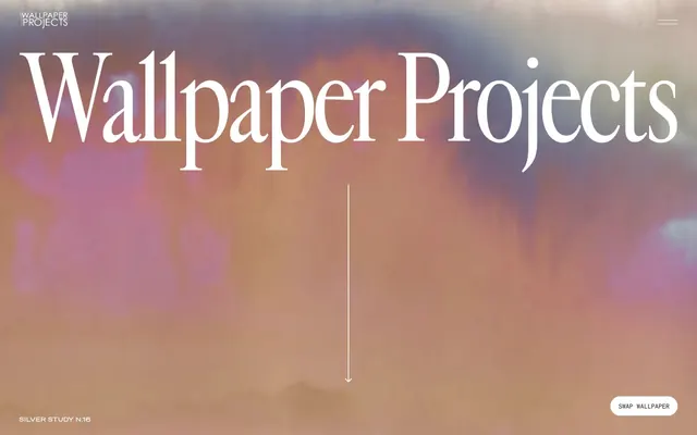
Preview image. Unlock full-res
Textured architectural canvas on fine paper.
Color palette
Primary text, headers, button backgrounds, outline borders for ghost buttons, navigational elements
Page backgrounds, button text, ghost button backgrounds, inverted interface elements, primary canvas color
Secondary surface background, subtle visual separation for sections or cards
Decorative strokes for icons and occasional text emphasis, used sparingly for outlines
Typography
- Weights
- 400, 500
- Sizes
- 36px, 48px, 132px, 180px
- Line height
- 1, 1.2, 1.24
- Letter spacing
- -0.0500em at 180px, -0.0250em at 132px, -0.0200em at 48px
- Fallback
- Playfair Display
Displays and prominent headings — characterized by its classic serif forms and generous sizing, it provides a sense of grandiosity and heritage. Its tight tracking at larger sizes maintains its stately presence without feeling cumbersome.
- Weights
- 400, 600
- Sizes
- 10px, 12px, 14px, 72px, 80px
- Line height
- 1, 1.5
- Letter spacing
- 0.1000em
- Fallback
- Inter
Body copy, navigation, buttons, and decorative large numbers — provides a crisp, modern contrast to the serif headings. The consistent positive letter-spacing across all sizes gives it an open, airy feel.
- Weights
- 400
- Sizes
- 12px, 14px
- Line height
- 1, 1.24, 1.3, 1.5, 1.6
- Letter spacing
- -0.0250em, -0.0200em, 0.0250em, 0.0500em
- Fallback
- Space Mono
Small text, labels, input fields, and occasional list items — its monospace nature lends a technical, precise undertone, often used for meta-information or functional elements. Letter-spacing varies to ensure legibility despite its fixed-width nature.
Spacing & shape
Components
Background: Deep Charcoal (#1e1e1e). Text: Alabaster White (#ffffff). Border radius: 20px. Padding: 12px vertical, 24px horizontal. Uses Soehne Breit Buch, weight 400.
Background: transparent. Text: Alabaster White (#ffffff). Border: 1px Alabaster White (#ffffff). Border radius: 0px. Minimal padding on text, indicating a link-like button. Uses Soehne Breit Buch, weight 400.
Background: Alabaster White (#ffffff). Text: Deep Charcoal (#1e1e1e). Border radius: 20px. Padding: 8px vertical, 16px horizontal. Uses Soehne Breit Buch, weight 400.
Background: transparent. Text: Alabaster White (#ffffff). Border: 1px Alabaster White (#ffffff) on focus. Placeholder color: Alabaster White. Uses Soehne Mono Buch.
Guidelines
- Use Cardinal Fruit for display and primary headings at 132px or 180px with corresponding negative letter-spacing for a grand, elegant appearance.
- Employ Deep Charcoal (#1e1e1e) as the dominant text color throughout the interface, ensuring high contrast on Alabaster White (#ffffff) or Cloud Cream (#fbf9f3) backgrounds.
- Apply a 20px border-radius consistently to all interactive buttons for a soft, approachable pill-shaped aesthetic.
- Maintain generous vertical spacing between sections, adhering to the 100px section gap to provide ample breathing room and a spacious feel.
- Utilize Soehne Breit Buch with 0.1000em letter-spacing for all navigation items and standard body text to promote an open, readable layout.
- Prioritize Cloud Cream (#fbf9f3) for secondary background surfaces, providing subtle depth and differentiation from pure white while maintaining warmth.
- Ensure all buttons follow the 12px vertical, 24px horizontal padding for dark filled buttons, and 8px vertical, 16px horizontal for light filled buttons, with rounded corners of 20px radius.
- Avoid using bright or vivid colors; restrict the palette to the established neutrals for all interface elements.
- Do not introduce sharp corners or square buttons; maintain the consistent 20px border radius for interactive components.
- Do not deviate from the specified typefaces; mixing in other fonts will disrupt the established aesthetic tension between classic and modern.
- Avoid dense, information-heavy blocks; prioritize generous white space and vertical rhythm for an upscale, uncluttered presentation.
- Do not use drop shadows or heavy elevation for interface elements; the design emphasizes a flat aesthetic with subtle surface changes.
- Refrain from using Soehne Mono Buch for primary headings or extensive body copy; its monospace nature is reserved for functional or technical elements.
- Do not auto-center content; adhere to the max-width page constraint when implied, or left-align content when working within a defined content column.
About this system
ShowHide
Wallpaper Projects evokes traditional luxury with a contemporary edge, balancing classic serif typography against minimalist sans-serifs. The palette is intentionally muted, centered around a rich, deep charcoal and a soft, warm off-white, allowing the sophisticated textures and patterns of the wallpaper imagery to take prominence. Interactions are subtle, favoring discreet hovers and ghost buttons over overt fanfare to maintain a refined and understated atmosphere. The overall feel is one of considered elegance and spatial artistry, with ample negative space. Visual hierarchy is established through a strong contrast in font sizes and weights, rather than a broad color spectrum.
The page primarily uses a contained layout within a soft, off-white canvas, with a prominent full-bleed hero section at the top featuring a large, elegant headline centered over an abstract, atmospheric background. Subsequent sections often feature a two-column layout with text on one side and a large visual on the other, frequently alternating side-to-side. Vertical sections are demarcated by consistent, spacious gaps rather than hard dividers, creating a seamless flow. Content tends to be left-aligned within its columns, fostering a clean and organized appearance. Navigation is a minimalist top bar, with a responsive hamburger menu for collapsed states.
The visual language focuses on high-quality product photography and architectural interior shots, showcasing the wallpaper in context. Photography is often full-bleed or large-scale, framed by ample negative space. Lifestyle elements are secondary, with the product itself being the central focus. Illustrations are either absent or very sparingly used as subtle, abstract graphic elements, as seen in some of the wallpaper patterns themselves. Icons are minimal, outlined, and monochromatic, supporting functionality without drawing excessive attention. Imagery is presented with sharp edges, avoiding rounded corners, creating a stark contrast with the rounded buttons.
Reminiscent of Farrow & Ball, The Future Perfect, Studio McGee.
# Wallpaper Projects — Style Reference
> Textured architectural canvas on fine paper.

**Theme:** light

**Site:** https://wallpaperprojects.com

Wallpaper Projects evokes traditional luxury with a contemporary edge, balancing classic serif typography against minimalist sans-serifs. The palette is intentionally muted, centered around a rich, deep charcoal and a soft, warm off-white, allowing the sophisticated textures and patterns of the wallpaper imagery to take prominence. Interactions are subtle, favoring discreet hovers and ghost buttons over overt fanfare to maintain a refined and understated atmosphere. The overall feel is one of considered elegance and spatial artistry, with ample negative space. Visual hierarchy is established through a strong contrast in font sizes and weights, rather than a broad color spectrum.

## Tokens — Colors

| Name | Value | Token | Role |
|------|------|------|------|
| Deep Charcoal | `#1e1e1e` | `--color-deep-charcoal` | Primary text, headers, button backgrounds, outline borders for ghost buttons, navigational elements |
| Alabaster White | `#ffffff` | `--color-alabaster-white` | Page backgrounds, button text, ghost button backgrounds, inverted interface elements, primary canvas color |
| Cloud Cream | `#fbf9f3` | `--color-cloud-cream` | Secondary surface background, subtle visual separation for sections or cards |
| Pure Black | `#000000` | `--color-pure-black` | Decorative strokes for icons and occasional text emphasis, used sparingly for outlines |

## Tokens — Typography

### Cardinal Fruit
- **Substitute:** Playfair Display
- **Weights:** 400, 500
- **Sizes:** 36px, 48px, 132px, 180px
- **Line height:** 1, 1.2, 1.24
- **Letter spacing:** -0.0500em at 180px, -0.0250em at 132px, -0.0200em at 48px
- **Role:** Displays and prominent headings — characterized by its classic serif forms and generous sizing, it provides a sense of grandiosity and heritage. Its tight tracking at larger sizes maintains its stately presence without feeling cumbersome.

### Soehne Breit Buch
- **Substitute:** Inter
- **Weights:** 400, 600
- **Sizes:** 10px, 12px, 14px, 72px, 80px
- **Line height:** 1, 1.5
- **Letter spacing:** 0.1000em
- **Role:** Body copy, navigation, buttons, and decorative large numbers — provides a crisp, modern contrast to the serif headings. The consistent positive letter-spacing across all sizes gives it an open, airy feel.

### Soehne Mono Buch
- **Substitute:** Space Mono
- **Weights:** 400
- **Sizes:** 12px, 14px
- **Line height:** 1, 1.24, 1.3, 1.5, 1.6
- **Letter spacing:** -0.0250em, -0.0200em, 0.0250em, 0.0500em
- **Role:** Small text, labels, input fields, and occasional list items — its monospace nature lends a technical, precise undertone, often used for meta-information or functional elements. Letter-spacing varies to ensure legibility despite its fixed-width nature.

## Tokens — Type Scale

| Role | Size | Line height | Letter spacing |
|------|------|------|------|
| caption | 10px | 1.5 | 1px |
| body | 14px | 1.5 | 1px |
| heading-sm | 36px | 1.24 | -0.05em |
| heading | 48px | 1.2 | -0.02em |
| heading-lg | 132px | 1 | -0.025em |
| display | 180px | 1 | -0.05em |

## Tokens — Spacing

- **Section gap:** 100px
- **Card padding:** 24px
- **Element gap:** 20px

## Tokens — Radius

- **Buttons:** 20px

## Layout

The page primarily uses a contained layout within a soft, off-white canvas, with a prominent full-bleed hero section at the top featuring a large, elegant headline centered over an abstract, atmospheric background. Subsequent sections often feature a two-column layout with text on one side and a large visual on the other, frequently alternating side-to-side. Vertical sections are demarcated by consistent, spacious gaps rather than hard dividers, creating a seamless flow. Content tends to be left-aligned within its columns, fostering a clean and organized appearance. Navigation is a minimalist top bar, with a responsive hamburger menu for collapsed states.

## Imagery

The visual language focuses on high-quality product photography and architectural interior shots, showcasing the wallpaper in context. Photography is often full-bleed or large-scale, framed by ample negative space. Lifestyle elements are secondary, with the product itself being the central focus. Illustrations are either absent or very sparingly used as subtle, abstract graphic elements, as seen in some of the wallpaper patterns themselves. Icons are minimal, outlined, and monochromatic, supporting functionality without drawing excessive attention. Imagery is presented with sharp edges, avoiding rounded corners, creating a stark contrast with the rounded buttons.

## Components

### Primary Filled Button - Dark
*Call to action.*

Background: Deep Charcoal (#1e1e1e). Text: Alabaster White (#ffffff). Border radius: 20px. Padding: 12px vertical, 24px horizontal. Uses Soehne Breit Buch, weight 400.

### Secondary Ghost Button - Dark
*Subtle interactive element.*

Background: transparent. Text: Alabaster White (#ffffff). Border: 1px Alabaster White (#ffffff). Border radius: 0px. Minimal padding on text, indicating a link-like button. Uses Soehne Breit Buch, weight 400.

### Secondary Filled Button - Light
*Subtle call to action on dark backgrounds.*

Background: Alabaster White (#ffffff). Text: Deep Charcoal (#1e1e1e). Border radius: 20px. Padding: 8px vertical, 16px horizontal. Uses Soehne Breit Buch, weight 400.

### Text Input - Dark
*Form element.*

Background: transparent. Text: Alabaster White (#ffffff). Border: 1px Alabaster White (#ffffff) on focus. Placeholder color: Alabaster White. Uses Soehne Mono Buch.

## Guidelines

### Do

- Use Cardinal Fruit for display and primary headings at 132px or 180px with corresponding negative letter-spacing for a grand, elegant appearance.
- Employ Deep Charcoal (#1e1e1e) as the dominant text color throughout the interface, ensuring high contrast on Alabaster White (#ffffff) or Cloud Cream (#fbf9f3) backgrounds.
- Apply a 20px border-radius consistently to all interactive buttons for a soft, approachable pill-shaped aesthetic.
- Maintain generous vertical spacing between sections, adhering to the 100px section gap to provide ample breathing room and a spacious feel.
- Utilize Soehne Breit Buch with 0.1000em letter-spacing for all navigation items and standard body text to promote an open, readable layout.
- Prioritize Cloud Cream (#fbf9f3) for secondary background surfaces, providing subtle depth and differentiation from pure white while maintaining warmth.
- Ensure all buttons follow the 12px vertical, 24px horizontal padding for dark filled buttons, and 8px vertical, 16px horizontal for light filled buttons, with rounded corners of 20px radius.

### Don't

- Avoid using bright or vivid colors; restrict the palette to the established neutrals for all interface elements.
- Do not introduce sharp corners or square buttons; maintain the consistent 20px border radius for interactive components.
- Do not deviate from the specified typefaces; mixing in other fonts will disrupt the established aesthetic tension between classic and modern.
- Avoid dense, information-heavy blocks; prioritize generous white space and vertical rhythm for an upscale, uncluttered presentation.
- Do not use drop shadows or heavy elevation for interface elements; the design emphasizes a flat aesthetic with subtle surface changes.
- Refrain from using Soehne Mono Buch for primary headings or extensive body copy; its monospace nature is reserved for functional or technical elements.
- Do not auto-center content; adhere to the max-width page constraint when implied, or left-align content when working within a defined content column.

## Agent Prompt Guide

Quick Color Reference:
text: #1e1e1e
background: #ffffff
border: #1e1e1e
accent: no distinct accent color
primary action: #1e1e1e (filled action)

Example Component Prompts:
Create a hero section: full width, background image of soft-hued abstract art, centered headline 'Wallpaper Projects' using Cardinal Fruit 180px, Alabaster White (#ffffff), letter-spacing -0.05em. Bottom center 'Swap Wallpaper' button: Alabaster White (#ffffff) text, no background, 1px Alabaster White (#ffffff) border, 0px border-radius.
Create a content section: Cloud Cream (#fbf9f3) background. Left column: 'Transforming Spaces' using Soehne Breit Buch 14px, Deep Charcoal (#1e1e1e), 0.1000em letter-spacing. Right column: body text 'Wallpaper Projects is...' using Soehne Breit Buch 14px, Deep Charcoal (#1e1e1e), 0.1000em letter-spacing. Below body text, a 'Let's Chat' button: Deep Charcoal (#1e1e1e) background, Alabaster White (#ffffff) text, 20px border-radius, 12px vertical padding, 24px horizontal padding.
Create a feature card: Alabaster White (#ffffff) background. Image occupying top half. Text '2023 Louis Vuitton' using Soehne Mono Buch 14px, Deep Charcoal (#1e1e1e), -0.02em letter-spacing, left-aligned. Followed by description using Soehne Mono Buch 12px, Deep Charcoal (#1e1e1e), 0.05em letter-spacing. Use 24px internal padding for the text content.
More like this









Keep what you find
A free account saves references to boards and can send you a weekly email of picks based on what you save.
To see every result, go Pro.