Preview image. Unlock full-res
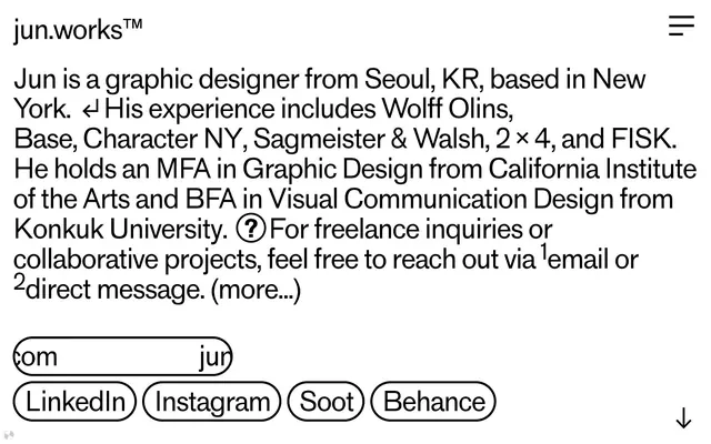
typographic canvas, pill-outlined actions
Color palette
Page backgrounds, overall site canvas, main surface for content
Dark borders and separators for elevated surfaces and inverted UI. Do not promote it to the primary CTA color
Subtle borders and decorative fills, providing a slight visual separation or distinction where a full Ink Black is too strong
Typography
- Weights
- 400
- Sizes
- 45px, 54px
- Line height
- 1.12, 1.15, 1.7
- Letter spacing
- -0.0540em at 54px, -0.0450em at 45px
- Fallback
- Arial Narrow
The primary display font for brand identity, headings, and key messaging. Its custom nature and tight letter spacing deliver a distinctive, condensed, and impactful visual presence, designed to be read as graphic elements.
- Weights
- 400
- Sizes
- 13px
- Line height
- 1.2
- Letter spacing
- normal
- Fallback
- Times New Roman
Used for all body copy and descriptive text. Its classic, serif appearance provides a contrasting texture to the bespoke 'Standard' font, grounding the content with traditional readability.
Spacing & shape
Components
Defined by a 4.5px Ink Black border, a 129.6px border-radius creating a pill shape, and Canvas White background. Text is Ink Black at 13px 'Times' 400. Padding is 5px top, 3px bottom, 18-19px left/right. Emphasizes an 'outlined' interaction style with no fill.
Uses Ink Black background with Canvas White text at 45px 'Standard' 400, letter-spacing -0.0450em. Features a 129.6px border-radius and generous padding (19px top/left/right, 13px bottom) to create a prominent, pill-shaped visual block.
Text is Ink Black at 45px 'Standard' 400, letter-spacing -0.0450em. Interactive state suggested by a 4.5px Ink Black border underneath, mirroring the aesthetic of the Pill Outline Button without being a fully formed button.
Rendered in Ink Black 'Times' 400 at 13px with 1.2 line height. The overall effect is dense text arranged on a sparse Canvas White background.
Guidelines
- Prioritize Ink Black (#000000) for all text, borders, and interactive outlines against Canvas White (#ffffff) backgrounds.
- Apply a 129.6px border-radius to all interactive elements, section tags, and any visually significant blocks to achieve the signature 'pill' aesthetic.
- Use 'Standard' font for all headings, brand marks, and prominent text elements, leveraging its custom design and tight letter-spacing for graphic impact.
- Maintain a clear visual hierarchy by strictly adhering to the monochromatic palette, letting typography and outlined shapes guide the eye.
- Employ consistent 4.5px borders around interactive elements that use the Ink Black color for emphasis.
- Use 'Times' font for all body copy and secondary information to provide contrast and readability.
- Utilize 13px as a general minimum vertical spacing between content elements to maintain a comfortable density.
- Avoid using any fill colors for buttons or interactive states; rely exclusively on Ink Black outlines on Canvas White backgrounds.
- Do not introduce color accents outside of the established monochromatic palette; color is not a component of brand identity here.
- Do not use generic or default border-radius values; the 129.6px radius is critical to the brand's visual language.
- Do not deviate from the specified font families; 'Standard' and 'Times' are fundamental to the system's character.
- Do not add shadows or elevation effects; the design language is flat and relies on crisp outlines and strong contrast.
- Avoid excessive imagery or complex background graphics; the focus is on typography and clean UI.
- Do not use letter-spacing outside the defined values for 'Standard' font; its specific tracking is part of its graphic appeal.
About this system
ShowHide
jun.works presents a typographic-centric aesthetic, leveraging bold, custom-designed lettering for primary information and system fonts for supporting details. The design is monochromatic, relying entirely on black on white with precise outlines and very generous radii to define interactive elements. Visual weight is managed through typography and border treatments on otherwise minimal components, creating a stark, high-contrast, text-heavy experience. Interaction elements are defined by rounded pill shapes rather than fills.
This system features a 'no imagery, pure UI' approach. The visual language is entirely functional and typographic, with brand identity conveyed through custom fonts, strict monochrome colors, and distinct component shapes. Icons, when present (like the menu icon), are minimal, outlined, and monochromatic, emphasizing a clean, graphic sensibility. There are no photographs, illustrations, or product screenshots—the text and layout are the visual content.
Reminiscent of Kerem Suer, Active Theory, Tobias van Schneider.
# jun.works — Style Reference
> typographic canvas, pill-outlined actions

**Theme:** light

**Site:** https://jun.works

jun.works presents a typographic-centric aesthetic, leveraging bold, custom-designed lettering for primary information and system fonts for supporting details. The design is monochromatic, relying entirely on black on white with precise outlines and very generous radii to define interactive elements. Visual weight is managed through typography and border treatments on otherwise minimal components, creating a stark, high-contrast, text-heavy experience.  Interaction elements are defined by rounded pill shapes rather than fills.

## Tokens — Colors

| Name | Value | Token | Role |
|------|------|------|------|
| Canvas White | `#ffffff` | `--color-canvas-white` | Page backgrounds, overall site canvas, main surface for content |
| Ink Black | `#000000` | `--color-ink-black` | Dark borders and separators for elevated surfaces and inverted UI. Do not promote it to the primary CTA color |
| Muted Gray | `#cccccc` | `--color-muted-gray` | Subtle borders and decorative fills, providing a slight visual separation or distinction where a full Ink Black is too strong |

## Tokens — Typography

### Standard
- **Substitute:** Arial Narrow
- **Weights:** 400
- **Sizes:** 45px, 54px
- **Line height:** 1.12, 1.15, 1.7
- **Letter spacing:** -0.0540em at 54px, -0.0450em at 45px
- **Role:** The primary display font for brand identity, headings, and key messaging. Its custom nature and tight letter spacing deliver a distinctive, condensed, and impactful visual presence, designed to be read as graphic elements.

### Times
- **Substitute:** Times New Roman
- **Weights:** 400
- **Sizes:** 13px
- **Line height:** 1.2
- **Letter spacing:** normal
- **Role:** Used for all body copy and descriptive text. Its classic, serif appearance provides a contrasting texture to the bespoke 'Standard' font, grounding the content with traditional readability.

## Tokens — Spacing

- **Section gap:** 26px
- **Card padding:** 19px
- **Element gap:** 13px

## Tokens — Radius

- **overall:** 129.6px

## Imagery

This system features a 'no imagery, pure UI' approach. The visual language is entirely functional and typographic, with brand identity conveyed through custom fonts, strict monochrome colors, and distinct component shapes. Icons, when present (like the menu icon), are minimal, outlined, and monochromatic, emphasizing a clean, graphic sensibility. There are no photographs, illustrations, or product screenshots—the text and layout are the visual content.

## Components

### Pill Outline Button
*Primary interactive element for navigation and calls to action.*

Defined by a 4.5px Ink Black border, a 129.6px border-radius creating a pill shape, and Canvas White background. Text is Ink Black at 13px 'Times' 400. Padding is 5px top, 3px bottom, 18-19px left/right. Emphasizes an 'outlined' interaction style with no fill.

### Section Heading Tag
*Distinctive visual tags for section titles like 'Service' or 'Recognition'.*

Uses Ink Black background with Canvas White text at 45px 'Standard' 400, letter-spacing -0.0450em. Features a 129.6px border-radius and generous padding (19px top/left/right, 13px bottom) to create a prominent, pill-shaped visual block.

### Navigation Link
*Top-level navigation items.*

Text is Ink Black at 45px 'Standard' 400, letter-spacing -0.0450em. Interactive state suggested by a 4.5px Ink Black border underneath, mirroring the aesthetic of the Pill Outline Button without being a fully formed button.

### Body Text Block
*General descriptive text and paragraphs.*

Rendered in Ink Black 'Times' 400 at 13px with 1.2 line height. The overall effect is dense text arranged on a sparse Canvas White background.

## Guidelines

### Do

- Prioritize Ink Black (#000000) for all text, borders, and interactive outlines against Canvas White (#ffffff) backgrounds.
- Apply a 129.6px border-radius to all interactive elements, section tags, and any visually significant blocks to achieve the signature 'pill' aesthetic.
- Use 'Standard' font for all headings, brand marks, and prominent text elements, leveraging its custom design and tight letter-spacing for graphic impact.
- Maintain a clear visual hierarchy by strictly adhering to the monochromatic palette, letting typography and outlined shapes guide the eye.
- Employ consistent 4.5px borders around interactive elements that use the Ink Black color for emphasis.
- Use 'Times' font for all body copy and secondary information to provide contrast and readability.
- Utilize 13px as a general minimum vertical spacing between content elements to maintain a comfortable density.

### Don't

- Avoid using any fill colors for buttons or interactive states; rely exclusively on Ink Black outlines on Canvas White backgrounds.
- Do not introduce color accents outside of the established monochromatic palette; color is not a component of brand identity here.
- Do not use generic or default border-radius values; the 129.6px radius is critical to the brand's visual language.
- Do not deviate from the specified font families; 'Standard' and 'Times' are fundamental to the system's character.
- Do not add shadows or elevation effects; the design language is flat and relies on crisp outlines and strong contrast.
- Avoid excessive imagery or complex background graphics; the focus is on typography and clean UI.
- Do not use letter-spacing outside the defined values for 'Standard' font; its specific tracking is part of its graphic appeal.

## Agent Prompt Guide

Quick Color Reference:
text: #000000
background: #ffffff
border: #000000
accent: no distinct accent color
primary action: no distinct CTA color

Example Component Prompts:
1. Create a section heading: 'Projects' in Ink Black background (#000000) with Canvas White text (#ffffff), 'Standard' font 45px 400, letter-spacing -0.0450em, a 129.6px border-radius, and 19px padding top/left/right, 13px padding bottom.
2. Design a navigation button: 'LinkedIn' with Canvas White background (#ffffff), Ink Black text (#000000), 'Times' font 13px 400, a 4.5px Ink Black (#000000) border, and 129.6px border-radius. Padding of 5px top, 3px bottom, 18px left/right.
3. Implement a body text paragraph: using 'Times' font 13px 400, Ink Black text (#000000) on a Canvas White (#ffffff) background, with a line height of 1.2.
4. Recreate the site header: 'jun.works™' text in 'Standard' font 45px 400, Ink Black (#000000) on Canvas White (#ffffff), with a tight letter-spacing of -0.0450em.
More like this









Keep what you find
A free account saves references to boards and can send you a weekly email of picks based on what you save.
To see every result, go Pro.