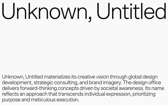
Preview image. Unlock full-res
Architectural blueprint on white marble.
Color palette
Dark borders and separators for elevated surfaces and inverted UI. Do not promote it to the primary CTA color
Dominant page and surface background color, providing a bright, expansive stage for content
Decorative fills primarily for SVG icons and imagery, ensuring maximum contrast when needed
Subtle background for secondary content blocks or to introduce mild textural shifts on surfaces
Background for accent panels or to break the flow with an unexpected warm-neutral surface
Muted UI surface for disabled controls, low-emphasis panels, and placeholder blocks. Do not promote it to the primary CTA color
Typography
- Weights
- 300
- Sizes
- 48px
- Line height
- 1.03
- Letter spacing
- -0.0500em
- Fallback
- Inter
Primary headings and navigational titles. Its weight 300 is purposefully light, creating an air of sophisticated understatement rather than bold declaration.
Spacing & shape
Components
Text links for primary navigation. Utilizes SCTO font, weight 300, color Ink (#080807).
Links that feature a subtle border, typically seen on hover or in active states. Border color is Ink (#080807) with 64 units of usage. Text color is Ink (#080807).
Standard paragraph text. Rendered in Ink (#080807) on Canvas (#f9f9f9) background.
Guidelines
- Maintain high contrast ratios, always aiming for AAA accessibility, such as Ink (#080807) on Canvas (#f9f9f9).
- Utilize SCTO font at weight 300 for all headings and navigational elements to establish a consistent brand voice.
- Employ a minimalist color palette, primarily using Canvas (#f9f9f9) as the dominant background and Ink (#080807) for all text and interactive borders.
- Ensure generous negative space around all content blocks and sections; use element gaps of at least 10px and card padding of 20px.
- Integrate subtle background shifts using Pale Stone (#d2d2d2), Clay Earth (#d5cac4), or Cloud Gray (#c5cbd9) to subtly delineate content sections without heavy visual dividers.
- Prioritize typography as the primary aesthetic element, using its precise weight and letter spacing to convey tone.
- Avoid introducing highly saturated or vivid colors; the system relies on an achromatic palette with minor tonal shifts.
- Do not use heavy shadows or complex elevation; the design system opts for flat surfaces and subtle background variations to create hierarchy.
- Refrain from using decorative borders or complex visual elements; simplicity and content focus are paramount.
- Do not use generic system fonts where SCTO is intended; the custom typeface is a core brand identifier.
- Avoid dense, information-heavy layouts; maintain ample whitespace around all elements for breathability and clarity.
About this system
ShowHide
Unknown, Untitled projects an atmosphere of understated authority, favoring precise typography and ample negative space over rich color or complex layouts. The visual language is stark, relying on a near-achromatic palette where the interplay of dark text against light surfaces defines the aesthetic. Typography, particularly the custom SCTO, carries the primary expressive load, rendered in a whisper-thin weight that suggests intellectual rigor. This system prioritizes clarity and a minimalist, content-focused presentation, with visual elements serving to complement rather than dominate the strong typographic voice.
Reminiscent of A.P.C., The Row, Oenophilia, Kikk.be.
# Unknown — Style Reference
> Architectural blueprint on white marble.

**Theme:** light

**Site:** https://unknown-untitled.com/en

Unknown, Untitled projects an atmosphere of understated authority, favoring precise typography and ample negative space over rich color or complex layouts. The visual language is stark, relying on a near-achromatic palette where the interplay of dark text against light surfaces defines the aesthetic. Typography, particularly the custom SCTO, carries the primary expressive load, rendered in a whisper-thin weight that suggests intellectual rigor. This system prioritizes clarity and a minimalist, content-focused presentation, with visual elements serving to complement rather than dominate the strong typographic voice.

## Tokens — Colors

| Name | Value | Token | Role |
|------|------|------|------|
| Ink | `#080807` | `--color-ink` | Dark borders and separators for elevated surfaces and inverted UI. Do not promote it to the primary CTA color |
| Canvas | `#f9f9f9` | `--color-canvas` | Dominant page and surface background color, providing a bright, expansive stage for content |
| Deep Graphite | `#000000` | `--color-deep-graphite` | Decorative fills primarily for SVG icons and imagery, ensuring maximum contrast when needed |
| Pale Stone | `#d2d2d2` | `--color-pale-stone` | Subtle background for secondary content blocks or to introduce mild textural shifts on surfaces |
| Clay Earth | `#d5cac4` | `--color-clay-earth` | Background for accent panels or to break the flow with an unexpected warm-neutral surface |
| Cloud Gray | `#c5cbd9` | `--color-cloud-gray` | Muted UI surface for disabled controls, low-emphasis panels, and placeholder blocks. Do not promote it to the primary CTA color |

## Tokens — Typography

### SCTO
- **Substitute:** Inter
- **Weights:** 300
- **Sizes:** 48px
- **Line height:** 1.03
- **Letter spacing:** -0.0500em
- **Role:** Primary headings and navigational titles. Its weight 300 is purposefully light, creating an air of sophisticated understatement rather than bold declaration.

## Tokens — Type Scale

| Role | Size | Line height | Letter spacing |
|------|------|------|------|
| heading | 48px | 1.03 | -2.4px |

## Tokens — Spacing

- **Section gap:** 60px
- **Card padding:** 20px
- **Element gap:** 10px

## Tokens — Radius

- **Default:** 0px

## Components

### Primary Navigation Link
*Navigation item*

Text links for primary navigation. Utilizes SCTO font, weight 300, color Ink (#080807).

### Subtle Border Link
*Interactive text link*

Links that feature a subtle border, typically seen on hover or in active states. Border color is Ink (#080807) with 64 units of usage. Text color is Ink (#080807).

### Content Paragraph
*Body text*

Standard paragraph text. Rendered in Ink (#080807) on Canvas (#f9f9f9) background.

## Guidelines

### Do

- Maintain high contrast ratios, always aiming for AAA accessibility, such as Ink (#080807) on Canvas (#f9f9f9).
- Utilize SCTO font at weight 300 for all headings and navigational elements to establish a consistent brand voice.
- Employ a minimalist color palette, primarily using Canvas (#f9f9f9) as the dominant background and Ink (#080807) for all text and interactive borders.
- Ensure generous negative space around all content blocks and sections; use element gaps of at least 10px and card padding of 20px.
- Integrate subtle background shifts using Pale Stone (#d2d2d2), Clay Earth (#d5cac4), or Cloud Gray (#c5cbd9) to subtly delineate content sections without heavy visual dividers.
- Prioritize typography as the primary aesthetic element, using its precise weight and letter spacing to convey tone.

### Don't

- Avoid introducing highly saturated or vivid colors; the system relies on an achromatic palette with minor tonal shifts.
- Do not use heavy shadows or complex elevation; the design system opts for flat surfaces and subtle background variations to create hierarchy.
- Refrain from using decorative borders or complex visual elements; simplicity and content focus are paramount.
- Do not use generic system fonts where SCTO is intended; the custom typeface is a core brand identifier.
- Avoid dense, information-heavy layouts; maintain ample whitespace around all elements for breathability and clarity.

## Agent Prompt Guide

Quick Color Reference:
text: #080807
background: #f9f9f9
border: #080807 (for interactive elements)
accent: no distinct accent color
primary action: no distinct CTA color

Example Component Prompts:
1. Create a page header: Left-aligned brand name 'Unknown, Untitled' in SCTO weight 300, 48px, color #080807. Right-aligned navigation link 'About' in SCTO weight 300, 48px, color #080807, with a #080807 border when interactive.
2. Design a content section: Background #d2d2d2, with a centered headline 'Our Vision' in SCTO weight 300, 48px, color #080807. Below the headline, a paragraph of body text in color #080807, with 20px padding.
3. Build an image gallery item: A rectangular image (no radius) with a #080807 border on all sides. Below the image, a caption in color #080807. No background color for the item itself, relying on section background.
More like this









Keep what you find
A free account saves references to boards and can send you a weekly email of picks based on what you save.
To see every result, go Pro.