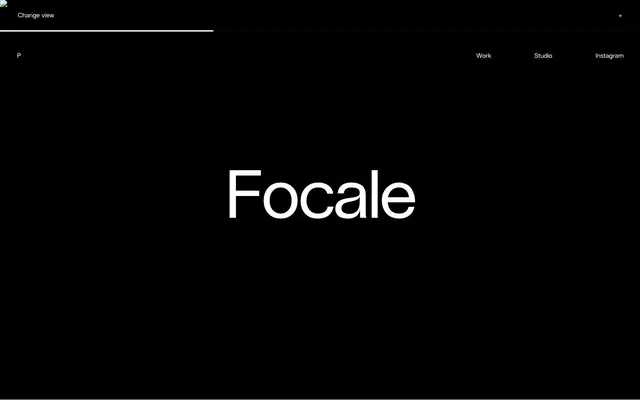
Preview image. Unlock full-res
Monochrome Gallery Canvas – a stark, high-contrast canvas where art is king.
Color palette
Dark borders and separators for elevated surfaces and inverted UI. Do not promote it to the primary CTA color
Primary page background, text on dark backgrounds, subtle surface overlays, inactive borders
Secondary background surface, offering a slight visual break from pure white
Tertiary background surface, providing a warm, almost beige undertone for content sections
Typography
- Weights
- 400
- Sizes
- 9px, 14px, 26px, 150px
- Line height
- 0.78, 1, 1.2, 1.48
- Letter spacing
- 0.14, 0.14, -0.027, -0.027
- Fallback
- Inter
All text elements: headings, body copy, navigation, links, and various labels. The family's clean lines and varied letter-spacing at different sizes contribute to a distinct, almost architectural feel, especially with the extremely wide tracking on some elements.
Spacing & shape
Components
Uses Lausanne-Regular, 14px, weight 400. Text color is Midnight Void (#000000). On hover/active, a thin 1px border appears below the text using Midnight Void (#000000).
Lausanne-Regular, 150px, weight 400, color Midnight Void (#000000), letter spacing -0.027em. Features extremely large size and wide tracking for an impactful, sparse delivery.
A 1px border using Canvas White (#ffffff) or Midnight Void (#000000) for visual separation, often acting as a bottom border for interactive areas.
Lausanne-Regular, 9px, weight 400, color Midnight Void (#000000), letter spacing 0.14em. Features a subtle, widely tracked uppercase style.
Lausanne-Regular, 9px, weight 400, color Midnight Void (#000000), letter spacing 0.14em. Used in close proximity to project titles at a smaller scale.
Guidelines
- Use Midnight Void (#000000) as the default text color on Canvas White (#ffffff) backgrounds, ensuring maximum contrast.
- Apply Lausanne-Regular at 150px with a letter-spacing of -0.027em for primary page headings to create a signature large, spaced-out typographic style.
- Utilize a 1px border of Midnight Void (#000000) or Canvas White (#ffffff) for all interactive element boundaries and visual dividers.
- Divide content sections primarily using background color changes between Canvas White (#ffffff), Stonewash Gray (#c5c1c0), and Warm Mist (#e8e1d9).
- Maintain a default padding of 15px for content surrounding interactive elements to ensure comfortable spacing.
- Implement a generous 90px vertical gap between major content sections to enhance the sense of space and visual quiet.
- Employ the 9px Lausanne-Regular with 0.14em letter-spacing for all secondary labels and tags, ensuring a consistent micro-typography style.
- Avoid using drop shadows or heavy box shadows; rely on background color changes and thin borders for visual hierarchy.
- Do not introduce additional color beyond the established achromatic palette; color should be absent to maintain focus on content and form.
- Refrain from using varied font families; Lausanne-Regular is the sole typeface for all content.
- Do not use generic padding values; adhere to 15px for horizontal component padding and 10px for vertical element spacing.
- Avoid adding corner radii to cards or containers; all elements should have sharp, square edges.
- Do not use different letter-spacing values from those defined for Lausanne-Regular at specific sizes (0.14em for small text, -0.027em for large text).
- Do not use highly saturated brand colors for interactive elements; all interactivity cues should be expressed through the monochrome palette and subtle borders.
About this system
ShowHide
plasticbionic employs a stark, minimalist aesthetic with an extreme contrast between pure black and white surfaces. Typography is the primary visual element, often very large and spaced out, creating a deliberate, unhurried rhythm. The system prioritizes quiet backgrounds and delicate boundary lines, allowing content blocks to define themselves through negative space and subtle shifts in background color. Interactions are marked by thin, almost invisible borders and transitions.
The page structure is full-bleed horizontally, but content is often visually centered within a clear vertical rhythm. The hero section is dominated by a large, centered project title against a pure black background. Subsequent sections feature large, distinct project showcases, each occupying a significant vertical slice of the screen. Navigation is a minimalist top bar, with thin separators or subtle hover states. The grid usage is implicit, with projects acting as large, self-contained blocks rather than a dense, repeating grid.
The visual language is characterized by direct, centered product or project showcases. Imagery is large-scale, often full-width, focusing on the output of creative work. There's no use of photography in the traditional sense, but rather high-quality product visuals or digital art. When present, images are treated as contained blocks within the expansive monochrome canvas, without overlapping or complex masking. Icons are minimal, likely outlined and monochromatic where needed, such as the '+' sign for expansion.
Reminiscent of Stripe, Muzli, AIGA Design Archives, Obys Agency.
# plasticbionic — Style Reference
> Monochrome Gallery Canvas – a stark, high-contrast canvas where art is king.

**Theme:** light

**Site:** https://plasticbionic.com

plasticbionic employs a stark, minimalist aesthetic with an extreme contrast between pure black and white surfaces. Typography is the primary visual element, often very large and spaced out, creating a deliberate, unhurried rhythm. The system prioritizes quiet backgrounds and delicate boundary lines, allowing content blocks to define themselves through negative space and subtle shifts in background color. Interactions are marked by thin, almost invisible borders and transitions.

## Tokens — Colors

| Name | Value | Token | Role |
|------|------|------|------|
| Midnight Void | `#000000` | `--color-midnight-void` | Dark borders and separators for elevated surfaces and inverted UI. Do not promote it to the primary CTA color |
| Canvas White | `#ffffff` | `--color-canvas-white` | Primary page background, text on dark backgrounds, subtle surface overlays, inactive borders |
| Stonewash Gray | `#c5c1c0` | `--color-stonewash-gray` | Secondary background surface, offering a slight visual break from pure white |
| Warm Mist | `#e8e1d9` | `--color-warm-mist` | Tertiary background surface, providing a warm, almost beige undertone for content sections |

## Tokens — Typography

### Lausanne-Regular
- **Substitute:** Inter
- **Weights:** 400
- **Sizes:** 9px, 14px, 26px, 150px
- **Line height:** 0.78, 1, 1.2, 1.48
- **Letter spacing:** 0.14, 0.14, -0.027, -0.027
- **Role:** All text elements: headings, body copy, navigation, links, and various labels. The family's clean lines and varied letter-spacing at different sizes contribute to a distinct, almost architectural feel, especially with the extremely wide tracking on some elements.

## Tokens — Type Scale

| Role | Size | Line height | Letter spacing |
|------|------|------|------|
| body | 14px | 1 | 0.14px |
| heading | 26px | 1.2 | -0.027em |
| display | 150px | 0.78 | -0.027em |

## Tokens — Spacing

- **Section gap:** 90px
- **Card padding:** 15px
- **Element gap:** 10px

## Tokens — Radius

- **Default:** 0px

## Layout

The page structure is full-bleed horizontally, but content is often visually centered within a clear vertical rhythm. The hero section is dominated by a large, centered project title against a pure black background. Subsequent sections feature large, distinct project showcases, each occupying a significant vertical slice of the screen. Navigation is a minimalist top bar, with thin separators or subtle hover states. The grid usage is implicit, with projects acting as large, self-contained blocks rather than a dense, repeating grid.

## Imagery

The visual language is characterized by direct, centered product or project showcases. Imagery is large-scale, often full-width, focusing on the output of creative work. There's no use of photography in the traditional sense, but rather high-quality product visuals or digital art. When present, images are treated as contained blocks within the expansive monochrome canvas, without overlapping or complex masking. Icons are minimal, likely outlined and monochromatic where needed, such as the '+' sign for expansion.

## Components

### Navigation Link
*Interactive text link in the top navigation or content filtering.*

Uses Lausanne-Regular, 14px, weight 400. Text color is Midnight Void (#000000). On hover/active, a thin 1px border appears below the text using Midnight Void (#000000).

### Large Display Headline
*Prominent headings for showcasing project names.*

Lausanne-Regular, 150px, weight 400, color Midnight Void (#000000), letter spacing -0.027em. Features extremely large size and wide tracking for an impactful, sparse delivery.

### Subtle Section Divider
*Separates content sections or UI elements with a delicate line.*

A 1px border using Canvas White (#ffffff) or Midnight Void (#000000) for visual separation, often acting as a bottom border for interactive areas.

### Actionable Text Label
*Labels for interactive actions like 'Change View'.*

Lausanne-Regular, 9px, weight 400, color Midnight Void (#000000), letter spacing 0.14em. Features a subtle, widely tracked uppercase style.

### Project Overview Tag
*Tags for project categories (e.g., 'Ai, Art Direction').*

Lausanne-Regular, 9px, weight 400, color Midnight Void (#000000), letter spacing 0.14em. Used in close proximity to project titles at a smaller scale.

## Guidelines

### Do

- Use Midnight Void (#000000) as the default text color on Canvas White (#ffffff) backgrounds, ensuring maximum contrast.
- Apply Lausanne-Regular at 150px with a letter-spacing of -0.027em for primary page headings to create a signature large, spaced-out typographic style.
- Utilize a 1px border of Midnight Void (#000000) or Canvas White (#ffffff) for all interactive element boundaries and visual dividers.
- Divide content sections primarily using background color changes between Canvas White (#ffffff), Stonewash Gray (#c5c1c0), and Warm Mist (#e8e1d9).
- Maintain a default padding of 15px for content surrounding interactive elements to ensure comfortable spacing.
- Implement a generous 90px vertical gap between major content sections to enhance the sense of space and visual quiet.
- Employ the 9px Lausanne-Regular with 0.14em letter-spacing for all secondary labels and tags, ensuring a consistent micro-typography style.

### Don't

- Avoid using drop shadows or heavy box shadows; rely on background color changes and thin borders for visual hierarchy.
- Do not introduce additional color beyond the established achromatic palette; color should be absent to maintain focus on content and form.
- Refrain from using varied font families; Lausanne-Regular is the sole typeface for all content.
- Do not use generic padding values; adhere to 15px for horizontal component padding and 10px for vertical element spacing.
- Avoid adding corner radii to cards or containers; all elements should have sharp, square edges.
- Do not use different letter-spacing values from those defined for Lausanne-Regular at specific sizes (0.14em for small text, -0.027em for large text).
- Do not use highly saturated brand colors for interactive elements; all interactivity cues should be expressed through the monochrome palette and subtle borders.

## Agent Prompt Guide

Quick Color Reference:
text: #000000
background: #ffffff
border: #000000
accent: no distinct accent color
primary action: no distinct CTA color

Example Component Prompts:
1. Create a top navigation bar: background #000000. On the left, 'Change View' text (Lausanne-Regular, 9px, 400, #ffffff, 0.14em letter-spacing). On the right, 'Work', 'Studio', 'Instagram' links (Lausanne-Regular, 14px, 400, #ffffff, 0.14em letter-spacing). Each link has a 1px #ffffff bottom border on hover/active.
2. Build a hero section: centered text 'Focale' (Lausanne-Regular, 150px, 400, #ffffff, -0.027em letter-spacing) against a solid #000000 background.
3. Design a project list item: background #e8e1d9. Project title 'Fortuneo' (Lausanne-Regular, 26px, 400, #000000, -0.027em letter-spacing). Below the title, tags 'Art Direction, CGI, Illustration' (Lausanne-Regular, 9px, 400, #000000, 0.14em letter-spacing).
More like this









Keep what you find
A free account saves references to boards and can send you a weekly email of picks based on what you save.
To see every result, go Pro.