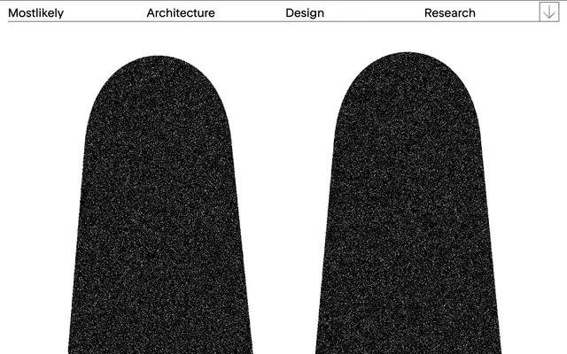
Preview image. Unlock full-res
Architectural blueprint on white marble
Color palette
Page backgrounds, elevated surfaces like cards, provides a crisp base for all content
Primary text, borders, dividers, and solid background elements. Defines structure and provides strong contrast
Typography
- Weights
- 400
- Sizes
- 14px, 30px
- Line height
- 1.4
- Fallback
- Arial
Primary typeface for all text content, including navigation, headings, and body text. Its custom nature gives the site a unique, almost hand-drawn or technical feel. Weight 400 is consistently used, contributing to the system's uniform visual density.
Spacing & shape
Components
Text in Ink Black (Rondelle, 14px, 400 weight) with a 1px solid Ink Black border on the bottom. Padding of 5px top/bottom and 20px left/right. The underline appears on hover/active states, creating a clear visual cue without adding visual weight when inactive.
A horizontal bar with a white background and a 1px Ink Black border along its bottom. Contains navigation links and possibly a logo. Height is approximately 55px (5px padding top + content height + 5px padding bottom + 1px border).
An element with a 1px solid Ink Black border. Can contain text, images, or icons. The background typically defaults to Canvas White when content is present, or Ink Black for specific content areas or backgrounds as shown in the screenshot for large masked shapes. Padding varies, with 70px left/right observed on some wider elements.
Guidelines
- Use Canvas White (#ffffff) as the default background for all page sections and elevated content.
- Apply Ink Black (#000000) for all primary text, borders, and significant structural lines.
- Maintain a consistent 1px solid Ink Black border for all interactive elements, navigation markers, and content dividers.
- Employ the Rondelle typeface at weight 400 for all textual content, prioritizing clarity and directness.
- Utilize 5px vertical padding and 20px horizontal padding for navigation items to create a spacious, balanced feel.
- Ensure all elements maintain sharp, 0px border-radii; rounded corners are not part of this visual system.
- Structure UI with generous horizontal spacing, using 70px padding on the left and right for main content areas.
- Avoid introducing any colors beyond Canvas White and Ink Black, as the system relies on a strictly monochrome palette.
- Refrain from using shadows or elevation effects; the design emphasizes flatness and clean lines.
- Do not apply rounded corners to any UI elements; all corners should be sharp and right-angled.
- Avoid decorative gradients or complex backgrounds; stick to solid color fills.
- Do not use generic system fonts; always specify 'Rondelle' for text.
- Do not use letter-spacing adjustments unless explicitly defined for a specific text style; default to normal.
- Avoid overly dense information layouts; prioritize comfortable spacing and clear segmentation of content.
About this system
ShowHide
The mostlikely design system presents a stark, high-contrast aesthetic reminiscent of architectural blueprints. It uses a minimal palette of pure black and white, creating a dense, graphical quality. Typography is custom and compact, lending a utilitarian yet refined feel. Components are defined by sharp lines and simple forms, emphasizing structure and clarity over elaborate ornamentation. The overall impression is one of directness and essentialism, where every visual element serves a clear functional purpose.
The page uses a maximum-width contained layout, with a prominent header that is full-width but visually contains elements. The hero section, as implied by the large black shapes, appears to break out of this containment, using full-bleed graphical elements. Content is arranged in a fluid manner, with clear vertical spacing between implied sections. The primary navigation is a horizontal bar at the top, emphasizing a clear, linear flow. The overall density feels open, with significant white space surrounding content.
The site employs a combination of abstract, granular black shapes and minimal iconography. There is no photography or complex illustrations. Graphics appear as large, sometimes masked, black forms with a textured, noisy fill, contrasting sharply with the white canvas. Icons are strictly outlined and monochrome, matching the overall stark aesthetic. Imagery serves a decorative and atmospheric role, adding a raw, tactile quality without distracting from the UI.
Reminiscent of Are.na, Minimalist portfolio sites, Dropbox (early versions).
# mostlikely — Style Reference
> Architectural blueprint on white marble

**Theme:** light

**Site:** https://mostlikely.at

The mostlikely design system presents a stark, high-contrast aesthetic reminiscent of architectural blueprints. It uses a minimal palette of pure black and white, creating a dense, graphical quality. Typography is custom and compact, lending a utilitarian yet refined feel. Components are defined by sharp lines and simple forms, emphasizing structure and clarity over elaborate ornamentation. The overall impression is one of directness and essentialism, where every visual element serves a clear functional purpose.

## Tokens — Colors

| Name | Value | Token | Role |
|------|------|------|------|
| Canvas White | `#ffffff` | `--color-canvas-white` | Page backgrounds, elevated surfaces like cards, provides a crisp base for all content |
| Ink Black | `#000000` | `--color-ink-black` | Primary text, borders, dividers, and solid background elements. Defines structure and provides strong contrast |

## Tokens — Typography

### Rondelle
- **Substitute:** Arial
- **Weights:** 400
- **Sizes:** 14px, 30px
- **Line height:** 1.4
- **Role:** Primary typeface for all text content, including navigation, headings, and body text. Its custom nature gives the site a unique, almost hand-drawn or technical feel. Weight 400 is consistently used, contributing to the system's uniform visual density.

## Tokens — Spacing

- **Section gap:** 70px
- **Card padding:** 20px
- **Element gap:** 10px

## Tokens — Radius

- **Default:** 0px

## Layout

The page uses a maximum-width contained layout, with a prominent header that is full-width but visually contains elements. The hero section, as implied by the large black shapes, appears to break out of this containment, using full-bleed graphical elements. Content is arranged in a fluid manner, with clear vertical spacing between implied sections. The primary navigation is a horizontal bar at the top, emphasizing a clear, linear flow. The overall density feels open, with significant white space surrounding content.

## Imagery

The site employs a combination of abstract, granular black shapes and minimal iconography. There is no photography or complex illustrations. Graphics appear as large, sometimes masked, black forms with a textured, noisy fill, contrasting sharply with the white canvas. Icons are strictly outlined and monochrome, matching the overall stark aesthetic. Imagery serves a decorative and atmospheric role, adding a raw, tactile quality without distracting from the UI.

## Components

### Primary Navigation Link
*Top navigation items*

Text in Ink Black (Rondelle, 14px, 400 weight) with a 1px solid Ink Black border on the bottom. Padding of 5px top/bottom and 20px left/right. The underline appears on hover/active states, creating a clear visual cue without adding visual weight when inactive.

### Header Bar
*Persistent top-level navigation and branding container*

A horizontal bar with a white background and a 1px Ink Black border along its bottom. Contains navigation links and possibly a logo. Height is approximately 55px (5px padding top + content height + 5px padding bottom + 1px border).

### Interactive Box with Border
*Interactive elements, image containers, or content blocks*

An element with a 1px solid Ink Black border. Can contain text, images, or icons. The background typically defaults to Canvas White when content is present, or Ink Black for specific content areas or backgrounds as shown in the screenshot for large masked shapes. Padding varies, with 70px left/right observed on some wider elements.

## Guidelines

### Do

- Use Canvas White (#ffffff) as the default background for all page sections and elevated content.
- Apply Ink Black (#000000) for all primary text, borders, and significant structural lines.
- Maintain a consistent 1px solid Ink Black border for all interactive elements, navigation markers, and content dividers.
- Employ the Rondelle typeface at weight 400 for all textual content, prioritizing clarity and directness.
- Utilize 5px vertical padding and 20px horizontal padding for navigation items to create a spacious, balanced feel.
- Ensure all elements maintain sharp, 0px border-radii; rounded corners are not part of this visual system.
- Structure UI with generous horizontal spacing, using 70px padding on the left and right for main content areas.

### Don't

- Avoid introducing any colors beyond Canvas White and Ink Black, as the system relies on a strictly monochrome palette.
- Refrain from using shadows or elevation effects; the design emphasizes flatness and clean lines.
- Do not apply rounded corners to any UI elements; all corners should be sharp and right-angled.
- Avoid decorative gradients or complex backgrounds; stick to solid color fills.
- Do not use generic system fonts; always specify 'Rondelle' for text.
- Do not use letter-spacing adjustments unless explicitly defined for a specific text style; default to normal.
- Avoid overly dense information layouts; prioritize comfortable spacing and clear segmentation of content.

## Agent Prompt Guide

Quick Color Reference:
text: #000000
background: #ffffff
border: #000000
accent: no distinct accent color
primary action: no distinct CTA color

Example Component Prompts:
Create a header bar: Canvas White background, 1px solid Ink Black bottom border, height around 55px. Content includes a 'Mostlikely' branding text (Rondelle, 14px, 400 weight, Ink Black) and navigation links (Rondelle, 14px, 400 weight, Ink Black, 5px vertical padding, 20px horizontal padding, 1px Ink Black bottom border on hover).
Create a basic interactive box: Canvas White background, 1px solid Ink Black border, 0px border-radius, contains text (Rondelle, 14px, 400 weight, Ink Black) and a small outlined Ink Black icon.
Create a full-width background section: Fill the entire width with a pure Canvas White background. Then, within this section, create large abstract shapes using Ink Black as a background color, ensuring they maintain the textured, noisy fill evident in the original image.
More like this









Keep what you find
A free account saves references to boards and can send you a weekly email of picks based on what you save.
To see every result, go Pro.