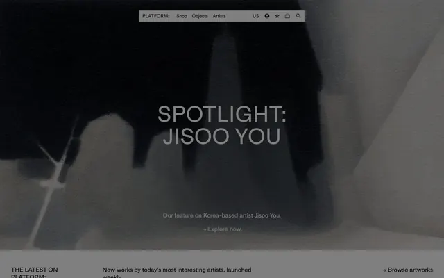
Preview image. Unlock full-res
monochromatic gallery exhibition
Color palette
Page backgrounds, card surfaces, ghost button backgrounds, default text color for inverse elements
Neutral form states, badge text, and quiet UI feedback where color should stay understated. Do not promote it to the primary CTA color
Typography
- Weights
- 400
- Sizes
- 12px, 15px, 20px, 48px, 72px
- Line height
- 1.15
- Letter spacing
- 0.12px at 12px, 0.15px at 15px, 0.2px at 20px
- Fallback
- system-ui, 'Segoe UI', Roboto, Helvetica, Arial, sans-serif, 'Apple Color Emoji', 'Segoe UI Emoji', 'Segoe UI Symbol'
Body copy, captions, links, and secondary navigation items. Its regular weight ensures readability while maintaining the understated tone.
- Weights
- 500
- Sizes
- 12px, 15px, 20px, 48px, 72px
- Line height
- 1, 1.2
- Letter spacing
- 0.96px at 48px, 1.44px at 72px
- Fallback
- system-ui, 'Segoe UI', Roboto, Helvetica, Arial, sans-serif, 'Apple Color Emoji', 'Segoe UI Emoji', 'Segoe UI Symbol'
Headings and spotlight titles. The medium weight combined with generous letter-spacing creates an open, editorial display quality, asserting presence without typical bolding.
Spacing & shape
Components
Transparent background, Ink Black (#000000) text, no border or padding, font MediumLLWeb weight 400. This minimal styling makes navigation blend seamlessly with the content.
Background transparent, Ink Black (#000000) text (MediumLLWeb weight 400), 8px top/bottom padding, 13px left/right padding, with a 1px bottom border on interaction for subtle emphasis. No border radius.
Transparent background with a 1px Ink Black (#000000) border. No padding within the card itself as artwork fills the space. All corners are sharp (0px radius). Artwork information appears directly below the image using MediumLLWeb, weight 400.
Transparent background, Ink Black (#000000) text and border, 10px padding on all sides. No border radius. The simple, sharp input field matches the overall aesthetic.
Guidelines
- Prioritize Ink Black (#000000) for text and primary UI interactions against Canvas White (#ffffff) backgrounds to maintain high contrast and sophistication.
- Use MediumLLWeb weight 500 for all large headings (48px, 72px) with the specified letter-spacing to create an open and editorial feel.
- Maintain a strict 0px border-radius for all components and elements; rounded corners are not part of this visual language.
- Employ ghost or outlined styles for interactive elements, using Ink Black (#000000) for borders or text, to preserve content as the primary focus.
- Utilize 'elementGap' of 10px for vertical spacing between related content blocks for a compact, intentional rhythm.
- Ensure all interactive elements have hover effects that subtly highlight their interactive nature within the black and white palette.
- Keep backgrounds for all major sections and components as Canvas White (#ffffff) or transparent, allowing content to define visual interest.
- Do not introduce strong chromatic colors into the core UI; color should only appear within artwork or imagery, not structural elements.
- Avoid heavy drop shadows or complex elevation; mimic the flatness of a printed page or gallery wall.
- Do not use typography weights heavier than MediumLLWeb 500; the brand's authority comes from thoughtful spacing and elegant forms, not visual weight.
- Refrain from using padding within cards displaying artwork; the art should bleed to the edge of its boundary.
- Do not vary from the established letter-spacing values for MediumLLWeb; precise tracking is a signature of this system.
- Avoid introducing rounded corners on any UI element; the design maintains a sharp, architectural edge.
- Do not use generic system fonts when MediumLLWeb (or its defined substitutes) should be used; font choice is critical to brand identity.
About this system
ShowHide
PLATFORM employs a high-contrast, minimalist gallery style, reminiscent of exhibition space. The visual system relies heavily on stark black and white, creating a strong editorial feel where artwork takes center stage. Typography is reserved and precise, with tight tracking. Components are ghosted or outlined, never interfering with content, maintaining a sense of refinement and directness.
The page primarily uses a full-bleed layout for the hero section, with a centered headline and subordinate text over a dark, textural background. Subsequent sections often feature a limited max-width for textual content, contrasting with grid-based image displays that utilize the full horizontal space. Content is arranged in alternating sections, typically with consistent vertical spacing. Text blocks tend to be centered or left-aligned within their containers, while image grids align to the overall page structure. Navigation is a minimalist top bar, with prominent 'PLATFORM:' branding and subtle text links.
This site predominantly uses large, high-resolution imagery showcasing fine art. Images are typically full-bleed within their sections or tightly cropped and contained within a 1px Ink Black (#000000) border, mimicking a framed piece. There is no usage of abstract graphics, 3D renders, or heavily treated photography. Icons are minimal, outlined Ink Black (#000000) pictograms, serving purely functional roles like search or user profile. The visual density is high on imagery, allowing the artwork to speak for itself, with explanatory text kept concise and positioned carefully around the visuals.
Reminiscent of Artnet, Saatchi Art, Paddle8.
# PLATFORM — Style Reference
> monochromatic gallery exhibition

**Theme:** light

**Site:** https://www.platformart.com

PLATFORM employs a high-contrast, minimalist gallery style, reminiscent of exhibition space. The visual system relies heavily on stark black and white, creating a strong editorial feel where artwork takes center stage. Typography is reserved and precise, with tight tracking. Components are ghosted or outlined, never interfering with content, maintaining a sense of refinement and directness.

## Tokens — Colors

| Name | Value | Token | Role |
|------|------|------|------|
| Canvas White | `#ffffff` | `--color-canvas-white` | Page backgrounds, card surfaces, ghost button backgrounds, default text color for inverse elements |
| Ink Black | `#000000` | `--color-ink-black` | Neutral form states, badge text, and quiet UI feedback where color should stay understated. Do not promote it to the primary CTA color |

## Tokens — Typography

### MediumLLWeb
- **Substitute:** system-ui, 'Segoe UI', Roboto, Helvetica, Arial, sans-serif, 'Apple Color Emoji', 'Segoe UI Emoji', 'Segoe UI Symbol'
- **Weights:** 400
- **Sizes:** 12px, 15px, 20px, 48px, 72px
- **Line height:** 1.15
- **Letter spacing:** 0.12px at 12px, 0.15px at 15px, 0.2px at 20px
- **Role:** Body copy, captions, links, and secondary navigation items. Its regular weight ensures readability while maintaining the understated tone.

### MediumLLWeb
- **Substitute:** system-ui, 'Segoe UI', Roboto, Helvetica, Arial, sans-serif, 'Apple Color Emoji', 'Segoe UI Emoji', 'Segoe UI Symbol'
- **Weights:** 500
- **Sizes:** 12px, 15px, 20px, 48px, 72px
- **Line height:** 1, 1.2
- **Letter spacing:** 0.96px at 48px, 1.44px at 72px
- **Role:** Headings and spotlight titles. The medium weight combined with generous letter-spacing creates an open, editorial display quality, asserting presence without typical bolding.

## Tokens — Type Scale

| Role | Size | Line height | Letter spacing |
|------|------|------|------|
| caption | 12px | 1.15 | — |
| body-sm | 15px | 1.15 | — |
| body | 20px | 1.15 | — |
| body-lg | 48px | 1.15 | — |
| heading-sm | 72px | 1.15 | — |

## Tokens — Spacing

- **Section gap:** 72px
- **Card padding:** 0px
- **Element gap:** 10px

## Tokens — Radius

- **all:** 0px

## Layout

The page primarily uses a full-bleed layout for the hero section, with a centered headline and subordinate text over a dark, textural background. Subsequent sections often feature a limited max-width for textual content, contrasting with grid-based image displays that utilize the full horizontal space. Content is arranged in alternating sections, typically with consistent vertical spacing. Text blocks tend to be centered or left-aligned within their containers, while image grids align to the overall page structure. Navigation is a minimalist top bar, with prominent 'PLATFORM:' branding and subtle text links.

## Imagery

This site predominantly uses large, high-resolution imagery showcasing fine art. Images are typically full-bleed within their sections or tightly cropped and contained within a 1px Ink Black (#000000) border, mimicking a framed piece. There is no usage of abstract graphics, 3D renders, or heavily treated photography. Icons are minimal, outlined Ink Black (#000000) pictograms, serving purely functional roles like search or user profile. The visual density is high on imagery, allowing the artwork to speak for itself, with explanatory text kept concise and positioned carefully around the visuals.

## Components

### Ghost Navigation Button
*Interactive elements within the top navigation and inline actions.*

Transparent background, Ink Black (#000000) text, no border or padding, font MediumLLWeb weight 400. This minimal styling makes navigation blend seamlessly with the content.

### Text Button
*Call to action for secondary actions or text-based prompts.*

Background transparent, Ink Black (#000000) text (MediumLLWeb weight 400), 8px top/bottom padding, 13px left/right padding, with a 1px bottom border on interaction for subtle emphasis. No border radius.

### Artwork Card
*Displaying individual artworks in grid layouts.*

Transparent background with a 1px Ink Black (#000000) border. No padding within the card itself as artwork fills the space. All corners are sharp (0px radius). Artwork information appears directly below the image using MediumLLWeb, weight 400.

### Text Input
*Form fields for user input.*

Transparent background, Ink Black (#000000) text and border, 10px padding on all sides. No border radius. The simple, sharp input field matches the overall aesthetic.

## Guidelines

### Do

- Prioritize Ink Black (#000000) for text and primary UI interactions against Canvas White (#ffffff) backgrounds to maintain high contrast and sophistication.
- Use MediumLLWeb weight 500 for all large headings (48px, 72px) with the specified letter-spacing to create an open and editorial feel.
- Maintain a strict 0px border-radius for all components and elements; rounded corners are not part of this visual language.
- Employ ghost or outlined styles for interactive elements, using Ink Black (#000000) for borders or text, to preserve content as the primary focus.
- Utilize 'elementGap' of 10px for vertical spacing between related content blocks for a compact, intentional rhythm.
- Ensure all interactive elements have hover effects that subtly highlight their interactive nature within the black and white palette.
- Keep backgrounds for all major sections and components as Canvas White (#ffffff) or transparent, allowing content to define visual interest.

### Don't

- Do not introduce strong chromatic colors into the core UI; color should only appear within artwork or imagery, not structural elements.
- Avoid heavy drop shadows or complex elevation; mimic the flatness of a printed page or gallery wall.
- Do not use typography weights heavier than MediumLLWeb 500; the brand's authority comes from thoughtful spacing and elegant forms, not visual weight.
- Refrain from using padding within cards displaying artwork; the art should bleed to the edge of its boundary.
- Do not vary from the established letter-spacing values for MediumLLWeb; precise tracking is a signature of this system.
- Avoid introducing rounded corners on any UI element; the design maintains a sharp, architectural edge.
- Do not use generic system fonts when MediumLLWeb (or its defined substitutes) should be used; font choice is critical to brand identity.

## Agent Prompt Guide

**Quick Color Reference**
text: #000000
background: #ffffff
border: #000000
accent: none observed
primary action: no distinct CTA color

**3-5 Example Component Prompts**
1. Create a `Ghost Navigation Button` named 'Shop' with 'MediumLLWeb' font, weight 400, color '#000000'.
2. Create an `Artwork Card` displaying an image placeholder. This card should have a 1px border of '#000000' and '0px' border-radius. Below the image, include two lines of `MediumLLWeb` text, weight 400, color '#000000'.
3. Create a `Text Input` field with '10px' padding, '0px' border-radius, background color transparent, and 1px border with color '#000000'. Placeholder text should be 'MediumLLWeb' weight 400, color '#000000'.
More like this









Keep what you find
A free account saves references to boards and can send you a weekly email of picks based on what you save.
To see every result, go Pro.