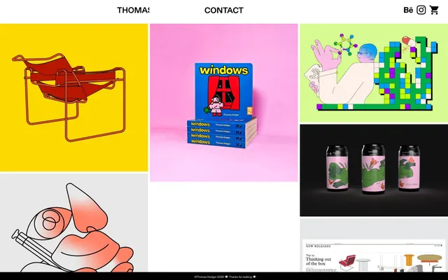
Preview image. Unlock full-res
Gallery Grid Canvas
Color palette
Dark borders and separators for elevated surfaces and inverted UI. Do not promote it to the primary CTA color
Page backgrounds, default text for reversed elements (e.g., footer copyright). The expansive white space ensures high readability and isolates artwork
Dark borders and separators for elevated surfaces and inverted UI.
Hairline borders, dividers, input outlines, and card edges on light surfaces. Do not promote it to the primary CTA color
Typography
- Weights
- 400
- Sizes
- 9px, 19px
- Line height
- 1.1, 1.3
- Fallback
- Inter
Body text, captions, and general interface text. Its clean, functional aesthetic supports content without distracting from the artwork.
- Weights
- 500, 700
- Sizes
- 26px
- Line height
- 1.1
- Fallback
- Inter
Main navigation and section headings. The varied weights provide emphasis for key navigational and informational elements.
- Weights
- 400
- Sizes
- 13px
- Line height
- 1.2
- Fallback
- Times New Roman
Fine print, copyright information, and sub-textual content. Its classic seriffed form provides a subtle contrast for auxiliary information.
Spacing & shape
Components
Each item is a square or rectangular container with a background color that is part of the artwork itself, no padding, and a 0px border-radius, presenting content edge-to-edge. No intrinsic box-shadow. Content within has its own dimensions.
Text rendered in 'Ink Grey' or 'Absolute Zero' (depending on context) using Diatype Variable at 26px weight 500 for main navigation. Underlined with a thin 'Absolute Zero' border on hover/focus (derived from link/borderColor context).
Text rendered in 'Ink Grey' using Diatype Variable at 26px weight 500.
Text in 'Canvas White' using Times at 13px weight 400.
Guidelines
- Prioritize image content. Most of the page should be dedicated to displaying artwork, respecting its inherent dimensions and aspect ratios.
- Maintain a clear, high-contrast visual hierarchy using 'Absolute Zero' for key text and borders against 'Canvas White' backgrounds.
- Use 'Ink Grey' for prominent headings to establish a slightly softer, yet still impactful, textual presence.
- Apply 'Absolute Zero' for all primary borders and dividers to emphasize the grid structure and define interactive areas.
- Keep all corners sharp with a 0px border-radius on all components, maintaining a crisp, rectilinear aesthetic.
- Employ 'Diatype' (or Inter) at 26px weight 700 for main navigation and headings, providing clear and concise guidance.
- Utilize 3px padding from the tokens only for small, internal element spacing where needed for compact density, otherwise prefer 0px for content containers.
- Avoid decorative shadows or complex elevation schemes; the design relies on flat, direct presentation.
- Do not introduce new colors into the UI beyond the defined neutrals; all vibrancy should come from the artwork itself.
- Refrain from using heavily styled buttons or components that draw attention away from the visual content.
- Do not implement soft curves or rounded corners; the aesthetic is sharp and geometric.
- Avoid unnecessary padding or excessive white space around artwork to maintain a dense, gallery-like feel.
- Do not use generic system fonts for prominent text roles; stick to 'Diatype' and 'Diatype Variable' for brand consistency.
- Under no circumstances should the browser default link color (#0000ee) appear; all links use 'Absolute Zero' or 'Ink Grey'.
About this system
ShowHide
Thomas Hedger's portfolio features a stark, high-contrast visual identity centered on vibrant illustration against a light canvas. The design system is highly content-driven, with individual artworks serving as the primary visual elements. Typography is minimal and functional, acting as a clear, understated frame for the colorful, intricate illustrations. A tightly controlled palette of neutrals defines the UI, allowing the bold and diverse color compositions within the artwork to command full attention.
The site is dominated by a diverse collection of highly stylized, often surreal, and always vibrant illustrations. These are the core content and visual identity. They feature a mix of bold outlines, flattened perspectives, and rich, often unexpected color palettes. Imagery is treated as full-bleed within its grid cell, without rounded corners or drop shadows, emphasizing a direct and unadorned presentation. The density is image-heavy, with each piece of artwork occupying a significant visual footprint. Iconography for social links (Behance, Instagram, Cart) is minimalist and outlined, using 'Absolute Zero' against the 'Canvas White' background.
Reminiscent of It's Nice That, The Brand Identity, Pentagram.
# Thomas Hedger — Style Reference
> Gallery Grid Canvas

**Theme:** light

**Site:** https://thomashedger.co.uk

Thomas Hedger's portfolio features a stark, high-contrast visual identity centered on vibrant illustration against a light canvas. The design system is highly content-driven, with individual artworks serving as the primary visual elements. Typography is minimal and functional, acting as a clear, understated frame for the colorful, intricate illustrations. A tightly controlled palette of neutrals defines the UI, allowing the bold and diverse color compositions within the artwork to command full attention.

## Tokens — Colors

| Name | Value | Token | Role |
|------|------|------|------|
| Absolute Zero | `#000000` | `--color-absolute-zero` | Dark borders and separators for elevated surfaces and inverted UI. Do not promote it to the primary CTA color |
| Canvas White | `#ffffff` | `--color-canvas-white` | Page backgrounds, default text for reversed elements (e.g., footer copyright). The expansive white space ensures high readability and isolates artwork |
| Ink Grey | `#29242b` | `--color-ink-grey` | Dark borders and separators for elevated surfaces and inverted UI. |
| Border Fog | `#e5e5e5` | `--color-border-fog` | Hairline borders, dividers, input outlines, and card edges on light surfaces. Do not promote it to the primary CTA color |

## Tokens — Typography

### Diatype
- **Substitute:** Inter
- **Weights:** 400
- **Sizes:** 9px, 19px
- **Line height:** 1.1, 1.3
- **Role:** Body text, captions, and general interface text. Its clean, functional aesthetic supports content without distracting from the artwork.

### Diatype Variable
- **Substitute:** Inter
- **Weights:** 500, 700
- **Sizes:** 26px
- **Line height:** 1.1
- **Role:** Main navigation and section headings. The varied weights provide emphasis for key navigational and informational elements.

### Times
- **Substitute:** Times New Roman
- **Weights:** 400
- **Sizes:** 13px
- **Line height:** 1.2
- **Role:** Fine print, copyright information, and sub-textual content. Its classic seriffed form provides a subtle contrast for auxiliary information.

## Tokens — Spacing

- **Card padding:** 0px
- **Element gap:** 3px

## Tokens — Radius

- **none:** 0px

## Imagery

The site is dominated by a diverse collection of highly stylized, often surreal, and always vibrant illustrations. These are the core content and visual identity. They feature a mix of bold outlines, flattened perspectives, and rich, often unexpected color palettes. Imagery is treated as full-bleed within its grid cell, without rounded corners or drop shadows, emphasizing a direct and unadorned presentation. The density is image-heavy, with each piece of artwork occupying a significant visual footprint. Iconography for social links (Behance, Instagram, Cart) is minimalist and outlined, using 'Absolute Zero' against the 'Canvas White' background.

## Components

### Artwork Grid Item
*Primary display for artwork portfolio items.*

Each item is a square or rectangular container with a background color that is part of the artwork itself, no padding, and a 0px border-radius, presenting content edge-to-edge. No intrinsic box-shadow. Content within has its own dimensions.

### Navigation Link
*Interactive text links in the header and footer.*

Text rendered in 'Ink Grey' or 'Absolute Zero' (depending on context) using Diatype Variable at 26px weight 500 for main navigation. Underlined with a thin 'Absolute Zero' border on hover/focus (derived from link/borderColor context).

### Header Branding
*Site title in the main header.*

Text rendered in 'Ink Grey' using Diatype Variable at 26px weight 500.

### Footer Copyright Text
*Small, legal text at the bottom of the page.*

Text in 'Canvas White' using Times at 13px weight 400.

## Guidelines

### Do

- Prioritize image content. Most of the page should be dedicated to displaying artwork, respecting its inherent dimensions and aspect ratios.
- Maintain a clear, high-contrast visual hierarchy using 'Absolute Zero' for key text and borders against 'Canvas White' backgrounds.
- Use 'Ink Grey' for prominent headings to establish a slightly softer, yet still impactful, textual presence.
- Apply 'Absolute Zero' for all primary borders and dividers to emphasize the grid structure and define interactive areas.
- Keep all corners sharp with a 0px border-radius on all components, maintaining a crisp, rectilinear aesthetic.
- Employ 'Diatype' (or Inter) at 26px weight 700 for main navigation and headings, providing clear and concise guidance.
- Utilize 3px padding from the tokens only for small, internal element spacing where needed for compact density, otherwise prefer 0px for content containers.

### Don't

- Avoid decorative shadows or complex elevation schemes; the design relies on flat, direct presentation.
- Do not introduce new colors into the UI beyond the defined neutrals; all vibrancy should come from the artwork itself.
- Refrain from using heavily styled buttons or components that draw attention away from the visual content.
- Do not implement soft curves or rounded corners; the aesthetic is sharp and geometric.
- Avoid unnecessary padding or excessive white space around artwork to maintain a dense, gallery-like feel.
- Do not use generic system fonts for prominent text roles; stick to 'Diatype' and 'Diatype Variable' for brand consistency.
- Under no circumstances should the browser default link color (#0000ee) appear; all links use 'Absolute Zero' or 'Ink Grey'.

## Agent Prompt Guide

Quick Color Reference: text: #000000, background: #ffffff, border: #000000, accent: no distinct accent color, primary action: no distinct CTA color

Example Component Prompts:
1. Create a Header Navigation Link: Text 'CONTACT' in 'Ink Grey' (#29242b) using Diatype Variable at 26px weight 500. On hover, add a 1px 'Absolute Zero' (#000000) bottom border.
2. Create an Artwork Grid Item Container: A square container with 0px padding, 0px border-radius, and no box shadow. Background color should be derived from the contained artwork (not a UI color).
3. Create a Footer Copyright: Text '©Thomas Hedger 2026' in 'Canvas White' (#ffffff) using Times at 13px weight 400.
4. Create a Header Brand Title: Text 'THOMAS HEDGER' in 'Ink Grey' (#29242b) using Diatype Variable at 26px weight 500.
More like this









Keep what you find
A free account saves references to boards and can send you a weekly email of picks based on what you save.
To see every result, go Pro.