Preview image. Unlock full-res
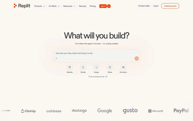
Warm, creative studio. Like paper and clay in a sunlit workbench, punctuated by a streak of vibrant orange.
Color palette
Primary call-to-action buttons, active navigation indicators, and key interactive elements – a potent focal point
Accent for small icons, decorative fills, and specific text highlights that require a deeper orange hue
Large decorative card backgrounds and graphic elements, adding a warm, inviting tone
Large decorative card backgrounds, used for higher visual impact than Soft Peach
Blue outline accent for tags, dividers, and focused UI edges. Do not promote it to the primary CTA color
Primary background for pages and larger sections, giving a warm, paper-like foundation to the UI
Background for elevated cards, active elements, and distinct content blocks, providing a crisp contrast against the Canvas
Primary body text, main headings, and significant borders. Provides strong contrast and visual weight to core content
Secondary text, subheadings, and contextual UI elements. Slightly softer than Carbon for less emphasis
Muted text, helper labels, placeholder text, and subtle borders. Used for information of lower hierarchy
Subtle borders, dividers, and ghost button outlines, providing gentle separation without harsh lines
Decorative backgrounds and subtle content dividers. Slightly darker than Canvas to provide minimal depth
Caption text and tertiary information, a slightly darker gray for smaller text sizes
Strictly for contrast-critical borders and some iconic elements
Typography
- Weights
- 400, 500
- Sizes
- 12px, 13px, 14px, 16px, 32px
- Line height
- 1.2, 1.25, 1.38, 1.5, 1.6
- Letter spacing
- normal
- Fallback
- Inter
Body text and general UI elements. Its clean, geometric form ensures readability in diverse contexts.
- Weights
- 400, 500, 600, 700
- Sizes
- 8px, 10px, 11px, 12px, 14px, 15px, 16px, 17px, 18px, 20px, 24px, 26px, 28px, 32px, 42px, 48px, 60px, 64px, 69px
- Line height
- 0.8, 0.83, 0.89, 1, 1.05, 1.1, 1.2, 1.4, 1.6
- Letter spacing
- -0.01em at 12px, -0.02em at 16px, -0.03em at 24px, -0.04em at 48px, etc.
- Fallback
- Inter Variable
Headings, display text, and emphasized UI elements. Variable font provides precise control over weight and a distinct, slightly condensed feel, especially with tight letter-spacing.
- Weights
- 400
- Sizes
- 14px
- Line height
- 1, 1.2, 1.57
- Letter spacing
- normal
- Fallback
- IBM Plex Sans
Specific utility text or code snippets, chosen for its clear, monospace-like qualities and distinct character shapes at small sizes.
Spacing & shape
Components
Filled button with 'Signal Orange' (#ff3c00) background, 'Ghost' (#ffffff) text, and a generous 'pill' (90px) border-radius. Padding is 10px vertical, 40px horizontal.
Transparent background with 'Carbon' (#0e0e0f) text and a 'Ghost' (#ffffff) border. Border-radius is 'sm' (6px) with an 8px horizontal padding, primarily used for internal navigation.
Background 'Ghost' (#ffffff) with 'Lead' (#36373b) text and 'Stone' (#dfddd8) border. 'Sm' (6px) border-radius, 8px horizontal padding, for less prominent interactions or categorization.
Background 'Ghost' (#ffffff) with '2xl' (60px) border-radius. Contains internal padding of 48px, used for presenting key functionalities.
Background can be 'Soft Peach' (#ffb199) or 'Vivid Coral' (#ff764c) with a large 'xl' or '2xl' (40px or 70px) border-radius, often with no internal padding for full-bleed graphics.
Transparent background with 'Carbon' (#0e0e0f) or 'Lead' (#36373b) text. The border color matches the text color, and border-radius is 'sm' (6px). Input has 4px vertical, 8px horizontal padding.
Guidelines
- Prioritize 'Canvas' (#faf6f1) as the primary page background to maintain the warm, receptive visual tone.
- Use 'Signal Orange' (#ff3c00) exclusively for primary calls-to-action to maximize impact and user focus.
- Apply generous border-radii: 'pill' (90px) for prominent buttons, '2xl' (60px) for key cards, and 'sm' (6px) for inputs and less prominent interactive elements.
- Employ ABC Diatype Plus Variable with tight letter-spacing (e.g., -1.92px at 48px) for all headings to create a modern, precise feel.
- Utilize 'Carbon' (#0e0e0f) for main body text and 'Ash' (#898c94) for secondary or descriptive text consistently for clear hierarchy.
- Maintain a comfortable density with an 'elementGap' of 8px and 'cardPadding' of 24px between internal block elements.
- Avoid using multiple bright accent colors; 'Signal Orange' (#ff3c00) and 'Accent Blue' (#2492ff) should be used judiciously and functionally.
- Do not introduce sharp corners or minimal border-radii; rounded shapes are a core identifier of this system.
- Refrain from heavy shadows or complex gradients; the system prefers clean surfaces and minimal elevation.
- Do not use dark backgrounds for major content sections, as the system is anchored in a light mode aesthetic.
- Avoid generic system fonts when custom fonts are specified; the unique tracking and weights of ABC Diatype are crucial to the brand's typographic identity.
- Do not rely on subtle color differences for interactive states; ensure sufficient contrast and use 'Signal Orange' for clear feedback.
About this system
ShowHide
Replit's design system evokes a playful yet powerful creative studio, featuring a bright, almost tactile off-white canvas overlaid with soft, rounded forms. Vivid orange accents punctuate the UI, highlighting active states and key actions, suggesting energy and innovation. Typography balances modern geometric sans-serifs with classic readability, often employing tight tracking for headlines to convey a sense of precision and forward momentum. Components are distinctly shaped with generous radii, ranging from slight curves to full pills, giving the interface a friendly, approachable feel despite its technical focus.
The page primarily uses a contained layout with a flexible-width content area that appears centered. The hero section often features a prominent, centered headline with a large input field, setting an immediate interaction focus. Sections alternate between full-bleed background-colored blocks (often the 'Canvas' or brand orange/pink decorative shapes) and contained white content sections. Content arrangement frequently uses a centered stack for forms and calls-to-action, transitioning to alternating image-right/text-left or feature grid patterns in subsequent sections. Spacing between major sections is generous, contributing to a comfortable, uncrowded feel. A sticky top navigation bar provides consistent access to primary links and actions.
Imagery typically features a mix of conceptual illustrations and stylized product screenshots. Illustrations are characterized by strong, simplified shapes, often in brand colors like 'Soft Peach' or 'Vivid Coral', used as large, organic background elements or contained within similarly rounded cards. Product screenshots are clean, showcasing UI in context, often with a slight perspective. Icons are outlined, simple, and mono-color, usually in 'Carbon' or 'Ash'. Imagery plays a decorative and explanatory role, often full-bleed within sections or acting as large, background shapes that define content areas, creating a fluid, almost sculptural feel.
Reminiscent of Figma, Webflow, Notion.
# replit — Style Reference
> Warm, creative studio. Like paper and clay in a sunlit workbench, punctuated by a streak of vibrant orange.

**Theme:** light

**Site:** https://replit.com

Replit's design system evokes a playful yet powerful creative studio, featuring a bright, almost tactile off-white canvas overlaid with soft, rounded forms. Vivid orange accents punctuate the UI, highlighting active states and key actions, suggesting energy and innovation. Typography balances modern geometric sans-serifs with classic readability, often employing tight tracking for headlines to convey a sense of precision and forward momentum. Components are distinctly shaped with generous radii, ranging from slight curves to full pills, giving the interface a friendly, approachable feel despite its technical focus.

## Tokens — Colors

| Name | Value | Token | Role |
|------|------|------|------|
| Signal Orange | `#ff3c00` | `--color-signal-orange` | Primary call-to-action buttons, active navigation indicators, and key interactive elements – a potent focal point |
| Deep Orange | `#ec4e02` | `--color-deep-orange` | Accent for small icons, decorative fills, and specific text highlights that require a deeper orange hue |
| Soft Peach | `#ffb199` | `--color-soft-peach` | Large decorative card backgrounds and graphic elements, adding a warm, inviting tone |
| Vivid Coral | `#ff764c` | `--color-vivid-coral` | Large decorative card backgrounds, used for higher visual impact than Soft Peach |
| Accent Blue | `#2492ff` | `--color-accent-blue` | Blue outline accent for tags, dividers, and focused UI edges. Do not promote it to the primary CTA color |
| Canvas | `#faf6f1` | `--color-canvas` | Primary background for pages and larger sections, giving a warm, paper-like foundation to the UI |
| Ghost | `#ffffff` | `--color-ghost` | Background for elevated cards, active elements, and distinct content blocks, providing a crisp contrast against the Canvas |
| Carbon | `#0e0e0f` | `--color-carbon` | Primary body text, main headings, and significant borders. Provides strong contrast and visual weight to core content |
| Lead | `#36373b` | `--color-lead` | Secondary text, subheadings, and contextual UI elements. Slightly softer than Carbon for less emphasis |
| Ash | `#898c94` | `--color-ash` | Muted text, helper labels, placeholder text, and subtle borders. Used for information of lower hierarchy |
| Stone | `#dfddd8` | `--color-stone` | Subtle borders, dividers, and ghost button outlines, providing gentle separation without harsh lines |
| Off-White Accent | `#cbc7c3` | `--color-off-white-accent` | Decorative backgrounds and subtle content dividers. Slightly darker than Canvas to provide minimal depth |
| Slate | `#52545a` | `--color-slate` | Caption text and tertiary information, a slightly darker gray for smaller text sizes |
| Black | `#000000` | `--color-black` | Strictly for contrast-critical borders and some iconic elements |

## Tokens — Typography

### ABC Diatype
- **Substitute:** Inter
- **Weights:** 400, 500
- **Sizes:** 12px, 13px, 14px, 16px, 32px
- **Line height:** 1.2, 1.25, 1.38, 1.5, 1.6
- **Letter spacing:** normal
- **Role:** Body text and general UI elements. Its clean, geometric form ensures readability in diverse contexts.

### ABC Diatype Plus Variable
- **Substitute:** Inter Variable
- **Weights:** 400, 500, 600, 700
- **Sizes:** 8px, 10px, 11px, 12px, 14px, 15px, 16px, 17px, 18px, 20px, 24px, 26px, 28px, 32px, 42px, 48px, 60px, 64px, 69px
- **Line height:** 0.8, 0.83, 0.89, 1, 1.05, 1.1, 1.2, 1.4, 1.6
- **Letter spacing:** -0.01em at 12px, -0.02em at 16px, -0.03em at 24px, -0.04em at 48px, etc.
- **Role:** Headings, display text, and emphasized UI elements. Variable font provides precise control over weight and a distinct, slightly condensed feel, especially with tight letter-spacing.

### IBM Plex Sans
- **Substitute:** IBM Plex Sans
- **Weights:** 400
- **Sizes:** 14px
- **Line height:** 1, 1.2, 1.57
- **Letter spacing:** normal
- **Role:** Specific utility text or code snippets, chosen for its clear, monospace-like qualities and distinct character shapes at small sizes.

## Tokens — Type Scale

| Role | Size | Line height | Letter spacing |
|------|------|------|------|
| body | 14px | 1.5 | -0.14px |
| body-lg | 16px | 1.4 | -0.32px |
| subheading | 24px | 1.2 | -0.72px |
| heading | 32px | 1.1 | -0.96px |
| heading-lg | 48px | 1.05 | -1.92px |
| display | 69px | 0.8 | -4.14px |

## Tokens — Spacing

- **Section gap:** 48px
- **Card padding:** 24px
- **Element gap:** 8px

## Tokens — Radius

- **2xl:** 60px
- **lg:** 20px
- **md:** 16px
- **none:** 0px
- **pill:** 90px
- **sm:** 6px
- **xl:** 40px

## Layout

The page primarily uses a contained layout with a flexible-width content area that appears centered. The hero section often features a prominent, centered headline with a large input field, setting an immediate interaction focus. Sections alternate between full-bleed background-colored blocks (often the 'Canvas' or brand orange/pink decorative shapes) and contained white content sections. Content arrangement frequently uses a centered stack for forms and calls-to-action, transitioning to alternating image-right/text-left or feature grid patterns in subsequent sections. Spacing between major sections is generous, contributing to a comfortable, uncrowded feel. A sticky top navigation bar provides consistent access to primary links and actions.

## Imagery

Imagery typically features a mix of conceptual illustrations and stylized product screenshots. Illustrations are characterized by strong, simplified shapes, often in brand colors like 'Soft Peach' or 'Vivid Coral', used as large, organic background elements or contained within similarly rounded cards. Product screenshots are clean, showcasing UI in context, often with a slight perspective. Icons are outlined, simple, and mono-color, usually in 'Carbon' or 'Ash'. Imagery plays a decorative and explanatory role, often full-bleed within sections or acting as large, background shapes that define content areas, creating a fluid, almost sculptural feel.

## Components

### Primary Action Button
*Call to action*

Filled button with 'Signal Orange' (#ff3c00) background, 'Ghost' (#ffffff) text, and a generous 'pill' (90px) border-radius. Padding is 10px vertical, 40px horizontal.

### Ghost Border Button
*Secondary action*

Transparent background with 'Carbon' (#0e0e0f) text and a 'Ghost' (#ffffff) border. Border-radius is 'sm' (6px) with an 8px horizontal padding, primarily used for internal navigation.

### Muted Border Button
*Tertiary action or filter tag*

Background 'Ghost' (#ffffff) with 'Lead' (#36373b) text and 'Stone' (#dfddd8) border. 'Sm' (6px) border-radius, 8px horizontal padding, for less prominent interactions or categorization.

### Feature Card
*Product feature display*

Background 'Ghost' (#ffffff) with '2xl' (60px) border-radius. Contains internal padding of 48px, used for presenting key functionalities.

### Decorative Section Card
*Visual content container*

Background can be 'Soft Peach' (#ffb199) or 'Vivid Coral' (#ff764c) with a large 'xl' or '2xl' (40px or 70px) border-radius, often with no internal padding for full-bleed graphics.

### Text Input
*User entry field*

Transparent background with 'Carbon' (#0e0e0f) or 'Lead' (#36373b) text. The border color matches the text color, and border-radius is 'sm' (6px). Input has 4px vertical, 8px horizontal padding.

## Guidelines

### Do

- Prioritize 'Canvas' (#faf6f1) as the primary page background to maintain the warm, receptive visual tone.
- Use 'Signal Orange' (#ff3c00) exclusively for primary calls-to-action to maximize impact and user focus.
- Apply generous border-radii: 'pill' (90px) for prominent buttons, '2xl' (60px) for key cards, and 'sm' (6px) for inputs and less prominent interactive elements.
- Employ ABC Diatype Plus Variable with tight letter-spacing (e.g., -1.92px at 48px) for all headings to create a modern, precise feel.
- Utilize 'Carbon' (#0e0e0f) for main body text and 'Ash' (#898c94) for secondary or descriptive text consistently for clear hierarchy.
- Maintain a comfortable density with an 'elementGap' of 8px and 'cardPadding' of 24px between internal block elements.

### Don't

- Avoid using multiple bright accent colors; 'Signal Orange' (#ff3c00) and 'Accent Blue' (#2492ff) should be used judiciously and functionally.
- Do not introduce sharp corners or minimal border-radii; rounded shapes are a core identifier of this system.
- Refrain from heavy shadows or complex gradients; the system prefers clean surfaces and minimal elevation.
- Do not use dark backgrounds for major content sections, as the system is anchored in a light mode aesthetic.
- Avoid generic system fonts when custom fonts are specified; the unique tracking and weights of ABC Diatype are crucial to the brand's typographic identity.
- Do not rely on subtle color differences for interactive states; ensure sufficient contrast and use 'Signal Orange' for clear feedback.

## Agent Prompt Guide

Quick Color Reference:
text: #0e0e0f
background: #faf6f1
border: #dfddd8
accent: #ff3c00
primary action: #ff3c00 (filled action)

Example Component Prompts:
1. Create a hero section with 'Canvas' (#faf6f1) background. The main heading should be 'What will you build?' using ABC Diatype Plus Variable at 69px, Carbon (#0e0e0f), with letter-spacing -4.14px. Below it, a subheading 'Turn ideas into apps in minutes' in ABC Diatype at 16px, Lead (#36373b), normal letter-spacing. Include a large 'Text Input' field with 'sm' (6px) radius.
2. Create a Primary Action Button: #ff3c00 background, #000000 text, 9999px radius, compact pill padding. Use this filled treatment for the main CTA.
3. Implement a 'Feature Card' as a 'Floating Card' (#ffffff) with '2xl' (60px) border-radius and 48px padding. The heading inside should be ABC Diatype Plus Variable at 42px, Carbon (#0e0e0f), letter-spacing -1.26px. Below it, a paragraph in ABC Diatype at 14px, Carbon (#0e0e0f), normal letter-spacing.
More like this


Keep what you find
A free account saves references to boards and can send you a weekly email of picks based on what you save.
To see every result, go Pro.