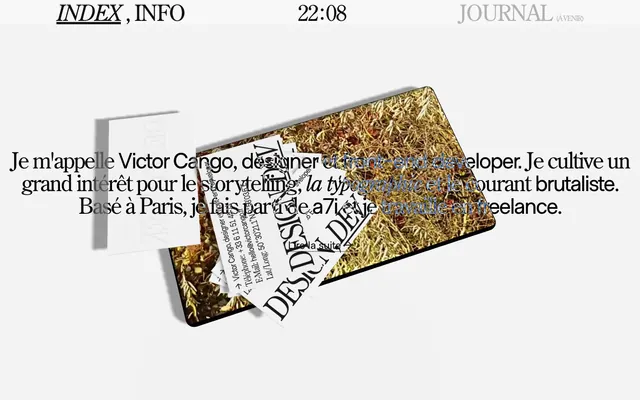
Preview image. Unlock full-res
Editorial type on stark canvas
Color palette
Dark borders and separators for elevated surfaces and inverted UI. Do not promote it to the primary CTA color
Page backgrounds, footer backgrounds — the primary light surface for all content
Typography
- Weights
- 400
- Sizes
- 16px, 21px, 50px
- Line height
- 1, 1.3
- Letter spacing
- -0.0940em at 50px, -0.0500em at 21px, normal at 16px
- Fallback
- Palatino Linotype, Georgia, serif
Hero headlines, main content headings, and larger textual elements where a distinguished, classic serif feel is desired to convey editorial weight. The subtle negative letter-spacing prevents open kerning at larger sizes.
- Weights
- 400
- Sizes
- 21px, 24px, 50px
- Line height
- 1, 1.3
- Letter spacing
- -0.0500em
- Fallback
- system-ui, 'Helvetica Neue', Arial, sans-serif
Body text, navigation items, and link text where a clean, modern sans-serif provides readability and a contemporary counterpoint to the serif headings. The consistent tight letter-spacing supports density and precision.
Spacing & shape
Components
Text in Ink Obsidian (#0f0f0f), MetroSans 400. Renders with a 1px solid Ink Obsidian underline upon hover or active state. Padding-bottom of 6px is used to separate the text from its underline.
century-old-style-std 400, 50px font size, 1.0 line height, letter-spacing -0.094em, Ink Obsidian (#0f0f0f).
MetroSans 400, 21px font size, 1.0 line height, letter-spacing -0.05em, Ink Obsidian (#0f0f0f). Typically positioned within the header bar with 4px left/right margin.
century-old-style-std 400, 16px font size, 1.3 line height, Ink Obsidian (#0f0f0f). Used for longer content blocks.
Background is Canvas Parchment (#f7f7f7), with 16px padding on all sides. Text elements use Ink Obsidian (#0f0f0f) with various typographic styles.
Guidelines
- Prioritize Ink Obsidian (#0f0f0f) for all primary text and critical UI elements against Canvas Parchment (#f7f7f7) backgrounds to ensure high contrast.
- Use century-old-style-std for expressive and editorial headlines, specifically at 50px with a letter-spacing of -0.0940em.
- Apply MetroSans for functional text elements, navigation, and body copy headings, ensuring 21px/24px sizes use -0.0500em letter-spacing.
- When creating interactive links, use Ink Obsidian (#0f0f0f) text and an Ink Obsidian (#0f0f0f) 1px underline, offset by 6px padding-bottom.
- Maintain a clear visual hierarchy by utilizing the distinct styles of century-old-style-std (serif) and MetroSans (sans-serif) purposefully.
- Structure sections with a minimum vertical separation of 48px to create comfortable density in the layout.
- Incorporate 16px padding on interior content blocks and cards to provide ample breathing room for text.
- Do not introduce new primary background or text colors; adhere strictly to Ink Obsidian (#0f0f0f) and Canvas Parchment (#f7f7f7).
- Avoid using decorative borders or drop shadows on cards or elements; rely on typography and spacing for separation.
- Do not deviate from the specified letter-spacing values for type roles, especially for larger headings and navigation where it defines the character.
- Refrain from using color to indicate interactive states; underlines and bolding in Ink Obsidian (#0f0f0f) are preferred.
- Do not use generic system fonts as substitutes for century-old-style-std or MetroSans without explicit approval, as their unique character is central.
- Avoid overly dense content blocks without sufficient element gaps; ensure 16px spacing between most adjacent UI elements.
- Do not use corner radius on any UI elements; maintain sharp, crisp edges throughout the design.
About this system
ShowHide
Victor Cango's design system cultivates a bold, editorial aesthetic with high-contrast typography as its primary visual lever. The stark achromatic palette emphasizes content, allowing the expressive serif and sans-serif typefaces to dictate hierarchy and tone. Understated interactions and minimal UI elements focus attention on the typographic compositions and carefully placed visual assets, often with a subtly distorted or layered quality. The overall impression is one of confident, art-directed communication.
The page primarily uses a contained, centered layout for content sections, set against a full-bleed Canvas Parchment background. The header is minimal, containing navigation links and a clock, with a clear separation of elements. The hero section features large, expressive typography centrally placed, often juxtaposed with abstracted graphical elements. Content sections typically flow with consistent vertical spacing (48px section gap), and text blocks maintain generous padding (16px) to enhance readability and visual impact, suggesting a content-dominant composition with artful visual accents.
This site features a blend of abstract, textural graphics, such as the prominent gold-textured card, and raw photographic elements, like physical paper with text. Imagery is often presented at an angle or partially obscured, conveying a sense of artistic arrangement and deconstruction. The overall treatment is art-directed and editorial, focusing on tactile qualities and visual intrigue rather than typical product imagery or lifestyle photography. Icons are minimal, likely text-based or simple vector underlines, emphasizing the typographic core.
Reminiscent of The Paragraph, AIGA Journal, Brutalism.com, Certain graphic design portfolio sites, Atypyk.
# Victor Cango — Style Reference
> Editorial type on stark canvas

**Theme:** light

**Site:** https://victorcango.fr

Victor Cango's design system cultivates a bold, editorial aesthetic with high-contrast typography as its primary visual lever. The stark achromatic palette emphasizes content, allowing the expressive serif and sans-serif typefaces to dictate hierarchy and tone. Understated interactions and minimal UI elements focus attention on the typographic compositions and carefully placed visual assets, often with a subtly distorted or layered quality. The overall impression is one of confident, art-directed communication.

## Tokens — Colors

| Name | Value | Token | Role |
|------|------|------|------|
| Ink Obsidian | `#0f0f0f` | `--color-ink-obsidian` | Dark borders and separators for elevated surfaces and inverted UI. Do not promote it to the primary CTA color |
| Canvas Parchment | `#f7f7f7` | `--color-canvas-parchment` | Page backgrounds, footer backgrounds — the primary light surface for all content |

## Tokens — Typography

### century-old-style-std
- **Substitute:** Palatino Linotype, Georgia, serif
- **Weights:** 400
- **Sizes:** 16px, 21px, 50px
- **Line height:** 1, 1.3
- **Letter spacing:** -0.0940em at 50px, -0.0500em at 21px, normal at 16px
- **Role:** Hero headlines, main content headings, and larger textual elements where a distinguished, classic serif feel is desired to convey editorial weight. The subtle negative letter-spacing prevents open kerning at larger sizes.

### MetroSans
- **Substitute:** system-ui, 'Helvetica Neue', Arial, sans-serif
- **Weights:** 400
- **Sizes:** 21px, 24px, 50px
- **Line height:** 1, 1.3
- **Letter spacing:** -0.0500em
- **Role:** Body text, navigation items, and link text where a clean, modern sans-serif provides readability and a contemporary counterpoint to the serif headings. The consistent tight letter-spacing supports density and precision.

## Tokens — Type Scale

| Role | Size | Line height | Letter spacing |
|------|------|------|------|
| body | 16px | 1.3 | — |
| subheading | 21px | 1.3 | -0.05em |
| heading | 24px | 1 | — |
| display | 50px | 1 | -0.094em |

## Tokens — Spacing

- **Section gap:** 48px
- **Card padding:** 16px
- **Element gap:** 16px

## Tokens — Radius

- **Default:** 0px

## Layout

The page primarily uses a contained, centered layout for content sections, set against a full-bleed Canvas Parchment background. The header is minimal, containing navigation links and a clock, with a clear separation of elements. The hero section features large, expressive typography centrally placed, often juxtaposed with abstracted graphical elements. Content sections typically flow with consistent vertical spacing (48px section gap), and text blocks maintain generous padding (16px) to enhance readability and visual impact, suggesting a content-dominant composition with artful visual accents.

## Imagery

This site features a blend of abstract, textural graphics, such as the prominent gold-textured card, and raw photographic elements, like physical paper with text. Imagery is often presented at an angle or partially obscured, conveying a sense of artistic arrangement and deconstruction. The overall treatment is art-directed and editorial, focusing on tactile qualities and visual intrigue rather than typical product imagery or lifestyle photography. Icons are minimal, likely text-based or simple vector underlines, emphasizing the typographic core.

## Components

### Navigation Link - Underlined
*Interactive text link, primarily for navigation.*

Text in Ink Obsidian (#0f0f0f), MetroSans 400. Renders with a 1px solid Ink Obsidian underline upon hover or active state. Padding-bottom of 6px is used to separate the text from its underline.

### Hero Headline
*Primary page title or major section heading.*

century-old-style-std 400, 50px font size, 1.0 line height, letter-spacing -0.094em, Ink Obsidian (#0f0f0f).

### Header Clock
*Decorative time display in the header.*

MetroSans 400, 21px font size, 1.0 line height, letter-spacing -0.05em, Ink Obsidian (#0f0f0f). Typically positioned within the header bar with 4px left/right margin.

### Body Text Paragraph
*General informational text.*

century-old-style-std 400, 16px font size, 1.3 line height, Ink Obsidian (#0f0f0f). Used for longer content blocks.

### Footer Section
*Container for copyright, contact info, and secondary navigation.*

Background is Canvas Parchment (#f7f7f7), with 16px padding on all sides. Text elements use Ink Obsidian (#0f0f0f) with various typographic styles.

## Guidelines

### Do

- Prioritize Ink Obsidian (#0f0f0f) for all primary text and critical UI elements against Canvas Parchment (#f7f7f7) backgrounds to ensure high contrast.
- Use century-old-style-std for expressive and editorial headlines, specifically at 50px with a letter-spacing of -0.0940em.
- Apply MetroSans for functional text elements, navigation, and body copy headings, ensuring 21px/24px sizes use -0.0500em letter-spacing.
- When creating interactive links, use Ink Obsidian (#0f0f0f) text and an Ink Obsidian (#0f0f0f) 1px underline, offset by 6px padding-bottom.
- Maintain a clear visual hierarchy by utilizing the distinct styles of century-old-style-std (serif) and MetroSans (sans-serif) purposefully.
- Structure sections with a minimum vertical separation of 48px to create comfortable density in the layout.
- Incorporate 16px padding on interior content blocks and cards to provide ample breathing room for text.

### Don't

- Do not introduce new primary background or text colors; adhere strictly to Ink Obsidian (#0f0f0f) and Canvas Parchment (#f7f7f7).
- Avoid using decorative borders or drop shadows on cards or elements; rely on typography and spacing for separation.
- Do not deviate from the specified letter-spacing values for type roles, especially for larger headings and navigation where it defines the character.
- Refrain from using color to indicate interactive states; underlines and bolding in Ink Obsidian (#0f0f0f) are preferred.
- Do not use generic system fonts as substitutes for century-old-style-std or MetroSans without explicit approval, as their unique character is central.
- Avoid overly dense content blocks without sufficient element gaps; ensure 16px spacing between most adjacent UI elements.
- Do not use corner radius on any UI elements; maintain sharp, crisp edges throughout the design.

## Agent Prompt Guide

Quick Color Reference:
- text: #0f0f0f
- background: #f7f7f7
- border: #0f0f0f
- accent: no distinct accent color
- primary action: no distinct CTA color

Example Component Prompts:
- Create a site header: Canvas Parchment background (#f7f7f7). Left aligned navigation link 'INDEX' (MetroSans 400, 21px, #0f0f0f, 6px padding-bottom for underline effect) next to 'INFO' (same style), centered clock '22:08' (MetroSans 400, 21px, #0f0f0f), right aligned 'JOURNAL' (MetroSans 400, 21px, #0f0f0f).
- Create a hero section with main headline: Canvas Parchment background (#f7f7f7). Centered headline 'Je m'appelle Victor Cango' (century-old-style-std 400, 50px, #0f0f0f, letter-spacing -0.094em). Below it, a paragraph 'Je cultive un grand intérêt pour le storytelling, la typographie et le courant brutaliste.' (century-old-style-std 400, 16px, #0f0f0f, 1.3 line height).
- Create a text link: Text 'Lire la suite' (MetroSans 400, 21px, #0f0f0f). Apply a 1px solid #0f0f0f underline with 6px padding-bottom on hover, and 48px margin-bottom below the link.
- Create a footer: Canvas Parchment background (#f7f7f7) with 16px padding on all sides. Include a list of text links using MetroSans 400, 16px, #0f0f0f, separated by 16px element gap.
More like this









Keep what you find
A free account saves references to boards and can send you a weekly email of picks based on what you save.
To see every result, go Pro.