Preview image. Unlock full-res
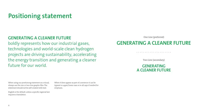
A positioning-statement page setting the tagline in green, with one-line preferred and two-line secondary lockups separated by a dotted divider.
Summary
The positioning-statement page, presenting the GENERATING A CLEANER FUTURE tagline in green with approved one-line and two-line lockups and rules for using it.
Visual description
On the left, a green headline GENERATING A CLEANER FUTURE leads into a large green explanatory paragraph, with two small gray serif usage notes set at the bottom in two columns. On the right, two approved lockups are stacked and centered: One Line (preferred) shows the tagline on a single green all-caps line, and below a dotted horizontal divider, Two Line (secondary) shows it broken across two green lines. The page is white with generous space around both lockups.
Key takeaway
Showing the tagline as locked graphic files, preferred versus secondary, separated by a literal dotted divider, makes the hierarchy unmistakable. Pairing the bold green statement with small neutral gray usage notes keeps rules legible without competing with the hero treatment.
Reuse notes
A clean model for any tagline or positioning page: state it big, then show the exact approved lockups. The instruction to use supplied graphic files rather than self-set text is a good governance note worth copying. Keep the lockups in the single brand color.
From this deck: Positioning statement, one-line and two-line lockups
View deck



More like this



Keep what you find
A free account saves references to boards and can send you a weekly email of picks based on what you save.
To see every result, go Pro.