Preview image. Unlock full-res
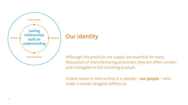
An our-identity page with an orange headline and body set entirely in orange, beside a concentric-circle diagram about lasting relationships built on understanding.
Summary
An identity page arguing that people, not the unseen products, make the visible difference, paired with a concentric-circle diagram on relationships built on understanding.
Visual description
The left side holds a diagram: a blue outer ring and a green inner ring, with the centered blue text Lasting relationships built on understanding, and orange nodes labeled Environment, Behavior, Communication, and Product. The right column leads with an orange Our identity headline, followed by two large paragraphs set in the same orange sans-serif, with a few words bolded for emphasis. The page is otherwise pure white with wide margins and a small bottom-left page number.
Key takeaway
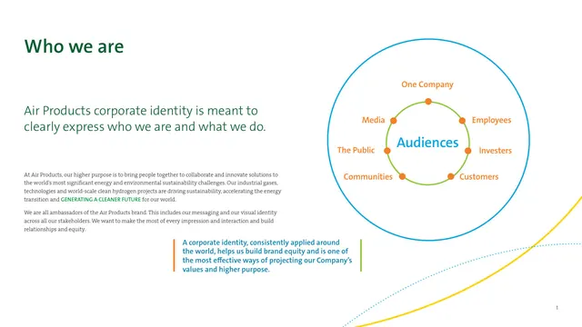
Setting an entire copy block in a brand accent color, not just the headline, is a bold monochrome move that makes a single page feel like a statement. The four-node ring reuses the same diagram grammar as the previous spread, showing how one diagram system flexes across pages.
Reuse notes
Good for a vision or values page that needs emphasis without imagery. Full-color body copy reads best in short, large blocks like this; it would tire the eye at small sizes or long lengths. Reusing the nested-ring diagram keeps the deck visually consistent.
From this deck: Our identity, understanding diagram
View deck



More like this



Keep what you find
A free account saves references to boards and can send you a weekly email of picks based on what you save.
To see every result, go Pro.