Preview image. Unlock full-res
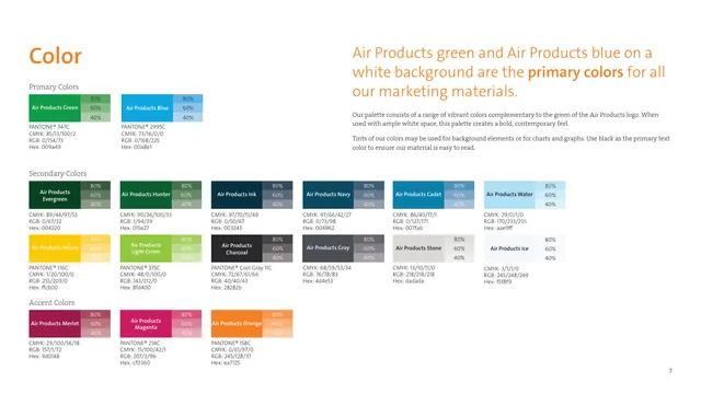
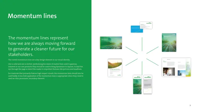
A green-panel spread introducing the curved momentum lines, with a radiating constellation of applied collateral mockups on the right.
Summary
The page that defines the brand's signature momentum lines, one solid and one dotted curve symbolizing states of matter, alongside a fan of collateral examples showing the device in use.
Visual description
A solid green panel fills the left half, carrying a white Momentum lines headline and several white body paragraphs that explain the curved lines as a key design element, with one solid and one dotted line representing the shift from solid to gaseous matter. The right half, on white, arranges roughly eight pieces of collateral, business cards, presentation covers, brochures, a banner, and an interior spread, radiating outward from a center point, connected by faint green lines like spokes. Each mockup shows the momentum-line curves applied over photography and green fields. A page number sits bottom-right.
Key takeaway
Grounding an abstract graphic device in a concrete rationale (solid plus dotted equals solid-to-gas) gives it meaning and makes it defensible. The radiating spoke layout of applied pieces is an energetic way to show one device flexing across many formats from a single hub.
Reuse notes
The core reference for this brand's most ownable asset. Any brand introducing a signature line, shape, or pattern can copy this structure: explain the idea on a color panel, then prove versatility with a constellation of real applications. The half-panel split keeps rationale and evidence cleanly separated.
From this deck: Momentum lines, signature curved graphic device
View deck





More like this








Keep what you find
A free account saves references to boards and can send you a weekly email of picks based on what you save.
To see every result, go Pro.