Preview image. Unlock full-res
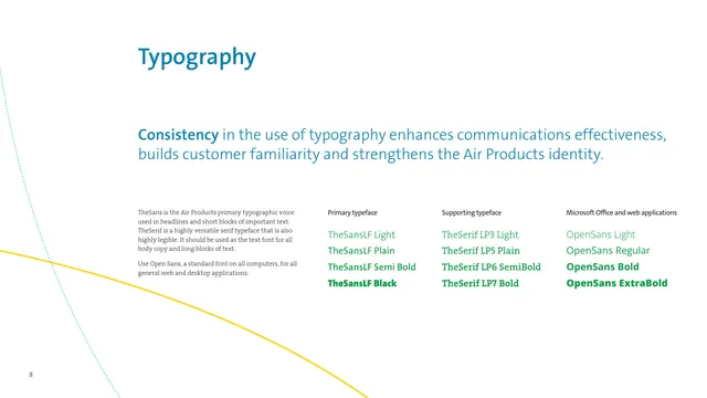
The typography page specifying TheSans as the primary voice, TheSerif as the supporting text face, and Open Sans for Office and web, each shown as a weight ladder.
Summary
The typography system: TheSans as the primary headline face, TheSerif as the supporting body face, and Open Sans as the Office and web fallback, each presented as a four-weight ladder.
Visual description
A blue Typography headline sits at upper-left, with a large blue sans-serif lead statement about consistency spanning the width below it. Three labeled specimen columns follow: Primary typeface shows TheSansLF in Light, Plain, Semi Bold, and Black; Supporting typeface shows TheSerif LP3 Light through LP7 Bold; and Microsoft Office and web applications shows Open Sans Light, Regular, Bold, and ExtraBold. Each specimen line is set in green except the heaviest weight, which is bold green. A small gray serif note sits left of the specimens. The brand momentum lines, a solid yellow curve and a dotted blue curve, sweep across the lower-left corner.
Key takeaway
Splitting the type system into three clearly labeled roles, brand primary, brand supporting, and a universally available fallback, pre-empts the question of what to use when fonts are unavailable. Showing each as a weight ladder in the brand color doubles as a live specimen.
Reuse notes
A practical typography page for brands that license custom fonts but need an Office-safe substitute. The three-column primary / supporting / system layout is directly reusable. Carrying the momentum lines into the corner keeps the page on-brand without imagery.
From this deck: Typography, TheSans, TheSerif and Open Sans
View deck



More like this






Keep what you find
A free account saves references to boards and can send you a weekly email of picks based on what you save.
To see every result, go Pro.