Preview image. Unlock full-res
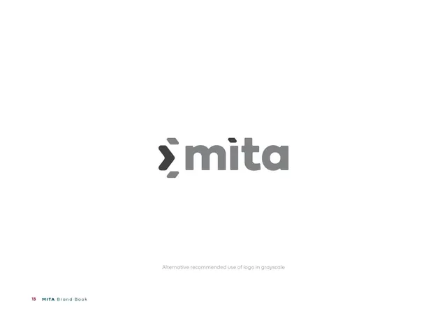
Logo-variations page showing the grayscale logo on white as the alternative recommended use.
Summary
The third "Logo Variations" page: the logo in grayscale on white, captioned as the alternative recommended use in grayscale.
Visual description
A white page. The logo is shown centered in grayscale: a near-black chevron and a medium-gray "mita" wordmark, preserving the two-tone contrast of the colour version but desaturated. A small gray caption reads "Alternative recommended use of logo in grayscale". Footer: "13 MITA Brand Book".
Key takeaway
Carrying the colour version's tonal contrast into grayscale (dark symbol, mid-gray wordmark) keeps the mark recognisable in single-colour print. Showing it as its own approved variation pre-empts bad ad-hoc conversions.
Reuse notes
Third in the variation set; the version for mono printing, faxes, engraving, or single-colour collateral on light stock. Pair with the dark-grayscale page that follows. Same centered layout throughout the set.
From this deck: Logo Variations (grayscale on light)
View deck








More like this







Keep what you find
A free account saves references to boards and can send you a weekly email of picks based on what you save.
To see every result, go Pro.