Preview image. Unlock full-res
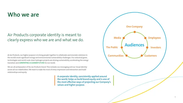
A who-we-are spread pairing a green headline and serif body with a concentric-circle Audiences diagram and the brand momentum lines in a corner.
Summary
A who-we-are page that states the purpose of the corporate identity, supported by a concentric-circle diagram mapping the company's audiences and a corner flourish of the brand momentum lines.
Visual description
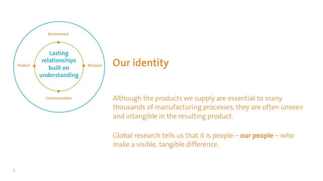
The left column carries an oversized dark-green Who we are headline, a blue sans-serif subhead, two serif body paragraphs, and a blue pull-quote marked by short orange and green vertical accent bars. The right side holds a diagram: a large blue ring labeled Audiences encloses a smaller green ring, with orange dots and labels (One Company, Employees, Investors, Customers, Communities, The Public, Media) ringing the structure. In the bottom-right corner, the signature curved momentum lines, one solid yellow and one dotted blue, sweep up off the edge. A small page number sits bottom-right.
Key takeaway
The concentric-circle audience map is a tidy way to show stakeholder hierarchy in two nested rings with labeled nodes. The orange-and-green accent bars marking the pull-quote are a small, reusable typographic signal. The momentum lines peeking into one corner brand the page without competing with content.
Reuse notes
Useful template for an about or stakeholder page in any corporate guideline. The nested-ring diagram scales to any set of audiences or values; keep the node count modest so labels stay legible. Pairs the serif body with a sans headline to separate voice from structure.