Preview image. Unlock full-res
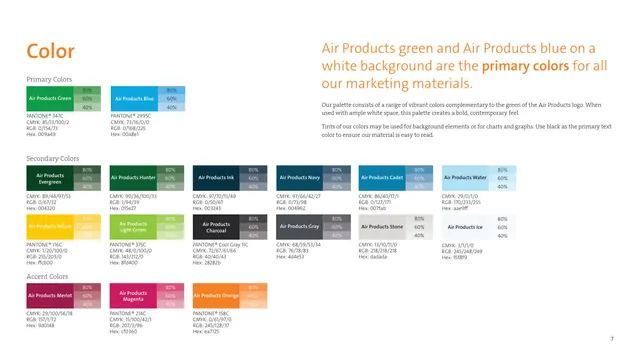
The color page laying out primary green and blue plus a wide secondary and accent range, each swatch shown with 80/60/40 tints and full Pantone, CMYK, RGB and hex specs.
Summary
The full color system: two primary brand colors, a broad secondary range, and three accent colors, each presented as a labeled swatch with 80/60/40 percent tints and complete print and screen values.
Visual description
An orange Color headline sits top-left with a right-hand intro block (orange headline, gray serif body) explaining that green and blue on white are primary. Below, swatches are arranged in labeled rows. Primary Colors shows Air Products Green and Air Products Blue. Secondary Colors runs two rows of swatches including Evergreen, Hunter, Ink, Navy, Cadet, Water, Yellow, Light Green, Charcoal, Gray, Stone, and Ice. Accent Colors shows Merlot, Magenta, and Orange. Each swatch carries a small 80/60/40 tint strip on its right edge and a caption listing Pantone, CMYK, RGB, and hex. The layout is dense but orderly on white.
Key takeaway
Attaching an 80/60/40 tint strip directly to every swatch, with all four color systems (Pantone, CMYK, RGB, hex) in the caption, is a complete and copyable spec format. Grouping into primary, secondary, and accent tiers communicates usage hierarchy at a glance.
Reuse notes
A reference-grade color page for any brand guideline. The per-swatch tint ladder is the move to reuse; it pre-answers how to make backgrounds and chart fills. A palette this large needs the strict grid and white space shown here to stay scannable.
From this deck: Color, primary, secondary and accent palette
View deck







More like this






Keep what you find
A free account saves references to boards and can send you a weekly email of picks based on what you save.
To see every result, go Pro.