Preview image. Unlock full-res
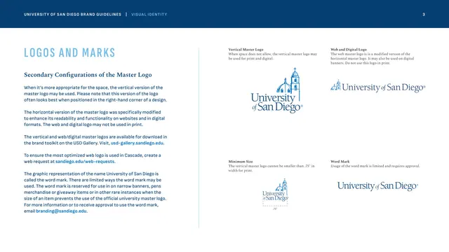
Vertical master logo, web and digital logo, minimum size and word mark shown in a four-quadrant grid beside usage text.
Summary
A continuation of Logos and Marks showing the alternative master-logo lockups: vertical, web/digital, word mark, and a vertical minimum-size diagram, arranged as a four-quadrant grid.
Visual description
Left column repeats "LOGOS AND MARKS" (Founders Blue caps) under a "Secondary Configurations of the Master Logo" Spectral subhead, with body copy on when to use the vertical version, the modified web/digital logo, and the limited word-mark usage, including two bright-blue email and request links. The right two-thirds is a four-cell grid, each cell with a small bold caption: top-left the stacked vertical master logo (Immaculata above a two-line wordmark); top-right the web and digital logo (smaller church, wider wordmark); bottom-left a "Minimum Size" vertical lockup dimensioned at .75"; bottom-right the standalone "University of San Diego" word mark with no church icon.
Key takeaway
Presenting every approved lockup variant in an even captioned grid makes the system legible at a glance and signals that these are the only sanctioned forms. Splitting print-only from web-only logos with explicit captions prevents the most common misuse.
Reuse notes
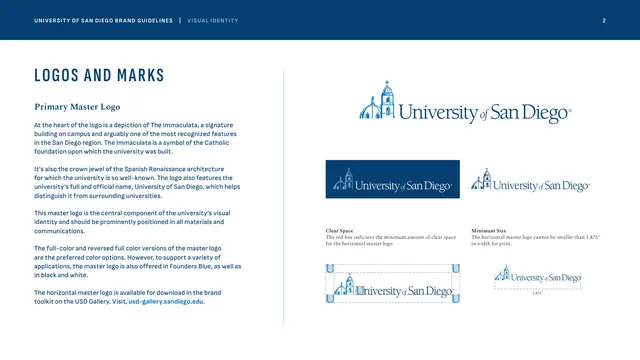
Reach for this when a brand has multiple orientation and channel-specific lockups to document compactly. The labeled grid keeps print versus digital rules unambiguous. Pairs directly with the preceding primary-logo page.
From this deck: Secondary master-logo configurations
View deck

More like this






Keep what you find
A free account saves references to boards and can send you a weekly email of picks based on what you save.
To see every result, go Pro.