Preview image. Unlock full-res
Full-bleed red section divider with the chapter title 1.0 LOGO set small in black at top-left.
Summary
A chapter-opening divider: an all-red page with the section title 1.0 LOGO set small in black in the top-left corner.
Visual description
The entire frame is filled with the brand warm red. The only element is the chapter label 1.0 LOGO in black, set in the condensed all-caps display face at a modest size, locked to the top-left corner. No imagery, no decoration; the saturated field itself does the work of marking a new section.
Key takeaway
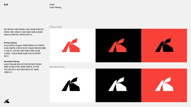
Using a single saturated color field plus a small corner title as a chapter break. The restraint resets the reader's eye between dense content sections and reinforces the core brand color.
Reuse notes
A reusable divider pattern for any multi-section guideline or report. Rotating the field color per chapter (here red, black and red again) could code each section while keeping the same minimal layout.