Preview image. Unlock full-res
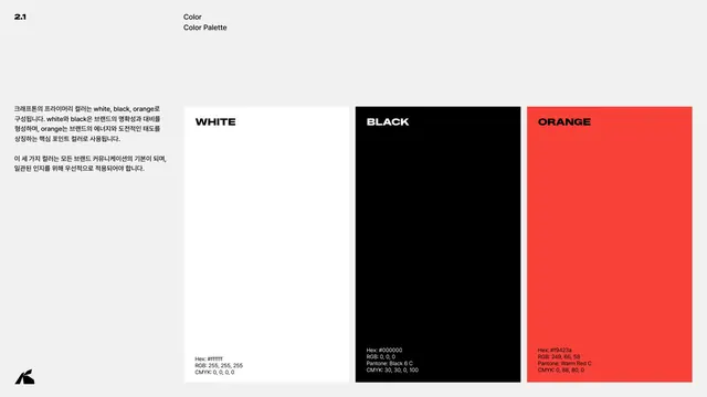
Primary palette page showing white, black and orange-red swatches as tall columns with full hex, RGB, Pantone and CMYK values.
Summary
The primary color palette: three tall swatch columns (white, black, orange-red) each annotated with full color values.
Visual description
Light grey page, header 2.1 / Color / Color Palette. A left Korean column states the primary colors are white, black and orange, with white and black providing clarity and contrast and orange the brand's energy accent. Three large vertical swatch panels fill the right side. WHITE: Hex #ffffff, RGB 255,255,255, CMYK 0,0,0,0. BLACK: Hex #000000, RGB 0,0,0, Pantone Black 6 C, CMYK 30,30,0,100. ORANGE: Hex #f9423a, RGB 249,66,58, Pantone Warm Red C, CMYK 0,88,80,0. Each label sits at the swatch top and its values at the bottom.
Key takeaway
A radically tight three-color palette presented as bold full-height columns, with every color given complete cross-media values (hex, RGB, Pantone, CMYK). Naming the warm red simply ORANGE shows internal brand language can override the literal color name.
Reuse notes
The gold-standard swatch page: one panel per color, all values present, including Pantone for print. A three-color system this disciplined is a strong model for brands that want maximum recognition from minimum palette.
From this deck: Color palette
View deck











More like this







Keep what you find
A free account saves references to boards and can send you a weekly email of picks based on what you save.
To see every result, go Pro.