
Preview image. Unlock full-res
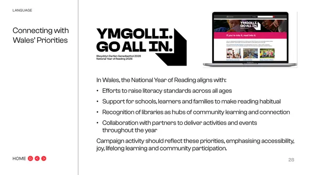
Red section divider introducing the Wales' Priorities chapter with big black title type and a soft angled corner shape.
Summary
The chapter break for Connecting with Wales' Priorities: a bold red field with a soft pink angled corner and the title in big black type.
Visual description
The page is mostly the signature bright red, with a paler pink angled wedge cutting into the bottom-right corner along the brand's chevron geometry. The two-line title "Connecting with Wales' Priorities" is set large and bold in black, left-aligned in the lower-middle. "HOME" nav bottom-left (here the pills read more subtly), faint page number "27" bottom-right. No body copy.
Key takeaway
Bringing the divider system back to the brand's hero red for a strategically important chapter ties the section to the master colour. The single soft corner is a quieter variant of the angled cut.
Reuse notes
Reuse as a chapter break; using the lead brand colour (red) for the most policy-relevant section is a subtle hierarchy cue among otherwise equal-weight dividers.
From this deck: Connecting with Wales' Priorities section divider
View deck










More like this









Keep what you find
A free account saves references to boards and can send you a weekly email of picks based on what you save.
To see every result, go Pro.