Preview image. Unlock full-res
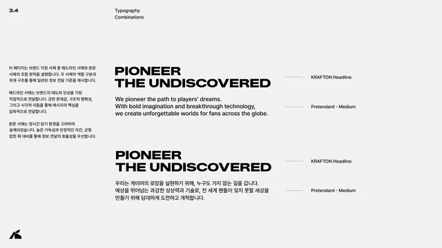
Page showing how the KRAFTON Headline face and Pretendard body pair in a headline-plus-paragraph layout, in English and Korean.
Summary
The type-combination page: a worked headline-plus-body example pairing KRAFTON Headline with Pretendard Medium, shown once in English and once in Korean.
Visual description
Light grey page, header 3.4 / Typography / Combinations. The left Korean column explains the pairing principle: the headline face carries the brand's attitude with strong presence and structural clarity, while the body face is built for sustained reading. The right side stacks two example blocks. Each pairs a two-line all-caps headline (PIONEER / THE UNDISCOVERED) in KRAFTON Headline with a three-line paragraph in Pretendard Medium, the first in English (We pioneer the path to players' dreams...) and the second in Korean. Thin leader lines on the far right label each element as KRAFTON Headline or Pretendard - Medium.
Key takeaway
Demonstrating the headline-to-body relationship with a real slogan and paragraph rather than lorem ipsum, and annotating each part with leader lines naming the exact face and weight. Repeating the same content in two languages proves the pairing holds bilingually.
Reuse notes
The most useful typography page for downstream designers: it shows the system in use, not just in isolation. Always annotate which face and weight does which job, and provide a bilingual example if the brand operates in more than one language.
From this deck: Typography combinations
View deck




More like this






Keep what you find
A free account saves references to boards and can send you a weekly email of picks based on what you save.
To see every result, go Pro.