Preview image. Unlock full-res
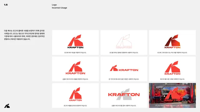
A nine-up grid of prohibited logo treatments, each red K lockup shown misused with a Korean caption.
Summary
The misuse page: a three-by-three grid of forbidden logo treatments, each captioned in Korean with a do-not instruction.
Visual description
Light grey page, header 1.5 / Logo / Incorrect Usage. A short Korean intro at left states the logo must always follow the defined form. The right side is a nine-cell grid of white tiles (the last cell a photographic tile), each showing the vertical lockup violated a different way: multiple colors on one mark, an outlined version, gradient or texture fill, altered symbol-to-wordmark proportion, an unapproved combination, the wordmark swapped to another typeface, arbitrarily re-proportioned, symbol and wordmark overlapped, and placed over a busy photographic background. Each tile carries a one-line Korean caption.
Key takeaway
Packing many distinct prohibitions into one tidy grid, each with a single concrete caption, so the rules are exhaustive but scannable. Ending with a real busy-background photo tile drives home the legibility point better than an abstract example.
Reuse notes
A comprehensive do-not page. Mirror each prohibition to a corresponding allowed behavior elsewhere in the book. The nine-up grid scales cleanly; drop or add cells per the number of real misuse risks.
From this deck: Logo incorrect usage
View deck




More like this








Keep what you find
A free account saves references to boards and can send you a weekly email of picks based on what you save.
To see every result, go Pro.