Preview image. Unlock full-res
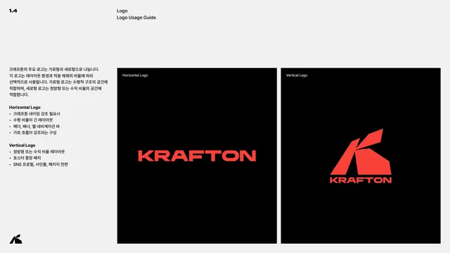
Page comparing the horizontal and vertical logos side by side with bulleted guidance on when to use each.
Summary
A usage-decision page that places the horizontal and vertical logos on two black panels and lists, in Korean, when to choose each.
Visual description
Light grey page, header 1.4 / Logo / Logo Usage Guide. The left Korean column explains that the primary logo splits into horizontal and vertical forms chosen by layout and medium ratio, then gives two bullet lists. Under Horizontal Logo: when emphasizing the KRAFTON name, for wide horizontal layouts, headers, banners and web nav bars. Under Vertical Logo: for square or vertical layouts, centered poster placement, SNS profiles, signage and package fronts. Two black panels at right show the horizontal wordmark (left) and the stacked vertical lockup (right), each labeled.
Key takeaway
Turning lockup selection into an explicit, side-by-side comparison with concrete context bullets rather than abstract rules. Seeing both forms next to their use cases removes guesswork for downstream designers.
Reuse notes
Add a usage-guide page whenever a system ships more than one lockup. Frame the choice around real contexts (header vs avatar, banner vs poster) so non-designers can pick correctly.
From this deck: Logo usage guide
View deck
More like this
Keep what you find
A free account saves references to boards and can send you a weekly email of picks based on what you save.
To see every result, go Pro.