Preview image. Unlock full-res
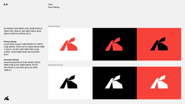
Page defining primary and secondary color pairings of the K logomark across white, black and red backgrounds in a two-by-three grid.
Summary
The color-pairing page: the K logomark shown in approved foreground-on-background combinations, split into primary (with red) and secondary (black and white only) rows.
Visual description
Light grey page, header 2.2 / Color / Color Pairing. The left Korean column explains pairing logic and distinguishes Primary Pairing (combinations including the accent orange, for energetic content) from Secondary Pairing (white and black only, for stable, official communication). The right side is a two-by-three grid. Primary Pairing row: red K on white, red K on black, black K on red. Secondary Pairing row: black K on white, white K on black, white K on red. Each cell is a full-bleed color tile holding the faceted K.
Key takeaway
Codifying exactly which mark-color-on-background-color combinations are allowed, and grouping them by intent (energetic primary vs stable secondary). The grid makes legal contrast pairings instantly clear and rules out weak or low-contrast ones.
Reuse notes
A practical pairing matrix for any small palette. Splitting combinations into accent-led and neutral-led groups guides tone as well as legibility. Reuse the grid format so each new background is vetted against the mark in one glance.
From this deck: Color pairing
View deck








More like this






Keep what you find
A free account saves references to boards and can send you a weekly email of picks based on what you save.
To see every result, go Pro.