Preview image. Unlock full-res
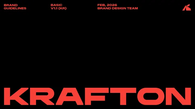
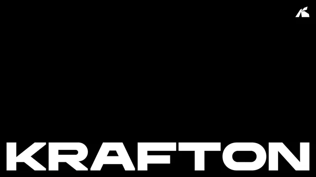
Black cover with a giant red KRAFTON wordmark across the bottom and red metadata labels along the top.
Summary
The deck cover: a near-empty black field anchored by an oversized red KRAFTON wordmark that bleeds off both edges along the bottom.
Visual description
Pure black background. Three short red metadata blocks run across the top in a small condensed all-caps face: BRAND / GUIDELINES, BASIC / V1.1 (KR), and FEB, 2026 / BRAND DESIGN TEAM. The faceted red K-shard logomark sits in the top-right corner. The lower third is dominated by the word KRAFTON in the custom extended condensed display face, set in warm red and scaled so the K and N nearly touch the canvas edges. The vast empty middle gives the wordmark maximum weight.
Key takeaway
Letting a single oversized wordmark, cropped at both edges, carry an otherwise empty cover. The cluster of tiny structured metadata up top balances the giant type below without competing with it.
Reuse notes
A confident title-page formula for any bold brand book or report: type as the only hero, framed by small functional labels. Works only on a dark ground with a wordmark strong enough to hold the weight.
From this deck: KRAFTON guidelines cover
View deck




More like this






Keep what you find
A free account saves references to boards and can send you a weekly email of picks based on what you save.
To see every result, go Pro.