
Preview image. Unlock full-res
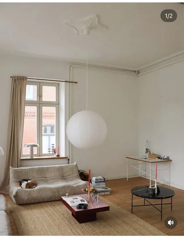
A curated palette of warm, muted earth tones demonstrating color harmony and versatility for design application.
Summary
A carefully selected palette of warm, earthy, muted colors shown in sample swatches, demonstrating color relationships and potential design applications.
Visual description
Multiple color swatches arranged in a grid or linear format, each showing a distinct warm, muted tone. Colors range from warm whites and beiges through browns and warm grays. The palette appears cohesive—colors relate to each other harmoniously, suggesting they were selected together for a design system or brand. The presentation is clean, with each color given equal visual weight and space to be evaluated independently and in relation to others.
Key takeaway
Warm, muted color palettes feel sophisticated and natural. Colors in this family work well together because they share warm undertones. This palette is versatile—suitable for both contemporary and heritage brands. Restraint in saturation creates elegance without coldness.
Reuse notes
Perfect reference for brands seeking an earthy, warm, premium aesthetic. Works well for fashion, home design, food/beverage, or lifestyle brands. The palette's natural quality makes it adaptable across industries. These colors photograph well in lifestyle imagery and pair excellently with natural materials and textures. Consider for sustainable/eco-conscious brands, rustic design, or heritage contexts where warmth and authenticity matter.
More like this








Keep what you find
A free account saves references to boards and can send you a weekly email of picks based on what you save.
To see every result, go Pro.