Preview image. Unlock full-res
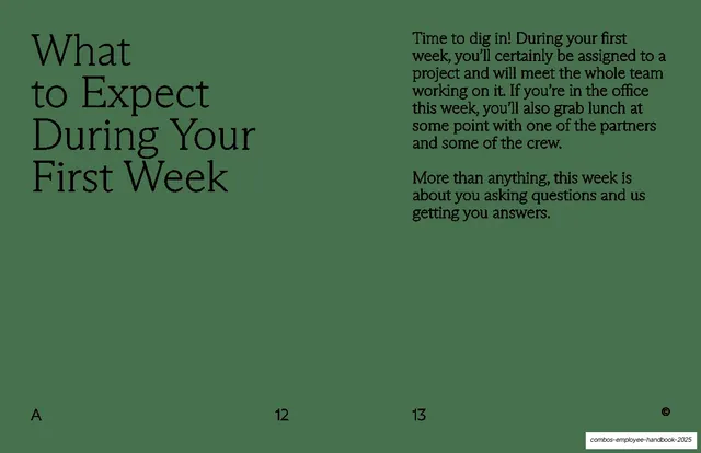
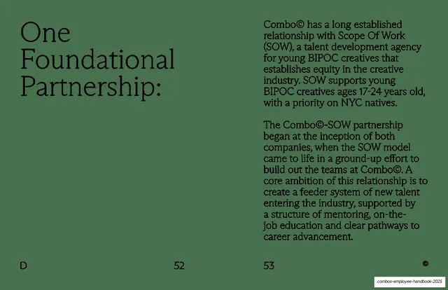
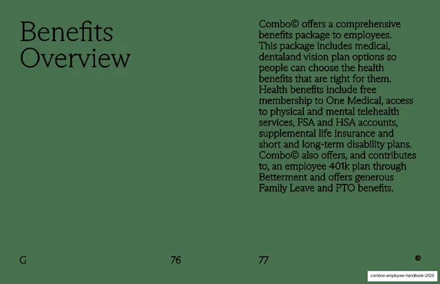
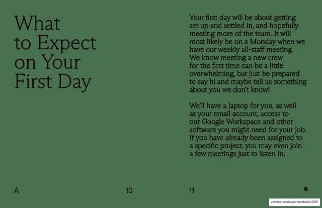
Green text spread with an oversized serif "What to Expect on Your First Day" headline left and two body paragraphs in a slab serif on the right.
Summary
A sage-green content spread: a big serif headline on the left, two columns-worth of warm body copy on the right explaining the first-day experience.
Visual description
Full-bleed muted sage-green background with all type in near-black. The left page carries the headline "What to Expect on Your First Day" in a light humanist serif across four lines. The right page holds two body paragraphs set in a narrower, slab-ish serif, ragged right, describing getting set up and meeting the team. Section letter "A" bottom-left, page numbers "10" and "11", circled-© bottom-right. Generous empty space below the right column.
Key takeaway
The fixed headline-left / body-right grammar on a saturated single color, with two distinct serifs (an airy display serif for the headline, a sturdier text serif for the body) doing the hierarchy instead of size alone. The green ground makes a plain text page feel designed.
Reuse notes
The workhorse content layout for this handbook and a clean template for any text-heavy internal doc. Reach for it when copy must stay readable but the page should not look like a Word document. The two-serif pairing is the load-bearing move; on a single typeface it loses its character.
From this deck: What to Expect on Your First Day
View deck