Preview image. Unlock full-res
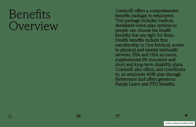
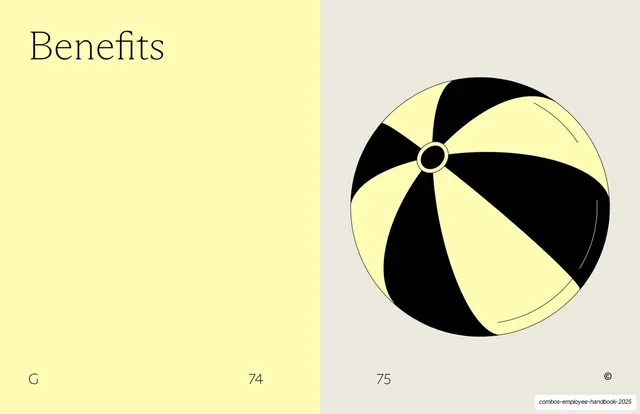
Two-panel section divider for "Benefits," a pale-yellow text panel beside a grey panel holding a black-and-yellow beach-ball line illustration.
Summary
A section-opening spread for the Benefits chapter: a pale-yellow left panel carrying only the word "Benefits" in serif type, paired with a grey right panel holding a single black-and-yellow beach-ball illustration.
Visual description
The slide is split into two equal vertical panels. The left panel is pale lemon-yellow, with the heading "Benefits" set in a fine, high-contrast serif at the top-left and otherwise empty. The right panel is warm light grey and centers a large line-drawn beach ball with alternating black and pale-yellow segments, a small ringed cap at the pole, and thin curved highlight strokes suggesting gloss. Both panels carry footer marginalia in small serif type: a letter "G" bottom-left and the page number "74" near the panel seam on the left, "75" at the panel seam on the right, and a small circled-C mark in the bottom-right corner. Generous empty space dominates both halves.
Key takeaway
Using a two-tone split panel as a chapter divider, where one side carries a single oversized word and the other a single illustrated object. The playful beach-ball line illustration warms up an otherwise austere serif-and-whitespace system without breaking it.
Reuse notes
A clean pattern for section breaks in a long handbook, report, or brand book, where you want a beat of rest and a visual motif rather than dense content. Works best as part of a recurring system: a matched object illustration per section plus consistent footer page numbering. The book-style "G / 74 / 75" marginalia signals an editorial, printed-document feel.
From this deck: Benefits section divider with beach-ball illustration
View deck