Preview image. Unlock full-res
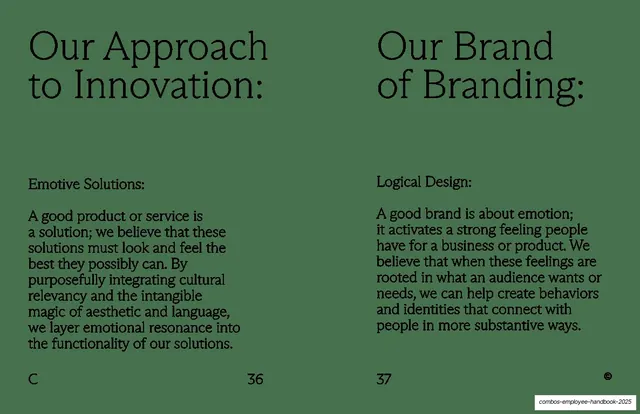
Green two-column spread contrasting "Our Approach to Innovation:" (Emotive Solutions) with "Our Brand of Branding:" (Logical Design), each a serif heading over a labeled paragraph.
Summary
A juxtaposition spread: "Our Approach to Innovation:" with an "Emotive Solutions" paragraph on the left, "Our Brand of Branding:" with a "Logical Design" paragraph on the right.
Visual description
Full-bleed sage-green, near-black type, two symmetrical columns. Each page leads with a large serif heading ending in a colon ("Our Approach to Innovation:" left, "Our Brand of Branding:" right). Below each, a small bold sub-label ("Emotive Solutions:" left, "Logical Design:" right) introduces a body paragraph in the text serif, ragged right, that starts around mid-page. The left argues that good products are solutions that should look and feel their best; the right argues that a good brand is about emotion. Section letter "C" bottom-left, page numbers "36" and "37", circled-© bottom-right.
Key takeaway
The deliberate cross: pairing innovation with "emotive" and branding with "logical" to flip expectations, made legible by mirrored layout and matching sub-labels. The colon-ended headings plus a bold inline label create a clear two-level heading system without changing typeface.
Reuse notes
A sharp template for presenting two related ideas as a contrast or a both/and. The mirrored structure and shared sub-label pattern keep the comparison balanced. Works best when the two paragraphs are close in length; reuse the colon-heading-plus-label device anywhere two parallel points need equal billing.
From this deck: Approach to Innovation / Brand of Branding
View deck