Preview image. Unlock full-res
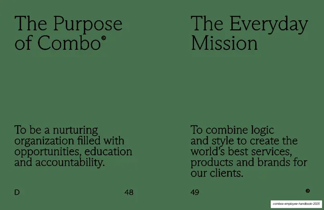
Sage-green two-column spread pairing "The Purpose of Combo" and "The Everyday Mission", each with a serif heading at top and a short serif statement below.
Summary
A symmetric two-column spread on sage-green: "The Purpose of Combo" and "The Everyday Mission" each sit as a serif heading at the top with a short serif statement anchored lower on the page.
Visual description
One flat sage-green spread split into two equal columns, no imagery. Each column has a two-line serif heading at the top ("The Purpose of Combo", with a superscript copyright mark, on the left; "The Everyday Mission" on the right) and, after a large empty gap, a short three-to-four-line serif statement near the lower third ("To be a nurturing organization filled with opportunities, education and accountability." left; "To combine logic and style to create the world's best services, products and brands for our clients." right). Dark ink throughout. Footer: section letter "D" bottom-left, page numbers 48 and 49, copyright glyph bottom-right.
Key takeaway
The top-heading / bottom-body split inside each column, with a deliberate void between them, so two parallel ideas read as a matched pair. The mirrored structure makes "purpose" and "mission" feel like two halves of one statement.
Reuse notes
Good for pairing two related framing statements (purpose vs. mission, vision vs. mission, who vs. why). The heading-top / body-bottom rhythm is reusable and forgiving of short copy. The empty middle is intentional whitespace; only use it when both statements are genuinely brief.
From this deck: Purpose of Combo / Everyday Mission spread
View deck