Preview image. Unlock full-res
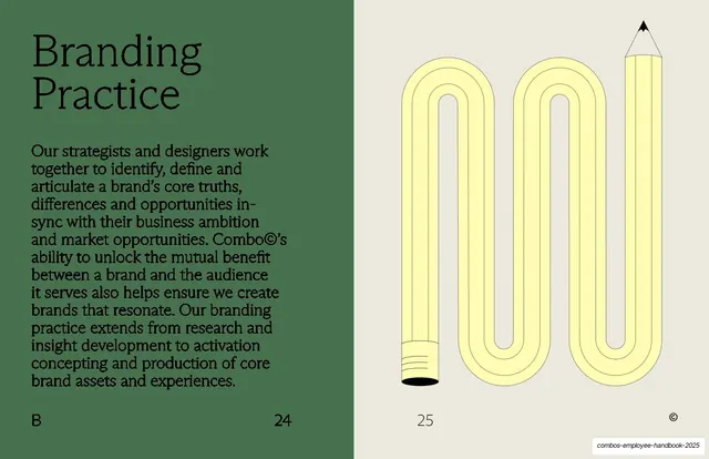
Split slide with a serif "Branding Practice" heading and paragraph on the green left page and a yellow line-art pencil bent into a back-and-forth scribble on the grey right page.
Summary
The branding-practice page: serif heading and copy on a green left half, a single yellow pencil bent into a continuous scribble on a grey right half.
Visual description
The slide splits into a sage-green left field and a pale grey right field. Left: "Branding Practice" as a serif sub-headline at top, with a body paragraph below in the text serif, ragged right, about identifying and articulating a brand's core truths and producing brand assets. Right: a playful line-art illustration of a single pencil whose body folds back and forth in a continuous looping scribble, rendered in flat yellow line with a black tip and a black eraser ferrule, reading as both a pencil and the mark it makes. Section letter "B" bottom-left, page numbers "24" and "25", circled-© bottom-right.
Key takeaway
Bending the recurring pencil motif into a witty form (a pencil that is also its own scribble) to illustrate "branding" without a literal logo. Keeping the illustration in the same flat yellow line language ties this playful moment to the divider system.
Reuse notes
Good when a content slide can carry one conceptual illustration alongside its copy. The morphing-object trick (one prop reshaped per idea) is reusable across a deck built on a single motif. Needs the illustration to stay clearly readable as the object, or the visual pun is lost.
From this deck: Branding Practice with pencil-scribble illustration
View deck