Preview image. Unlock full-res
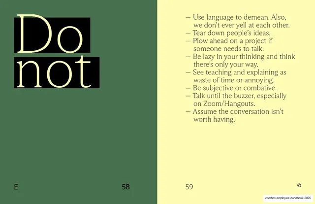
Sage-green spread with a giant serif "Do not" reversed out of black blocks on the left and a dash-bulleted list of discouraged behaviours on the right.
Summary
The "don't" half of the dos-and-don'ts pair: a giant serif "Do not" reversed out of two black blocks on the left page of a sage-green spread, with a dash-bulleted list of discouraged behaviours on the right.
Visual description
One flat sage-green spread. Left page: the words "Do not" set very large in a humanist serif across two lines, knocked out in pale yellow against two solid black rectangular blocks, top-left, the rest empty green. Right page: an em-dash bulleted list in the same serif at body size of things not to do ("Use language to demean. Also, we don't ever yell at each other.", "Tear down people's ideas.", "Plow ahead on a project if someone needs to talk.", and more). Footer: section letter "E" bottom-left, page numbers 58 and 59, copyright glyph bottom-right.
Key takeaway
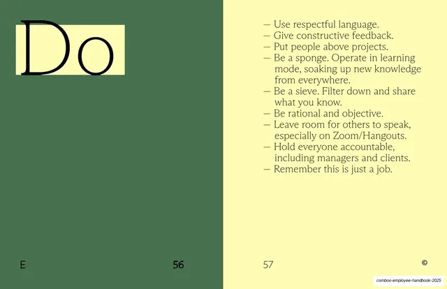
The inversion: where the "Do" page highlighted its word in yellow, the "Do not" page reverses the word out of black, so the two facing-spread pages read as a clear positive/negative pair before you read a word. Same grid, opposite color logic.
Reuse notes
Built to pair with the "Do" page (slide 28); show them together. The black-block reversal is a strong, slightly stern treatment, well suited to prohibitions or warnings. Reuse the highlight-vs-reverse contrast for any do/don't or before/after. Keep the list lengths and layout matched to the partner page.
From this deck: Do not list spread
View deck




More like this






Keep what you find
A free account saves references to boards and can send you a weekly email of picks based on what you save.
To see every result, go Pro.