Preview image. Unlock full-res
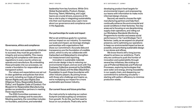
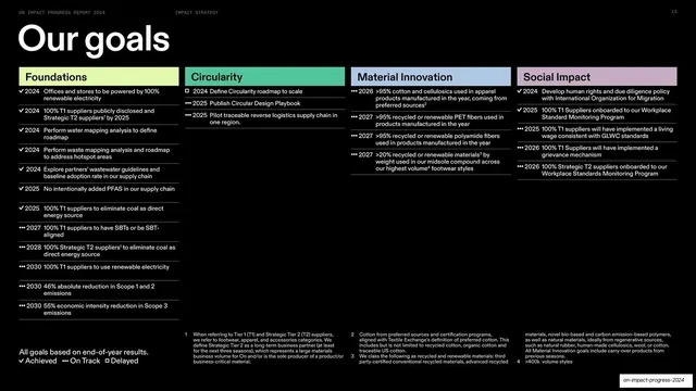
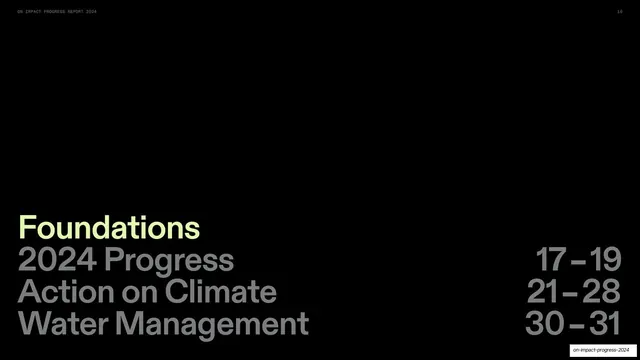
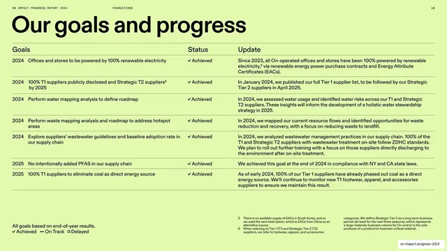
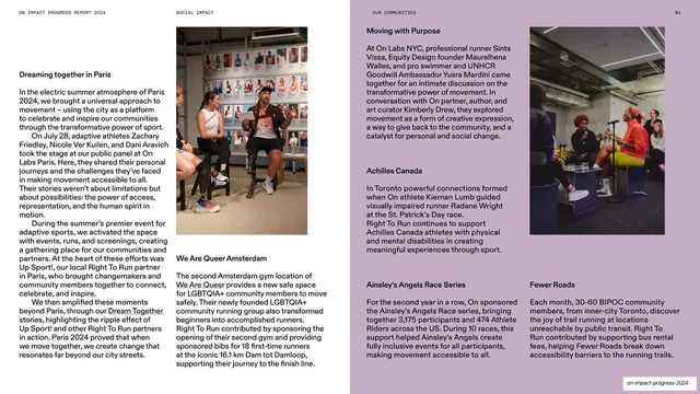
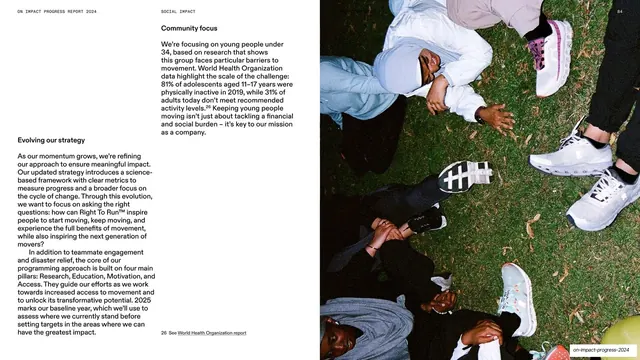
Editorial spread with two columns of forward-strategy body copy on the left and a full-height overhead photo of runners' legs and shoes on grass on the right.
Summary
A strategy spread: two columns of body copy under bold subheads on the white left page, balanced by a full-height overhead photograph of runners lying on grass with their shoes toward the camera on the right.
Visual description
A tiny all-caps running header tops both pages. The left page is white with two columns of small serif body copy under bold subheads ("Evolving our strategy", "Community focus"), including a numbered footnote near the bottom. The right half is a full-bleed, full-height color photograph shot from directly above: several people lying on dark green grass arranged radially, their legs and patterned running shoes pointing inward. An italic "on-impact-progress-2024" label sits bottom-right.
Key takeaway
The overhead, radially-composed photo gives the otherwise text-heavy strategy page a strong graphic anchor, and its dark green reads almost as a color block. Reserving the entire right half for that one image keeps the forward-looking copy uninterrupted.
Reuse notes
Good for a "what we learned / where we're going" page that is mostly prose but needs visual weight. A distinctive top-down or patterned photo works better here than a conventional eye-level shot because it behaves like a graphic. Keep the footnote and subheads consistent with the other text spreads.
From this deck: Evolving our strategy spread with overhead photo
View deck