Preview image. Unlock full-res
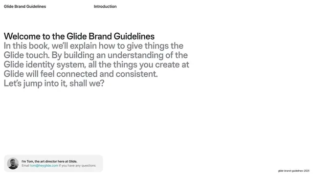
Light intro slide with a bold black headline over grey body copy and a small avatar contact card in the lower-left.
Summary
A welcome page introducing the purpose of the guidelines, signed off by a small art-director contact card in the bottom-left corner.
Visual description
White ground with the standard header: "Glide Brand Guidelines" left, "Introduction" center. A bold black headline "Welcome to the Glide Brand Guidelines" runs at the top of the content block; beneath it a multi-line paragraph set in lighter mid-grey explains the book's intent and closes with "Let's jump into it, shall we?". The right two-thirds of the slide is intentionally empty. A small rounded-rectangle card sits in the lower-left: a circular photo avatar beside two lines reading "I'm Tom, the art director here at Glide" and an email line with a colored link.
Key takeaway
Pairing a bold black headline with a lighter grey body paragraph for instant hierarchy, and grounding an intro with a small human contact card so the document feels owned rather than anonymous.
Reuse notes
A warm, personal opener for any internal guideline or onboarding deck. The avatar card pattern works anywhere you want a named point of contact. Leaves generous whitespace, so it reads premium only at this scale of restraint.