Preview image. Unlock full-res
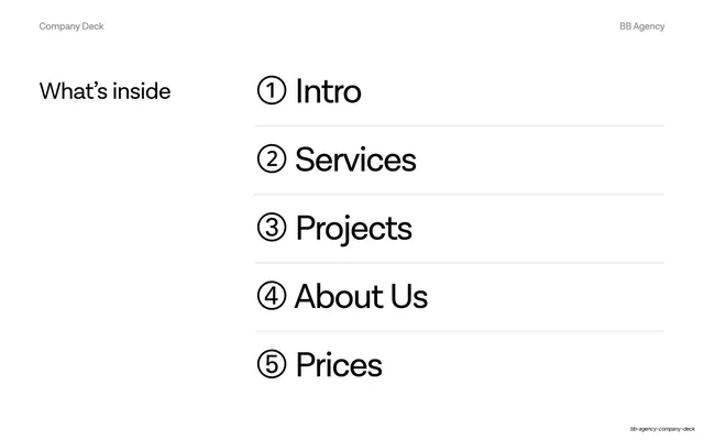
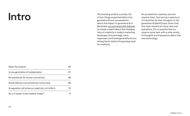
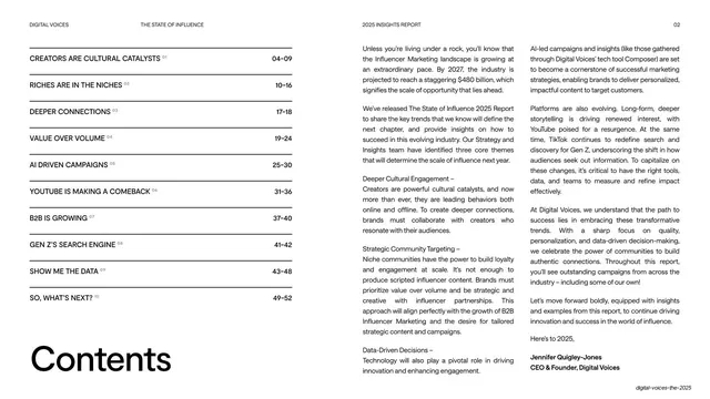
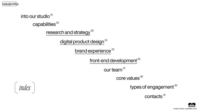
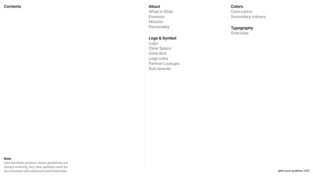
A three-column table of contents on white, with bold section headers over greyed sub-items and a note in the lower-left.
Summary
The deck's table of contents, organized into three vertical columns separated by thin rules, with bold category labels above lighter sub-entries.
Visual description
White ground. "Contents" sits top-left as the page title. Three columns are divided by faint vertical hairlines. The left column is empty under its header; the middle column lists "About" (What is Glide, Essence, Mission, Personality) and "Logo & Symbol" (Logo, Clear Space, Glide Bolt, Logo rules, Partner Lockups, Sub-brands); the right column lists "Colors" (Core colors, Secondary colours) and "Typography" (Overview). Section headers are bold black; sub-items are mid-grey. A small bold "Note" with a grey paragraph about evolving guidelines sits in the lower-left.
Key takeaway
Splitting a contents list across ruled columns and using a single bold/grey weight contrast to separate sections from sub-items, so the index doubles as a map of the document's structure.
Reuse notes
A clean multi-section index for any longer guideline or report deck. The vertical-rule columns scale to as many sections as needed. The footnote slot in the corner is a tidy place for a caveat or version note.