Preview image. Unlock full-res
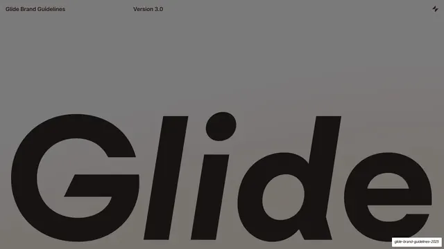
Cover slide with an oversized black "Glide" wordmark filling the lower two-thirds of a warm grey field.
Summary
The title slide: a warm mid-grey field with a huge near-black italic "Glide" wordmark bled off the bottom edge.
Visual description
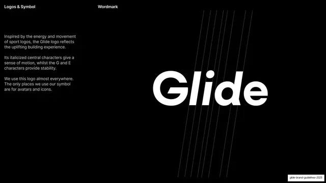
A warm grey ground holds a small bold-sans header across the top: "Glide Brand Guidelines" on the left, "Version 3.0" at center, and the small four-point Glide "bolt" symbol top-right. The lower two-thirds is filled by an oversized near-black wordmark "Glide", whose central "li" characters are italicized for motion while the G and e stay upright; the lowercase letters run off both side edges.
Key takeaway
Letting one oversized italic wordmark bleed off-canvas carry the whole cover, with only a thin utility header for context. The leaning "li" inside an otherwise upright logotype is a quiet motion cue.
Reuse notes
A confident cover pattern for brand books or guideline decks built around a strong logotype. The muted grey keeps it calm; depends on a distinctive display cut to hold the lower half.