Preview image. Unlock full-res
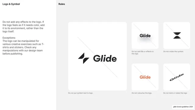
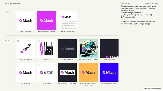
Light slide of logo rules, one large correct lockup beside a grid of five crossed-out misuse examples, each captioned.
Summary
A logo-rules slide: a short policy column on the left, one large card showing a misuse, and a grid of smaller cards each showing a crossed-out logo error.
Visual description
Light off-white ground. Header reads "Logo & Symbol" left and "Rules" center. A left column states not to add effects to the logo, with an "Exceptions" note about creative uses like t-shirts and stickers. The right area is a grid of white rounded-rectangle cards, each containing a logo example struck through with a thin diagonal "do not" line. One large card (left) shows the symbol placed next to the wordmark ("Do not put symbol next to logo."); four smaller cards to the right show "Do not add fills or effects", "Do not rotate the symbol", "Do not colourise the logo" (a coral wordmark), and "Do not twist or rotate the logo". Captions sit in small grey type under each card.
Key takeaway
The classic misuse grid done cleanly: one larger anchor card plus a tidy cluster of smaller crossed-out examples, each with a one-line caption, all on soft white cards against a neutral ground.
Reuse notes
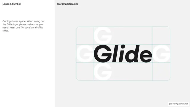
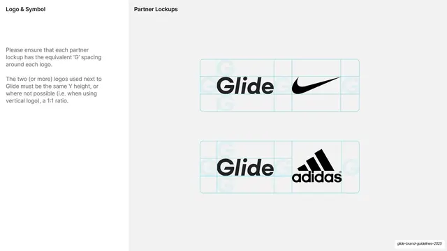
A standard, highly reusable logo do-not grid for any brand guideline. The card-plus-caption format scales to as many rules as needed. Pairs with the clear-space and partner-lockup slides in the logo section.
From this deck: Logo misuse do-not grid
View deck





More like this








Keep what you find
A free account saves references to boards and can send you a weekly email of picks based on what you save.
To see every result, go Pro.